
Contact paper is one of the most underestimated tools in home decor. If you have written it off as something only useful for lining kitchen drawers, it is time to look again. The quality has genuinely improved. Today’s contact paper comes in convincing marble finishes, rich wood grains, bold patterns, solid matte colors, and textured surfaces that look and feel far more intentional than the shiny vinyl of years past. It costs a fraction of what paint, veneer, or replacement furniture would run you. And it is removable — making it the single most renter friendly, budget conscious furniture hack available.
What makes contact paper so satisfying is the transformation to effort ratio. You can take a scratched, dated, or plain boring piece of furniture and turn it into something that looks genuinely designed — in an afternoon, with scissors, a squeegee, and twenty dollars worth of material. The ideas in this article go well beyond the obvious. Yes, we cover dresser tops and shelf liners, but we also get into furniture legs, cabinet backs, side tables, headboards, and approaches you probably have not considered. Fifteen specific ideas, each with practical detail that actually helps you execute them well.
1. Marble Contact Paper on a Dresser Top for Instant Elegance
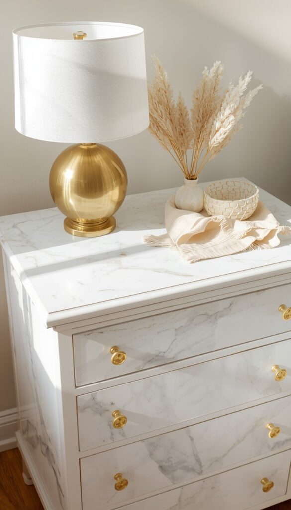
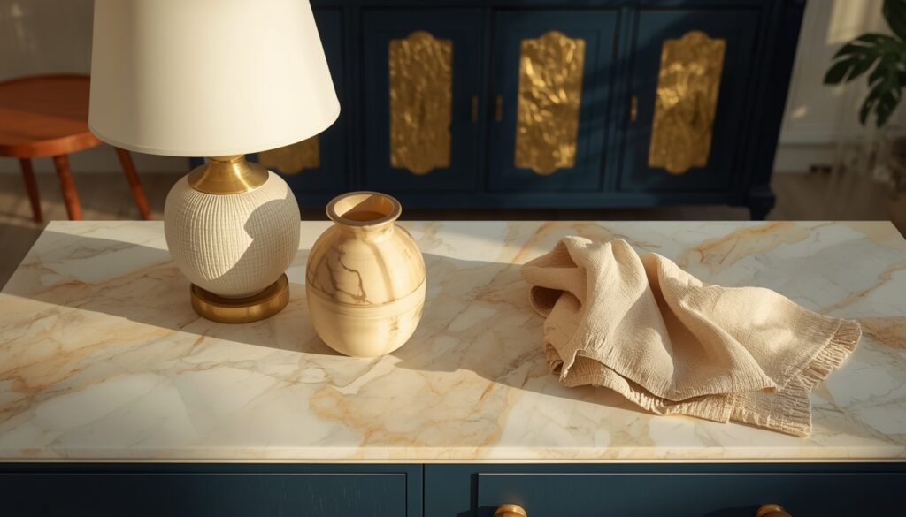
Covering a dresser top in marble effect contact paper is one of the most visually rewarding contact paper projects you can do — and one of the most forgiving for beginners. The top surface of a dresser is flat, accessible, and relatively small. You are working with a manageable piece of contact paper, fewer air bubbles to fight, and a result that is immediately visible every time you walk into the room. Marble contact paper in white and grey, white and gold, or black and gold reads as genuinely high end from a normal viewing distance, especially on a painted dresser in a complementary color.
The key to making marble contact paper look real rather than cheap is in the application and the finish. Start with a clean, completely smooth surface — any dust, grease, or bumps will show through the paper. Use a credit card or a dedicated squeegee to press the paper down from the center outward, working out every air bubble as you go. Trim the edges with a fresh craft knife blade rather than scissors for the cleanest possible line. Rounded corners require careful scoring and folding — cut small relief notches at the curve so the paper folds smoothly without puckering.
For the most convincing result, choose contact paper with a realistic vein pattern rather than an even, repeating one. Real marble has random, flowing veins — a pattern that tiles or repeats every twelve inches immediately reads as artificial. Look for marble designs with longer, more random vein patterns that look significantly more authentic. If your dresser top is very large, consider wrapping the paper around and under the edge slightly — about a half inch — so there is no visible raw edge at the front. That small detail makes an enormous difference to the finished quality.
2. Wood Grain Contact Paper on a Painted Side Table
A plain painted side table — especially inexpensive flat pack styles — can look significantly more expensive when covered in warm wood grain contact paper. This works especially well when you want the warmth and character of real wood but your budget does not stretch to solid wood furniture. Good wood grain contact paper, applied carefully, creates the visual impression of a real wood surface from across a room. Up close, you will know the difference — but in context, styled with a lamp, a small plant, and a stack of books, it reads as genuine wood with very little effort.
The most convincing wood grain contact papers mimic specific wood species with accuracy — light oak, walnut, pine, and reclaimed wood are the most useful for home decor applications. Light oak grain paper on a side table suits Scandinavian influenced rooms, minimalist spaces, and natural organic interiors beautifully. Walnut grain paper reads as richer and more contemporary, working well with black metal frames, dark flooring, and modern furniture. Avoid papers with very obvious, oversized grain patterns — real wood grain is typically subtle and consistent, not dramatically swirled or exaggerated.
Apply wood grain paper in the direction that real wood planks would run — horizontally on a tabletop, vertically on legs or side panels. Running grain in the wrong direction reads as immediately artificial to anyone familiar with real wood. If you are covering multiple surfaces of the same piece, align the grain direction consistently throughout. On a side table with a lower shelf, align the grain on both the top surface and the shelf in the same direction so they read as the same continuous material. That consistency is what elevates a contact paper project from a quick fix to a genuine design decision.
3. Black Matte Contact Paper on Kitchen Cabinet Doors for a Bold Update
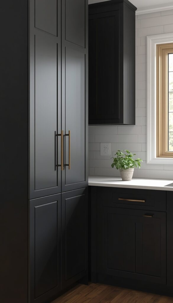
Covering kitchen cabinet door fronts in matte black contact paper is one of the most dramatic contact paper transformations possible — and one that gets the most disbelieving reactions when people find out what they are actually looking at. Matte black works particularly well on flat panel cabinet doors. The absence of raised molding means you have one clean surface to cover, and the matte finish absorbs light the same way that matte black paint does, giving it a very convincing painted quality. In a kitchen with white walls and warm hardware, black cabinet fronts feel genuinely designed and current.
Preparation on cabinet doors is more critical than on furniture because cabinet surfaces take more wear and are viewed at closer range. Remove the doors if possible — applying contact paper to vertical surfaces is significantly harder than working on a flat horizontal one. Wipe every surface with an isopropyl alcohol solution to remove grease before applying — grease is the enemy of good adhesion, and kitchens accumulate it even on surfaces that look clean. Use a high quality matte black contact paper rather than a cheap gloss version — the difference in texture, thickness, and how it handles wear is significant.
Bubbles are your main enemy on large flat door surfaces, and the way to prevent them is patience and a systematic approach. Peel back only the first few inches of backing, align the paper to the door edge, press that section down firmly, then slowly peel the backing further while pressing down with a squeegee in a firm, continuous motion from the center outward. Never try to peel the entire backing at once on a large surface — the paper sticks to itself and creates wrinkles that are difficult to recover from. If a bubble appears after application, a fine needle prick and a firm press from the squeegee usually resolves it cleanly.
4. Floral Contact Paper on Drawer Fronts for Playful Personality
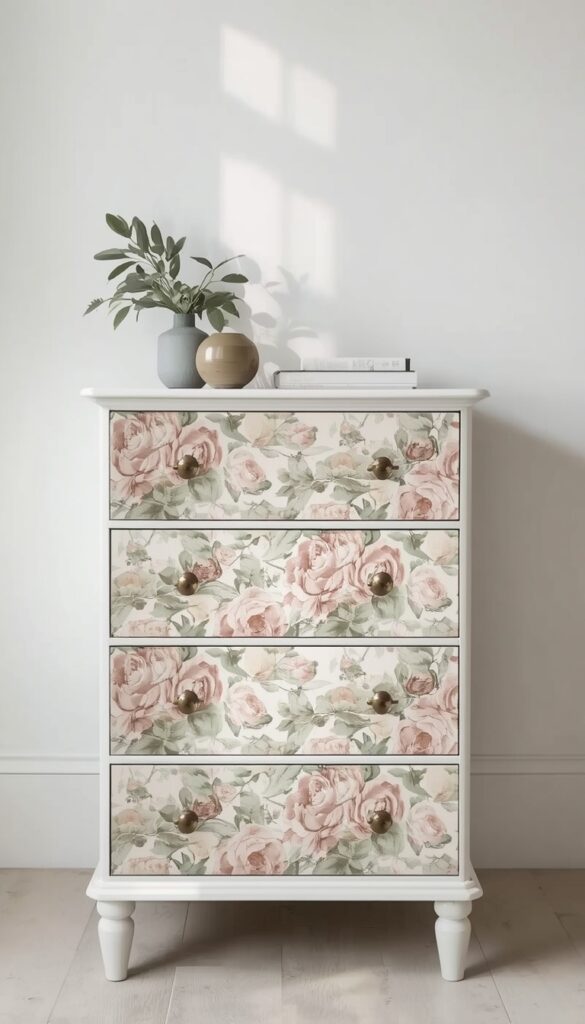
Using bold floral contact paper on drawer fronts — while leaving the dresser body in its original color — is a furniture update idea that delivers enormous personality with minimal material. Each drawer front becomes a small framed panel of pattern, and the effect when the drawers are closed is a dresser face that looks almost like an upholstered piece. This approach is perfect for a children’s bedroom, a guest room, or any space where you want a strong design statement without committing to an entire room of pattern. It is also far more controlled than wallpaper — if you tire of the print, you simply peel off the drawer panels and start fresh.
Choose a floral print with a pattern repeat that works well at the scale of your drawer fronts. A drawer that is roughly fourteen inches wide and five inches tall does not show enough of a large scale floral to read well — the blooms get cropped and the pattern looks accidental. A medium scale print with blooms ranging from two to four inches works much better in this context, giving each drawer a readable, balanced portion of the pattern. If you want all drawers to match, buy enough contact paper to align the pattern across all drawer fronts as if they were one continuous surface.
Aligning the pattern across multiple drawers requires planning. Before you apply anything, lay all the drawer fronts on a flat surface with the gaps between them representing the dresser frame gaps. Lay the contact paper over the top and mark where each drawer falls on the pattern. Then cut each piece individually using those marks as guides, so when the drawers are reinstalled, the pattern flows continuously across all of them. This is the detail that separates a contact paper dresser that looks designed from one that just looks covered. It takes an extra twenty minutes and makes an enormous difference.
5. Terrazzo Contact Paper on a Coffee Table Top
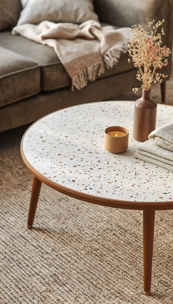
Terrazzo effect contact paper on a coffee table top is the kind of update that guests ask about specifically — because terrazzo looks like a premium, expensive material and contact paper that mimics it well is genuinely convincing from conversation distance. The characteristic speckled pattern of terrazzo — small chips of marble, granite, and glass set in a cement matrix — translates beautifully into printed contact paper because the pattern is naturally varied and non repeating. A white or cream terrazzo with warm pink and grey chips on a mid century or minimal coffee table immediately looks like a custom painted or resurfaced piece.
Apply terrazzo contact paper to the top surface only for the cleanest result. Wrapping it onto the side apron of a coffee table requires more careful cutting and corner work, and in most cases the top only application reads well enough that the extra complexity is not worth it. The apron can stay in its existing finish — natural wood, painted white, or matte black all complement the terrazzo pattern beautifully. Use a metal ruler and a fresh craft blade to trim the edges of the paper flush with the table edge rather than wrapping it underneath — the flush edge looks cleaner and is more durable on a coffee table that gets regular use.
Terrazzo contact paper for a coffee table needs to be a thicker, more durable grade than standard decorative contact paper because coffee tables sustain real daily use — drinks, books, remote controls, feet. Look for contact papers with a thickness of at least 0.2mm and a surface with some resistance to scratching. Heavier weight decorative contact paper in terrazzo patterns holds up significantly better under daily use. If you want extra protection, apply a thin layer of matte decoupage medium over the top of the contact paper after application — it adds a slight buffer against wear and prolongs the life of the finish considerably.
6. Rattan Print Contact Paper on Wardrobe Panels for a Boho Look
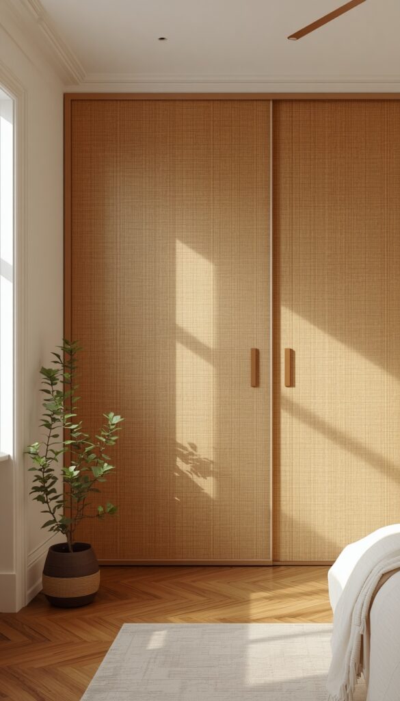
Rattan print contact paper — designs that replicate the woven texture and warm golden tones of natural rattan — is one of the more recent and genuinely exciting additions to the contact paper world. Applied to the flat door panels of a wardrobe or a large freestanding armoire, rattan print paper transforms a plain, dated piece into something that feels like it belongs in a curated boho or organic modern room. The visual texture of the woven rattan pattern creates depth and warmth that solid colors cannot achieve, and the warm honey and caramel tones of rattan work beautifully against white walls and natural wood floors.
This approach works best on flat panel wardrobe doors — the kind with a smooth, uninterrupted surface that contact paper can adhere to without navigating raised molding or inset panels. Sliding wardrobe doors with flat laminate panels are actually ideal candidates because their surfaces are perfectly smooth, which means contact paper adheres well and removes cleanly when you are ready for a change. Remove the doors before applying if your wardrobe system allows it — it is significantly easier to work on a flat horizontal surface than a vertical one.
For the most convincing result with rattan print contact paper, choose a design with a natural scale weave — not an oversized blow up of the rattan pattern, which reads as a print rather than a texture. The weave should look life size or close to it. A warm, slightly varied tone within the paper — lighter highlights, slightly darker shadows in the weave — also increases the realism compared to a flat, single tone print. Style the finished wardrobe with rattan handles or leather strap pulls rather than standard metal hardware — the hardware change combined with the rattan print panels makes the whole piece look like it came from a design forward furniture store.
7. Color Block Contact Paper on Furniture Legs for a Graphic Update
Covering furniture legs is one of the easiest and most overlooked ways to update a piece, and color block contact paper on legs is a particularly clever approach. Choose a bold, solid color contact paper — matte terracotta, deep forest green, cobalt blue, or rich mustard — and cover just the legs of an otherwise neutral piece. A natural wood dining table with terracotta wrapped legs. A cream side table with cobalt blue legs. The contrast between the neutral top surface and the colored legs creates a graphic, contemporary look that feels far more expensive and intentional than the actual effort involved.
Covering cylindrical or tapered legs requires a different technique than flat surfaces. Cut a strip of contact paper slightly longer and taller than the leg surface area. Starting at the back seam line of the leg, carefully wrap the paper around the circumference, smoothing out air pockets as you go. The seam at the back should be as tight and clean as possible — use a fresh craft blade to trim the overlapping edge against a metal ruler for a perfectly straight seam line. On tapered legs, cut the paper with a slight flare — wider at the top than at the bottom — to prevent puckering at the narrow end.
For square or rectangular legs, the approach is simpler — cut a separate piece of contact paper for each face of the leg, aligning them so they meet precisely at each edge for a clean, painted appearance. Matte finish contact paper on legs is significantly more convincing than gloss for most interiors because matte reads as paint, which is naturally what you would expect on a furniture leg. This technique is also fantastic for flat pack furniture — covering the plain birch legs of a basic drawer unit in matte sage green immediately makes it look like a custom piece rather than a standard purchase.
8. Dark Linen Texture Contact Paper on a Bedside Table
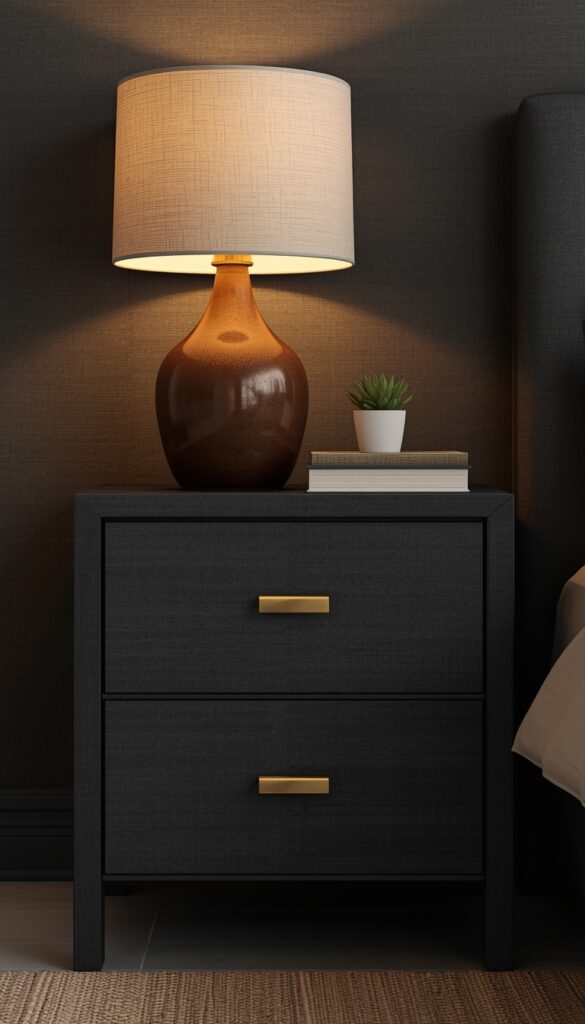
Textured contact paper — particularly those that replicate the appearance of linen, fabric, or fine weave — is a category most people overlook in favor of patterns and faux materials. But a matte, linen textured contact paper in dark charcoal, deep navy, or rich forest green applied to a basic bedside table creates something that looks almost like a lacquered, fabric wrapped piece from a boutique furniture brand. The texture breaks up the surface in a way that solid color paint does not, adding a visual depth that makes even the simplest bedside table look more considered and more finished.
Textured contact papers require the same careful application as smooth ones, but they are somewhat more forgiving with minor air bubbles because the surface texture breaks up the visual evidence. The caveat is that seams and edges show more with textured papers — the texture interruption at a join is more noticeable than on a smooth surface. Plan your application to keep seams on the least visible edges of the piece, and press edges down particularly firmly to prevent peeling at the corners, which is where textured papers tend to lift first.
A dark linen textured bedside table looks particularly beautiful paired with brass hardware — swap out any existing knob or pull for a simple solid brass drawer pull before finishing the application, because the combination of dark textured surface and warm brass is one of the most satisfying small furniture details you can achieve. Add a warm lamp on top, a small stack of books, and a simple plant or bud vase, and the bedside table becomes a genuinely composed vignette. The contact paper investment for a single bedside table is typically under ten dollars. The visual result is worth many times that.
9. Gold Foil Contact Paper on Furniture Edges and Insets for Glamour
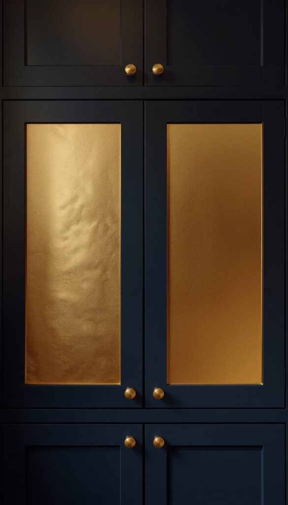
Gold foil contact paper used as a trim or accent detail — rather than covering an entire surface — is one of the most sophisticated contact paper techniques in this list. Applied to the routed edge of a table, the inset panel of a cabinet door, the trim of a mirror frame, or the drawer edge of a dresser, gold foil paper reads as gilding rather than covering. The metallic quality of true foil finish contact paper is genuine — it reflects light the way real gold leaf does, catching the light differently as you move around the piece. Used sparingly, it reads as a deliberate design choice, not a decorating hack.
The most common mistake with gold foil contact paper is applying it to surfaces that are not perfectly smooth and flat. Foil papers have almost no opacity — every imperfection in the surface beneath shows through the foil, including dust, scratches, and grain texture in the wood. Sand any surface receiving gold foil contact paper until it is completely smooth, wipe clean with a tack cloth, and apply a thin coat of paint or sealant in the base color first if the surface is raw or rough. On a smooth, painted surface, gold foil contact paper adheres cleanly and looks extraordinary.
Cabinet door inset panels are the most rewarding surface for this technique. Many traditional or Shaker style cabinet doors have a flat inset panel recessed within a raised frame — applying gold foil contact paper to just that inner panel, carefully trimmed to sit flush with the shoulder of the recess, creates the impression of a gilded inset that would be genuinely expensive to commission from a furniture maker. Paired with brushed black or dark navy painted cabinet bodies, the gold inset doors look almost lacquered and gilded — a genuinely glamorous result from a few dollars of metallic contact paper and an hour of careful work.
10. Concrete Effect Contact Paper on a TV Unit for Industrial Style
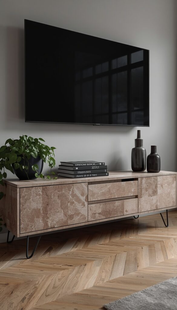
Concrete effect contact paper applied to a TV unit or entertainment console is one of the most effective ways to introduce industrial design character into a living room without the weight, permanence, or cost of actual concrete. A good concrete effect contact paper captures the subtle color variation, the occasional pitting, and the flat matte quality of real poured concrete convincingly enough to read as the genuine material in a styled room setting. Combined with black metal legs, black metal frame accessories, and dark wood accents, the concrete look surface anchors the industrial aesthetic beautifully.
The best concrete contact papers are multi tonal — they carry a base of warm mid grey with subtle variations of lighter and darker tones, replicating the natural variation in cured concrete. Single tone grey contact paper reads as painted, not concrete. Look specifically for papers that include subtle texture in the surface of the material itself, not just in the print — this tactile quality adds to the realism significantly. Papers with both tonal variation and slight surface texture are among the most convincing available for this application.
On a large TV unit with multiple door and drawer fronts, align the concrete paper so the tonal variation flows naturally across the whole piece rather than treating each section independently. Real concrete slabs have continuous variation across their surface — treating each panel as a separate application with a fresh piece of paper placed randomly creates a patchwork effect that reads as wallpaper rather than concrete. Orient each section so the lighter and darker tonal variations flow in a consistent direction across the whole unit, and the result reads as a single material surface rather than individual covered panels.
11. Pastel Solid Contact Paper on a Children’s Bookshelf
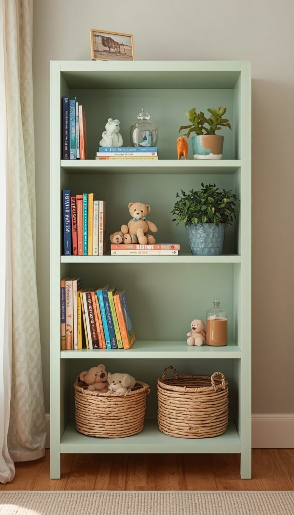
A children’s bookshelf covered in soft pastel contact paper is one of the most charming and most practical contact paper projects you can do. Children’s rooms accumulate scratched, marked, and battered furniture quickly, and contact paper is the perfect solution — it covers existing damage, refreshes the piece, and when it eventually gets marked or scuffed itself, you simply peel it off and start fresh. Soft mint green, warm dusty rose, powder blue, or pale butter yellow are all colors that work beautifully on a children’s bookshelf and give the room a cohesive, sweet aesthetic without being overly baby-like.
The most effective approach for a bookshelf is covering the back panel in a slightly deeper or contrasting pastel — if the main body of the shelf is soft mint, cover the back panel in a slightly deeper sage or a warm cream. This creates a two tone effect that makes the shelf look deliberately designed rather than just covered. Objects displayed on the shelves — books, small toys, baskets, and plants — sit against the colored back panel and pop more clearly than they would against an all white surface. This two tone approach works for any bookshelf, not just in children’s rooms.
For children’s furniture specifically, make sure the contact paper you use is non toxic and does not contain PVC plasticizers that can off gas in a small room. Many standard contact papers are PVC based — look specifically for brands that label their products as phthalate free or PVC free. Apply the contact paper with firm, consistent pressure and finish all edges with an extra press using a bone folder or the handle of a butter knife — children’s furniture takes more physical contact than adult pieces, and well sealed edges resist peeling significantly better.
12. Two Tone Contact Paper on a Dining Chair Seat for a Fresh Look
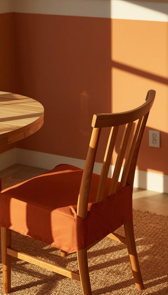
Dining chair seats are one of the most practical contact paper applications because they are flat, accessible, and covered in material that genuinely wears and stains over time. On a solid wooden seat — which many budget dining chairs have — a good quality, appropriately textured contact paper works very well. The material protects the wood from the inevitable scratches, food spills, and daily wear that dining chairs sustain, and gives the seat a fresh color or pattern that can be peeled off and replaced as tastes change.
The two tone approach applies a different contact paper to the seat and to the back rail or spindles of the chair. A seat in warm terracotta contact paper and chair back in matte black gives a budget chair a genuinely designed, color blocked quality. Or a seat in warm wood grain paper with a dark forest green back panel. The combination adds visual interest to what is otherwise a very simple piece of furniture. This also works beautifully for mismatched dining chairs — covering different chair models in the same contact paper palette ties them together visually, creating an intentionally mixed but cohesive set.
Clean wooden dining chair seats thoroughly before applying — food residue, wax, and oils from daily use all compromise adhesion. Sand any rough spots or old varnish lightly with fine grit sandpaper, wipe clean, and allow to dry fully before starting. Use a contact paper that is at minimum 0.2mm thick on a dining chair seat — thin papers scuff and tear quickly under daily sitting use. Apply carefully and press the edges under the seat firmly, securing them with additional contact paper tape if needed for a clean underside finish. Replace the contact paper on dining chairs every twelve to eighteen months to keep the surface looking fresh.
13. Scallop Pattern Contact Paper on the Inside of a Cabinet
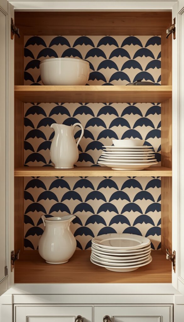
Using patterned contact paper on the inside back panel of an open cabinet or a glass fronted cabinet creates a detail that genuinely surprises and delights — the pattern is hidden until you open the door or look through the glass, at which point it provides an unexpected pop of color and pattern behind whatever is stored inside. Scallop patterns — the classic repeated arch or shell motif — are particularly well suited to this application because they are geometric, they do not require pattern alignment across a single flat surface, and they look beautiful in almost any color combination from bold navy and white to soft blush and cream.
Open shelving in a kitchen or dining room benefits enormously from this technique. Replacing the plain white or wood back panel of a kitchen shelf with a bold scallop patterned contact paper in deep blue and white immediately makes the shelf look more designed, and everything stored in front of it — glassware, ceramics, a plant, a cookbook — looks more intentional against the patterned background. This is essentially the same principle as color blocking shelf backs, but with the added dimension of a graphic pattern that adds even more visual interest.
For glass fronted cabinets specifically — the kind of display cabinet you might use for glassware or ceramics — patterned contact paper on the back interior panel is an almost magical update. The pattern is partially visible through the glass doors at all times, creating a layered view of the paper behind the displayed objects. Choose a color that complements what you display inside — a navy scallop behind white ceramics, a sage green behind warm terracotta pieces, or a warm blush behind glass and crystal. The combination of the displayed objects and the patterned backdrop creates a genuinely curated cabinet as display case effect.
14. Faux Grass cloth Contact Paper on a Headboard Panel
Faux grasscloth contact paper — which replicates the woven, organic texture of natural grasscloth wallcovering — applied to a simple wooden headboard panel is one of the most effective contact paper furniture ideas for a bedroom. Natural grasscloth wallcovering is expensive, time consuming to install, and difficult to clean. Contact paper in a convincing grasscloth texture captures most of the visual warmth and organic quality at a fraction of the cost, and it can cover a basic wooden or MDF headboard panel without requiring any specialist application skills. The result reads as a textured, organic headboard that looks well considered and design forward.
Choose a faux grasscloth paper in a warm neutral — natural tan, warm sand, soft greige, or pale honey. These tones suit the widest range of bedroom palettes and read most convincingly as natural grasscloth, which comes primarily in earthy, neutral tones. Avoid grasscloth papers in unnatural colors like bright blue or saturated green — they read as a print rather than a natural material. The texture in the paper itself matters as much as the printed pattern — papers with an actual embossed or raised weave texture in the substrate read significantly more convincingly than those with a purely printed texture on a smooth surface.
Apply the grass cloth contact paper to the headboard panel in vertical strips, aligning the weave pattern at each join as carefully as possible — grass cloth is typically woven in vertical stripes, and maintaining that directionality is important to the illusion. Most faux grass cloth papers are designed for wall application and come in wider rolls that can cover a headboard panel in one or two strips with minimal joining. Once applied, the headboard looks best with simple white linen bedding and natural material accents — linen cushions, a wooden lamp base, dried pampas grass in a simple ceramic vase — that reinforce the organic, natural quality of the grass cloth surface.
15. Bold Geometric Contact Paper on a Plain Dresser
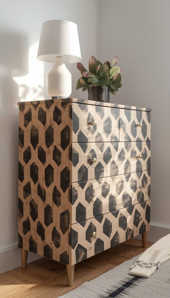
A bold geometric contact paper transformation is one of the most satisfying upgrades you can give a plain dresser. The clean, smooth surfaces of most flat pack dressers are essentially ideal substrates for contact paper. The flat drawer fronts, smooth top surface, and consistent panel sizes make application straightforward and alignment manageable. A bold geometric contact paper — a striking hexagon, a large scale diamond, a strong chevron, or a bold art deco fan pattern — transforms a plain dresser from a standard piece into something that looks custom and genuinely designed.
For the most striking geometric result, treat the entire drawer face as one surface and align the geometric pattern across all drawers so it flows continuously. Cut each drawer piece individually with the pattern alignment pre marked, so when you reinstall the drawers, the hexagons or diamonds run without interruption from top to bottom. This continuous pattern approach is the single most important detail that makes a geometric contact paper dresser look truly designed rather than simply covered.
Change the hardware at the same time as the contact paper — this is non negotiable. Even the most beautifully applied contact paper is undermined by cheap looking pulls. A bold geometric paper in black and cream suits simple brass pulls beautifully. A colorful geometric in terracotta and cream works with matte black round knobs. A blue and white geometric calls for ceramic pulls with a complementary pattern. The hardware change adds a small amount to the project cost and at least doubles the visual impact of the result. It is absolutely worth it every single time.
Conclusion
Contact paper furniture ideas work because they meet a genuine need — the need to make a space feel personal, considered, and beautiful without the cost, commitment, or skill level that traditional furniture refinishing demands. Every idea in this article is genuinely achievable on a weekend afternoon with basic tools and a few rolls of the right material. The key takeaway is this: contact paper performs best when it is applied with real intention and real preparation — a clean surface, careful alignment, patient bubble removal, and the right finish. Approach it thoughtfully and the results will consistently exceed your expectations. Pick the idea that excites you most, order your contact paper, and transform something in your space this weekend.
Frequently Asked Questions
Q: Does contact paper actually stay on furniture long term? A: Yes, when applied correctly to a clean, smooth surface, quality contact paper stays put for two to five years on furniture with regular use. The key factors are surface preparation — completely clean and dry before application — and edge sealing. Edges that are not pressed down firmly are where peeling starts. Use a bone folder or squeegee to press every edge thoroughly.
Q: Will contact paper damage furniture when I remove it? A: On most finished furniture surfaces — painted, laminate, or sealed wood — contact paper removes cleanly without damage. On raw wood, unsealed MDF, or very old painted surfaces, the adhesive can pull the surface. Always test a small piece in an inconspicuous area first. Warming the paper with a hairdryer before peeling softens the adhesive and helps it release more cleanly.
Q: What thickness of contact paper works best for furniture projects? A: For furniture that gets daily use — coffee tables, dresser tops, cabinet doors, and dining chairs — choose contact paper with a minimum thickness of 0.2mm. Thinner papers feel flimsy, scuff easily, and show wear quickly. Thicker papers handle daily contact significantly better, look more convincing, and adhere more smoothly to furniture surfaces without wrinkling.
Q: How do I apply contact paper without air bubbles? A: Peel the backing only a few inches at a time rather than all at once. Press down each section firmly with a squeegee or credit card before peeling further, and work from the center outward. If bubbles appear after full application, use a fine sewing needle to prick the bubble and press it flat with your fingernail. Most bubbles resolve completely with this method.
Q: Can contact paper go on upholstered furniture? A: Contact paper does not adhere to fabric or upholstered surfaces — it needs a smooth, non porous substrate. For upholstered pieces, only apply contact paper to the hard wooden or laminate sections such as legs, frames, drawer fronts, or side panels. For the fabric portions, reupholstering or spray fabric paint are the appropriate alternatives.
Q: How do I cut contact paper perfectly straight? A: Always cut contact paper with a metal ruler and a fresh craft knife rather than scissors — scissors compress the edge and create a slightly uneven line that shows on finished work. Change your craft knife blade frequently because a slightly dull blade drags and tears rather than cutting cleanly. A self healing cutting mat keeps your work surface protected and gives you guide lines to work against.
Q: Is contact paper waterproof enough for bathroom or kitchen furniture? A: Most standard contact paper is water resistant rather than fully waterproof — it handles splashes and moisture well but should not be soaked. For kitchen and bathroom furniture, choose specifically labeled waterproof contact papers and seal all edges carefully to prevent water from getting beneath the adhesive layer. Re-seal any lifted edges immediately rather than waiting, since moisture will continue to work underneath lifted sections.
Q: What surface colors work best underneath contact paper? A: Dark contact papers — black, navy, deep green — cover almost any surface color effectively because their opacity is high. Light and pale contact papers — white marble, pale pastels, cream — can allow the original surface color to influence the final appearance. For light papers over dark furniture, apply a white primer spray or a coat of white paint first for the most accurate final color result.