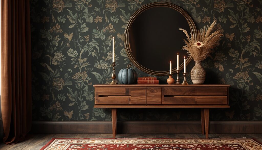
There’s a specific feeling that hits when fall finally arrives , that urge to nest, to wrap your home in warmth, to make every room feel like the inside of a cozy cabin while rain taps at the window. Wallpaper is one of the fastest ways to achieve that feeling, and fall themed wallpaper designs have come so far beyond the basic leaf print. Today’s options are sophisticated, layered, and genuinely stunning. Whether you’re committing to a full room or just doing an accent wall, the right fall wallpaper can completely transform how a space feels from September through November.
What makes fall wallpaper so exciting right now is the range. You can go dark and moody with deep forest scenes and midnight botanicals, or stay warm and bright with golden foliage and harvest tones that feel like afternoon sun through amber leaves. The twelve designs in this article cover that full spectrum , with specific details on color palettes, room pairings, and styling tips that actually help you make a decision. If you’ve been on the fence about wallpaper, fall is honestly the best season to commit. The results are worth every bit of the effort.
1. Moody Dark Botanical Wallpaper for a Dramatic Fall Statement
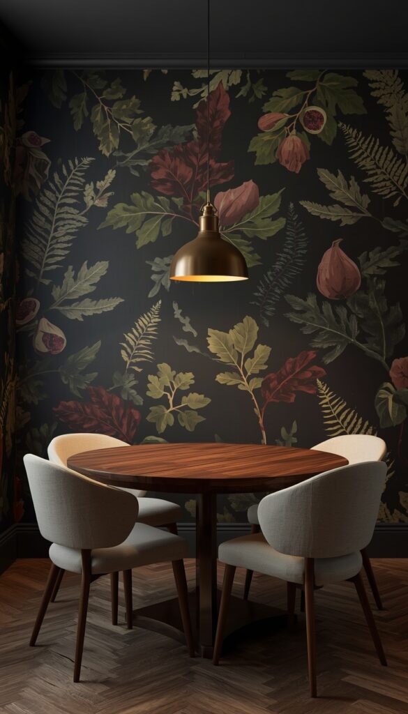
Dark botanical wallpaper is having a serious moment, and fall is absolutely its season. Picture deep charcoal or near black backgrounds covered in oversized botanical illustrations , oak leaves, fig branches, and fern fronds rendered in rich forest green, burgundy, and bronze. The contrast between the dark ground and the detailed foliage creates a sense of depth that feels genuinely luxurious. This style works particularly well in dining rooms and home offices where you want the space to feel enveloping and intentional. It’s a bold move, but the payoff is extraordinary.
The key to making dark botanical wallpaper work is pairing it with the right lighting. Warm toned bulbs , think 2700K to 3000K , make the dark background recede and bring the illustrated foliage forward in a rich, glowing way. Overhead cool lighting will flatten the whole effect. A brass or antique gold pendant light above a dining table surrounded by dark botanical walls looks spectacular. Add wooden furniture with visible grain, cream or rust colored linen upholstery, and brass hardware, and you’ve built a dining room that genuinely feels like fall in its most sophisticated form.
If full room coverage feels too committed, a single accent wall behind a bed or behind a built in bookcase delivers dramatic impact with less risk. A reading nook with dark botanical wallpaper on three walls and a simple linen armchair inside it becomes the most atmospheric corner in your home. For renters or anyone hesitant to commit, peel and stick versions of dark botanical prints exist from several quality manufacturers; they’ve improved dramatically in texture and finish. Some are now nearly indistinguishable from traditional wallpaper, especially in lower light rooms where they work best anyway.
2. Golden Foliage Wallpaper That Captures Peak Autumn Color
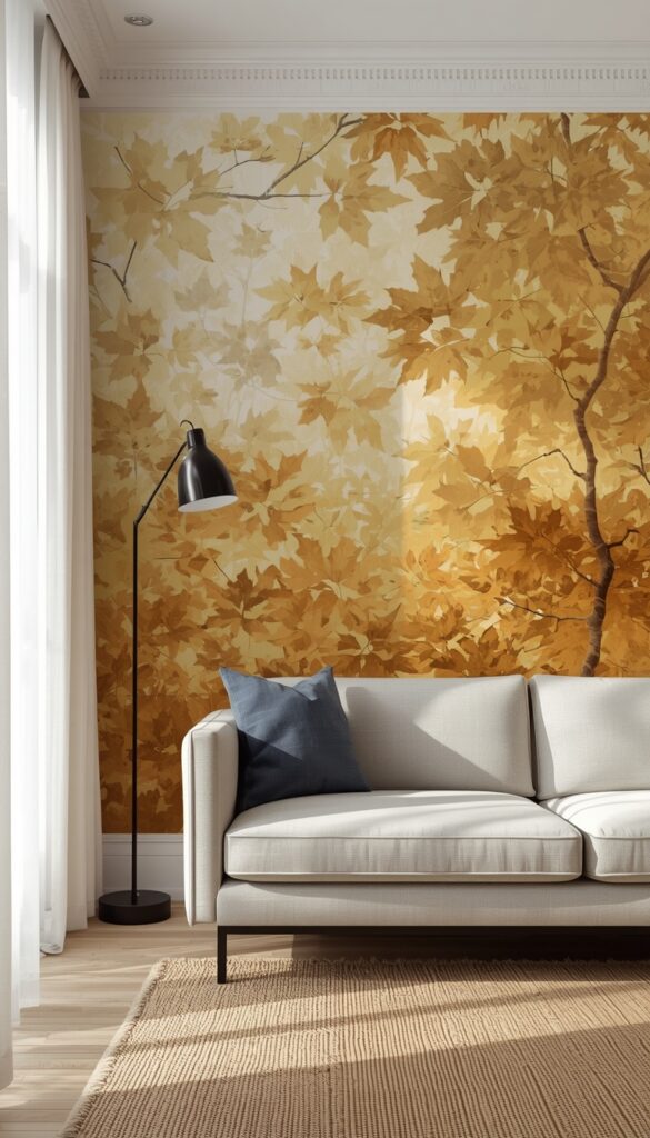
Nothing says fall quite like a wall covered in golden foliage. The best versions of this design layer multiple leaf shapes , maple, ginkgo, aspen, and birch , in a rich palette that moves from pale butter yellow through warm amber to deep burnt gold. This isn’t a flat, uniform pattern. The most beautiful examples have illustrated leaves at different scales, some overlapping, some with visible vein detail, some catching imaginary light. The result feels like standing beneath a canopy of trees on the most perfect October afternoon you’ve ever experienced.
Golden foliage wallpaper is one of the most versatile fall designs because it plays well with almost every interior style. In a traditional home, pair it with mahogany furniture and hunter green accents for a classic autumn palette. In a more modern space, let the wallpaper be the single statement piece , keep everything else clean and neutral so the gold really sings. A light gray sofa, white painted trim, and simple black iron fixtures let golden foliage wallpaper carry the entire room without competition. It’s a remarkably flexible design that rewards restraint in the surrounding decor.
For bedrooms, golden foliage wallpaper on the wall behind the headboard creates a canopy like effect that feels genuinely dreamy. Pair it with crisp white linen bedding and warm wood bedside tables for a look that’s cozy without being heavy. The gold tones in the wallpaper will pick up naturally in candlelight and warm lamp glow during the evening hours, making the bedroom feel different , and more beautiful , at different times of day. That quality, where a wallpaper actually changes with the light, is one of the best things about choosing a design with real tonal variation rather than a flat repeat.
3. Forest Mushroom and Fungi Wallpaper for a Whimsical Fall Feel
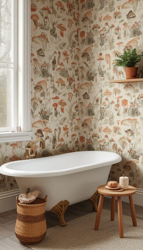
Mushroom and fungi wallpaper has moved well beyond novelty , it’s now one of the most requested botanical wallpaper styles for fall, and for good reason. The best designs feature detailed illustrations of mushrooms in their natural habitat: chanterelles, fly agarics, morels, and bracket fungi growing among fallen leaves, moss, and twisted roots. The color palette is perfectly autumnal , warm ochre, rust, deep brown, cream, and sage green. It feels like a fairy tale forest floor brought to life on your walls, and it works especially beautifully in bathrooms and hallways.
What makes fungi wallpaper so compelling is its storytelling quality. Each section of a well designed repeat tells a slightly different micro story , a cluster of mushrooms here, a beetle on a leaf there, a curl of fern frond between them. This level of illustrative detail rewards looking closely, which makes it ideal for rooms where people spend time waiting or pausing , a powder room, an entryway, or a stairwell. Guests always comment on it. It has that quality of artwork that reveals more detail the longer you look, which is exactly what the best wallpaper does.
Styling a room with mushroom and fungi wallpaper is genuinely fun. Bring in natural materials that echo the woodland mood , wicker baskets, raw wood shelves, ceramic vessels in earthy brown and cream tones. Dried moss, small fern plants, and terracotta pots with trailing greenery all complement the illustration beautifully. In a bathroom, a simple white freestanding tub against fungi wallpaper with a raw brass faucet and a small wooden stool creates a scene that looks like it belongs in a luxury boutique hotel. It’s an unexpected combination that absolutely delivers.
4. Warm Plaid and Tartan Wallpaper for a Cozy Cabin Atmosphere
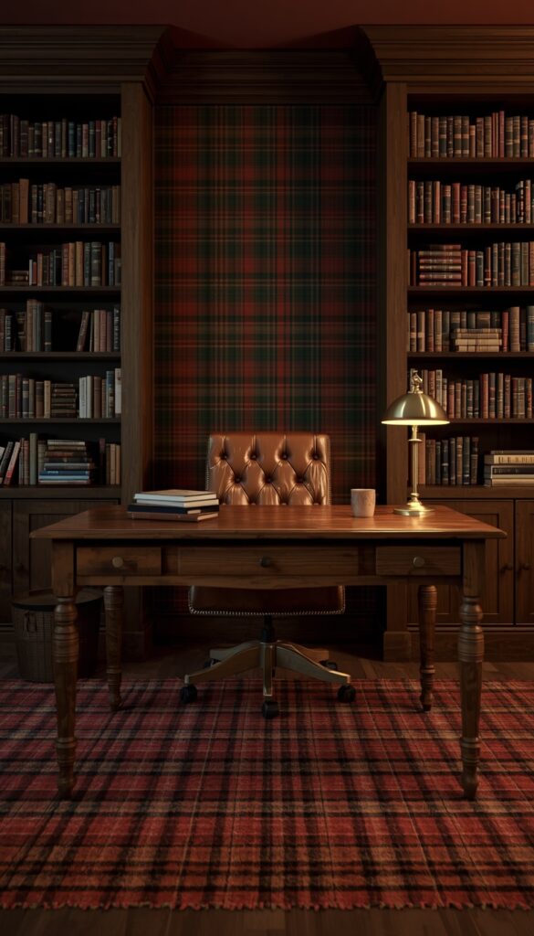
Plaid wallpaper might be the most underrated fall wallpaper choice in the design world right now. Not the thin lined, traditional wallpaper border plaid from the 1990s , this is rich, oversized tartan and buffalo check rendered in fall’s best colors: deep rust and cream, forest green and gold, burgundy and warm tan. These designs bring the warmth of a cozy flannel shirt and translate it into something architectural. A room with plaid wallpaper immediately feels like a weekend cabin, a fireside retreat, a place where you’d want to spend the entire autumn.
The rooms that benefit most from plaid wallpaper are the ones that already lean traditional or rustic , a study lined with bookshelves, a mudroom, a basement den, or a cozy master bedroom. In a home office with plaid wallpaper in deep burgundy and hunter green, a leather desk chair, and wood paneled built-ins, the space takes on a warm, scholarly atmosphere that makes work feel more enjoyable. The pattern’s regularity also makes it surprisingly easy to furnish around , because the design is geometric rather than organic, it plays well with both traditional and more contemporary furniture.
One common hesitation about plaid wallpaper is scale. In a small room, a large-scale plaid can feel overwhelming. The solution is to choose a smaller repeat or opt for a tone on tone plaid where the lines are subtle variations of the same base color , think a deep rust with slightly darker rust crosshatching. This reads as texture from a distance and pattern up close, giving the room warmth and depth without visual chaos. In larger rooms, go bold , a full wall of oversized buffalo check in rust and cream behind a leather sofa creates a statement that’s both cozy and visually strong.
5. Watercolor Autumn Leaves Wallpaper With a Soft, Artistic Touch
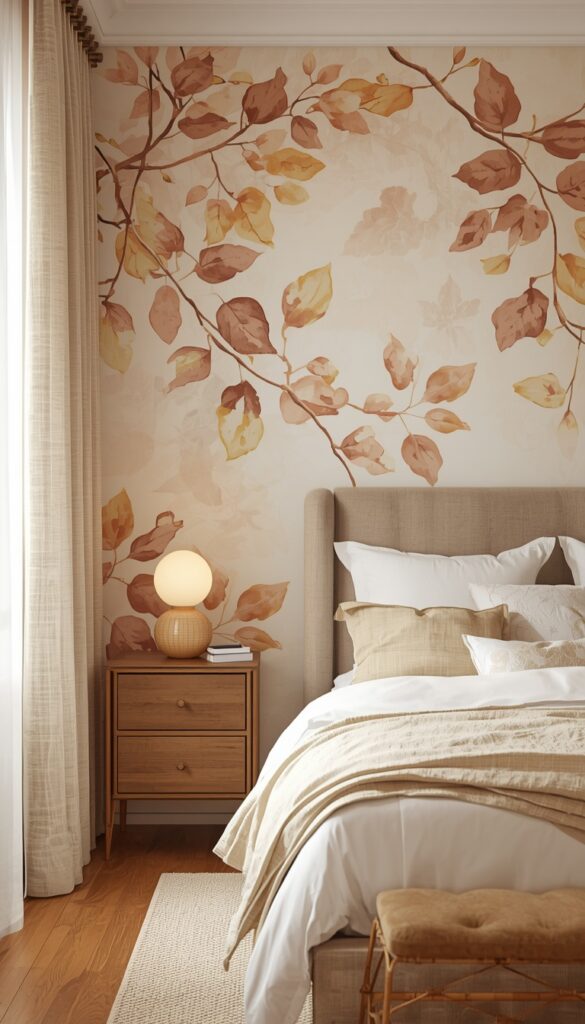
Watercolor autumn leaf wallpaper occupies a beautiful middle ground between bold pattern and gentle texture. The illustrations are loose and painterly , leaves rendered in wet on wet technique with bleeding edges, soft color gradients, and the natural imperfection of a real watercolor painting. The palette typically moves through soft gold, warm amber, blush, sage, and muted rust , colors that feel like fall filtered through gauze. This style works in rooms where you want seasonal warmth without drama, making it particularly well suited to nurseries, guest bedrooms, and feminine home offices.
The beauty of watercolor wallpaper is its softness , but that same quality means it needs the right finishing touches to feel complete rather than unfinished. Natural linen curtains in a warm off white, wooden furniture with a light honey finish, and soft wool textiles in complementary tones all help ground the space. If the wallpaper leans toward the cooler side of the fall palette , more dusty rose and sage than burnt orange , pair it with blush and cream accents. If it runs warmer, anchor it with deeper wood tones and terracotta or amber accessories.
Lighting makes a significant difference with watercolor wallpaper. Because the colors are inherently soft and blended, the paper can look washed out under bright overhead lighting. Position table lamps and floor lamps at lower levels to create pools of warm light that reveal the painting-like depth of the design. A bedside table lamp casting warm light across watercolor leaf wallpaper in the evening creates a genuinely beautiful effect , the colors deepen and the painting quality becomes more visible. This is a wallpaper that looks completely different at noon versus nine in the evening, and both versions are lovely.
6. Deep Burgundy Damask Wallpaper for Elegant Fall Elegance
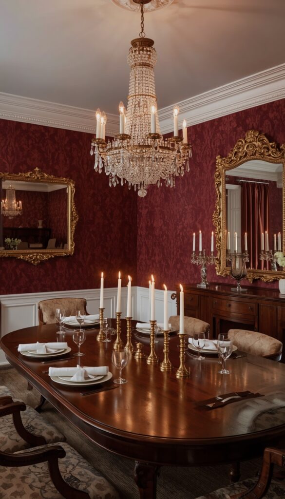
Burgundy damask wallpaper is a fall classic that never gets old , but the modern versions are far more refined than what most people picture. Today’s fall damask designs use the traditional repeat structure but render it in rich jewel tones: deep burgundy, wine, plum, and oxblood against slightly lighter or darker grounds that create a tone on tone effect. Some versions add metallic gold or bronze details in the pattern that catch the light in subtle, elegant ways. This isn’t your grandmother’s wallpaper , it’s a sophisticated, deeply luxurious choice for fall.
Damask wallpaper has been used in formal spaces for centuries for a reason , it communicates quality and intention. In a modern context, the best way to use it is with confident contrast. Don’t surround burgundy damask wallpaper with more dark, heavy elements or the room will feel oppressive. Instead, bring in light reflecting surfaces , a large mirror in a gilded frame, crisp white painted ceiling, glass or crystal light fixtures that scatter light across the patterned walls. White or cream upholstery in a formal dining chair against burgundy damask walls creates a stunning, high contrast combination that feels both classic and fresh.
A dining room is the ideal canvas for deep burgundy damask wallpaper. The formal quality of the pattern suits the purpose of the room, and the color makes candlelight look absolutely magical during fall and winter entertaining. Set a table with cream linen napkins, brass candlesticks, and simple white plates and the wallpaper does most of the atmospheric work for you. In a bedroom, burgundy damask on a single accent wall behind the headboard adds a sense of richness that feels like sleeping in a boutique hotel. Keep the rest of the room light and the effect is sophisticated without being overwhelming.
7. Vintage Harvest Botanical Wallpaper Inspired by Old Print Books
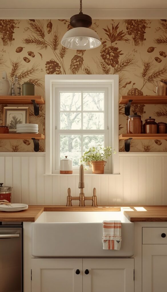
There’s a category of fall wallpaper that draws directly from the illustrated botanical prints of eighteenth and nineteenth century naturalist books , and it’s absolutely gorgeous. These designs feature detailed engravings of harvest plants: wheat stalks, hops, acorns, chestnuts, wild berries, and seed pods rendered in the precise, slightly formal style of old scientific illustration. The color palette tends toward muted ochre, sepia, warm cream, and faded rust , tones that feel aged and authentic. In a kitchen or breakfast room, this style of wallpaper creates an atmosphere that feels both historical and completely livable.
The vintage quality of these botanical prints is partly what makes them so enduring. Unlike trend driven designs that feel dated quickly, antique inspired harvest botanical wallpaper has an inherent timelessness. It doesn’t scream any particular decade , it feels like it could have been hanging in a well loved farmhouse for generations. This makes it a relatively safe long term investment for rooms you’re planning to keep wallpapered for several years. It pairs beautifully with open wooden shelving, vintage ceramic canisters, copper or iron kitchen hardware, and unfussy linen window treatments.
Kitchen installation is where vintage harvest botanical wallpaper really shines, but it requires thoughtful product selection. Kitchens generate steam and occasional splashes, so you need a wallpaper with a vinyl coating or a paper that’s been treated for moisture resistance. Many specialty wallpaper manufacturers now offer their botanical designs in a scrubbable, moisture resistant finish , always verify the technical spec before purchasing for kitchen or bathroom use. Applied above a simple shaker style wainscoting in painted white or cream, vintage harvest botanical wallpaper in the upper portion of a kitchen wall creates a charming, lived in look that’s completely authentic.
8. Pumpkin and Gourd Pattern Wallpaper Done With Surprising Sophistication
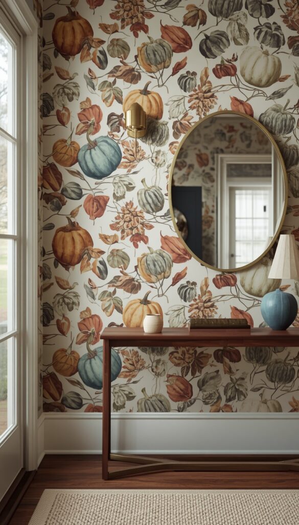
Pumpkin wallpaper gets a bad reputation because most people picture the cartoonish, orange and black Halloween versions. But there’s a category of pumpkin and gourd wallpaper that is genuinely beautiful , and it has nothing to do with holiday graphics. These designs feature realistically illustrated heirloom pumpkins and gourds in their full botanical variety: pale blue Jarrahdale, deep green kabocha, striped carnival squash, and creamy white lumina pumpkins arranged among autumn leaves and dried corn. The illustrations are painterly and detailed, and the palette is sophisticated rather than seasonal holiday bright.
The color palette in this type of pumpkin wallpaper is what elevates it. When the designer leans into the actual colors of heirloom and heritage pumpkin varieties , slate blue, dusty sage, deep terracotta, muted gold, warm ivory , the result is a pattern that reads as sophisticated botanical illustration first, fall motif second. This distinction matters for longevity. A wallpaper that reads primarily as art rather than decoration feels appropriate well beyond a single season or holiday. In an entryway or mudroom, this type of pumpkin botanical wallpaper creates a fall welcome that’s genuinely impressive rather than merely seasonal.
Styling around sophisticated pumpkin wallpaper is about respecting what’s already there. The illustration carries a lot of visual information, so keep furnishings simple and let the wallpaper do the heavy lifting. A bentwood console table in warm walnut, a simple oval mirror in a thin brass frame, and a single linen runner on the floor are all the entryway needs. Add a small handthrown ceramic bowl on the console for keys and the scene is complete. Real heirloom pumpkins and gourds displayed nearby in the same color family as the wallpaper illustration create a beautiful inside to outside connection that guests will absolutely notice.
9. Misty Forest Wallpaper With Atmospheric Fog and Bare Trees
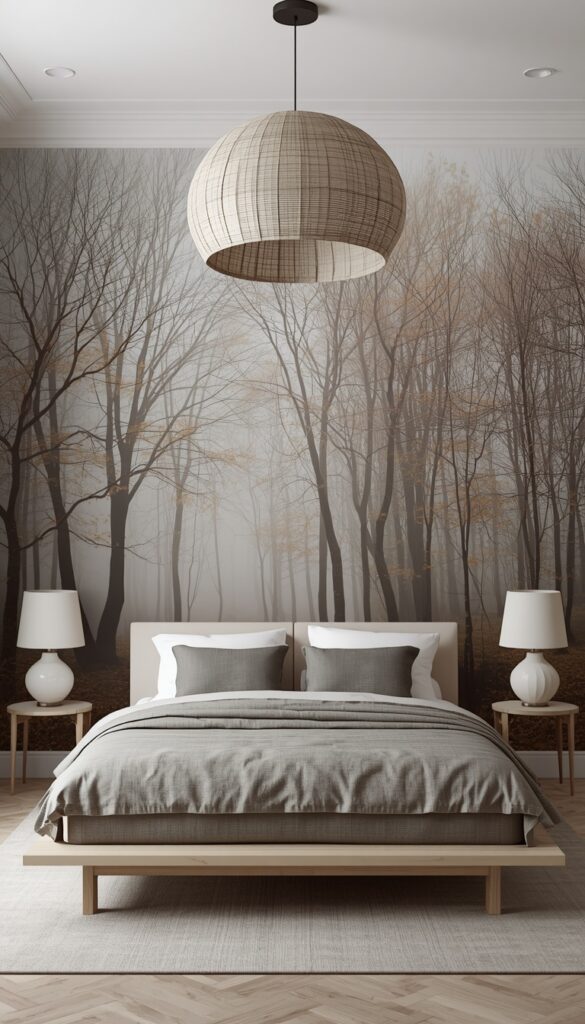
Misty forest wallpaper captures something deeply specific about fall , that particular morning quality when fog sits low between bare trees and everything feels quiet and slightly magical. The best designs in this category are photorealistic or painterly renderings of deciduous forests in late autumn: bare branches reaching upward, soft light filtering through fog, fallen leaves suggested at the forest floor, a color palette of soft gray, warm taupe, misty blue, and the faintest gold. The mood is introspective and beautiful , perfect for bedrooms and quiet home offices.
What makes misty forest wallpaper genuinely special is its tonal complexity. Unlike flat color botanical patterns, a well executed forest scene has foreground, middle ground, and background , layers of depth that make a flat wall feel like it recedes into the distance. This depth creating quality makes small rooms feel larger rather than smaller, which is counterintuitive but absolutely real. A small bedroom with misty forest wallpaper on the far wall feels like it extends beyond its physical boundaries. The eye is drawn into the scene rather than stopped at the wall surface.
The color palette of misty forest wallpaper coordinates naturally with a specific range of textiles and materials. Soft gray linen, warm greige wool, natural wood in lighter tones, and matte white or pale stone ceramics all work beautifully. Avoid bold accent colors , they break the misty, dreamlike mood of the wallpaper. If you want a touch of warmth, bring in aged brass or antique bronze rather than polished gold. A simple platform bed with linen bedding in warm gray and white, low wooden bedside tables, and a single large linen pendant light is genuinely all you need to complete this room.
10. Acorn and Oak Leaf Repeat Wallpaper for a Classic Fall Pattern
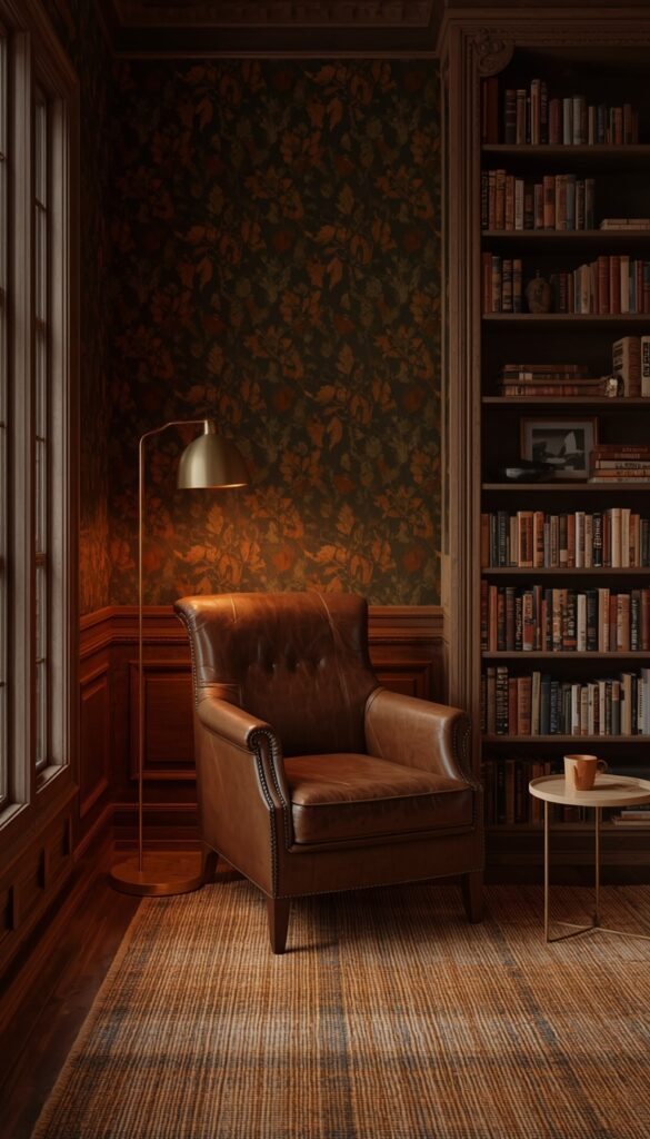
The acorn and oak leaf combination is arguably the most classic fall motif in wallpaper design , and when executed well, it’s timeless in a way that few seasonal patterns achieve. The best versions of this design use a dense, flowing repeat where oak leaves in their full range of fall colors , green transitioning to yellow, amber, russet, and deep brown , interweave with acorns at various stages. The pattern has a natural, organic rhythm that feels like looking up at an actual oak tree canopy. Executed in quality wallpaper, it has a richness that photographs can’t fully capture.
Scale and color are the two variables that most determine whether this pattern works in a given room. For rooms with standard eight foot ceilings, a medium scale repeat , where the full pattern repeat measures about eighteen to twenty four inches , tends to work best. Too small a repeat can look busy and wallpaper like in a dated sense. Too large a scale on a low ceiling can feel awkward. In rooms with ten foot or higher ceilings, go big , a large scale acorn and oak repeat on walls with that kind of height creates a genuinely majestic effect. Color matters too: a dark green ground with rust and gold leaves reads rich and formal, while a cream ground with the same leaf colors feels warmer and more casual.
A library or study is perhaps the most natural home for acorn and oak leaf wallpaper. Lined with bookshelves in dark wood, a deep leather armchair, a brass reading lamp, and a wool area rug in warm plaid or a simple solid, the space becomes a quintessential autumn retreat. The symbolism isn’t accidental , oak trees represent strength and endurance, and acorns represent potential and harvest. These are deeply appropriate ideas for a room devoted to reading and thinking. If you’ve been looking for a reason to finally wallpaper a home office, an acorn and oak design in deep, saturated fall colors is an excellent starting point.
11. Abstract Autumn Wallpaper for a Modern Fall Inspired Room
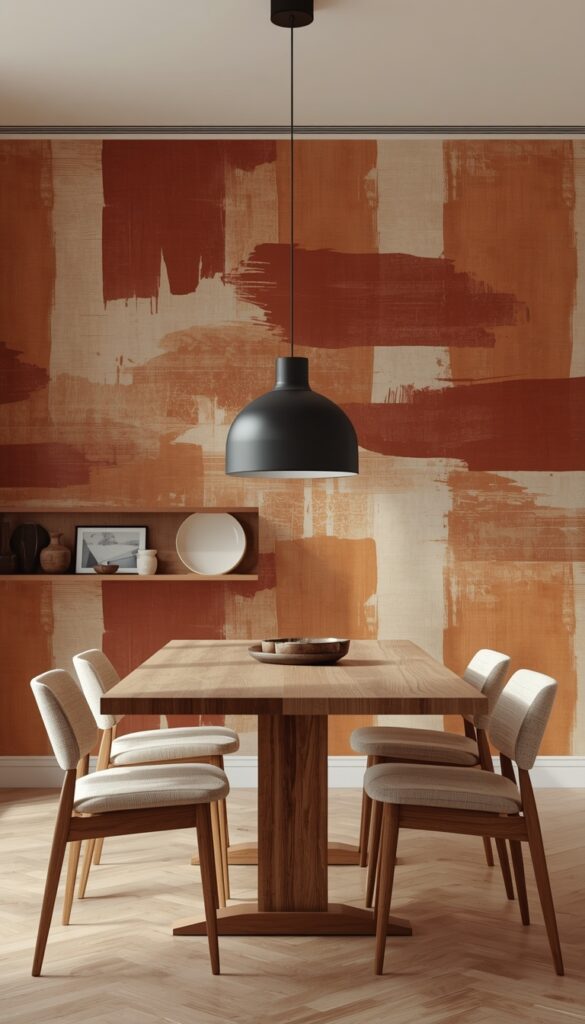
Not every fall wallpaper needs a recognizable leaf or forest scene. Abstract autumn wallpaper translates the season into color field, texture, and loose organic form rather than literal illustration. Think brushstroke style designs in burnt sienna, raw umber, deep amber, and warm terracotta , large gestural marks that suggest fall foliage the way an impressionist painting does, without spelling it out. This style belongs firmly in modern and contemporary interiors, where the fall palette is desired but literal motifs would feel inconsistent with the overall design direction.
The best abstract fall wallpapers feel like living artwork on the wall , they have the presence and energy of a large canvas painting but cover an entire surface. Because they’re not tied to a specific motif, they also tend to feel less overtly seasonal, which makes them a stronger long term investment if you’re committing to traditional wallpaper rather than peel and stick. A dining room with abstract warm toned wallpaper in burnt orange and ochre feels unmistakably autumnal in October but transitions beautifully into a rich, warm backdrop for the winter entertaining season without looking mismatched.
Styling an abstract fall wallpaper room is about letting the color carry the season while keeping forms simple. Furniture with clean lines and natural materials , a solid oak dining table, chairs with a simple profile in natural linen, a minimal pendant light in matte black or brushed brass , gives the abstract wallpaper room to breathe. Avoid patterned textiles in this type of room because two competing abstract elements will always fight for attention. Solid colored throw pillows, a simple wool rug in a complementary tone, and a few carefully chosen ceramic objects on open shelving are all you need to complete the look beautifully.
12. Candlelit Floral Wallpaper in Deep Fall Tones for a Romantic Mood
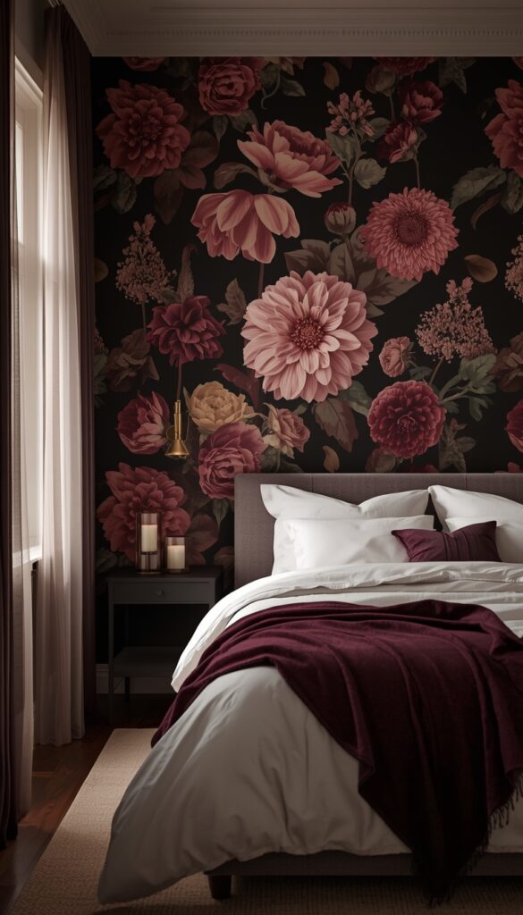
Deep fall floral wallpaper is categorically different from the bright spring floral designs that flood the market most of the year. This version features large scale blooms , dahlias, chrysanthemums, marigolds, and dried roses , rendered in a palette that belongs entirely to autumn: deep crimson, wine, dusty mauve, burnt orange, warm gold, and deep plum. The flowers often appear against dark grounds , midnight navy, deep forest green, or near black , which gives them a quality that’s genuinely reminiscent of Dutch Golden Age oil paintings. Romantic, rich, and deeply beautiful.
The flower types matter in this category. Dahlias are the quintessential fall flower and they appear in some of the most stunning wallpaper designs of this type , their geometric petal structure renders beautifully at large scale. Chrysanthemums add a slightly wilder energy. Marigolds bring in the warm gold that anchors the palette. When a designer includes dried or semi dried flowers with papery petals and muted tones alongside the full blooms, the overall composition gains a melancholic beauty that feels very specifically autumnal. Look for designs where the botanicals have shadows and depth, not flat graphic versions.
A primary bedroom is the ideal room for deep fall floral wallpaper. The romance of the design suits the intimacy of the space, and the dark tones create an enveloping quality that makes a bedroom feel like a genuine sanctuary. Pair dark floral wallpaper with white or ivory linen bedding to give the eye a resting place. A simple white ceiling keeps the room from feeling oppressive. Aged brass fixtures, a velvet throw in deep plum or wine, and a few simple taper candles in brass holders complete the mood beautifully. On a crisp October evening with the window slightly open and candles lit, this bedroom will feel like the most atmospheric room you’ve ever slept in.
Wrapping Up: The Right Fall Wallpaper Changes Everything
Fall wallpaper isn’t just decoration , it’s a genuine mood shift for your home. The twelve designs in this article prove that the category goes far beyond simple leaf prints, offering everything from moody dark botanicals and misty forest scenes to sophisticated damask and abstract brushstroke designs. The best choice depends on your room, your existing palette, and how deeply you want to commit to the season. What all twelve designs share is the ability to transform a flat, neutral space into something that feels intentionally autumnal and genuinely beautiful. Pick the one that makes you feel something real, grab a few samples, and let the wallpaper do what it does best , make your home feel like the coziest place on earth.
FAQs
Q: What is the most popular fall wallpaper design right now? A: Dark botanical wallpaper in deep charcoal or forest green backgrounds with detailed leaf and foliage illustrations is one of the most popular fall wallpaper styles currently. Misty forest scenes and deep floral designs in burgundy and plum are also trending strongly for autumn decorating, particularly for bedrooms and dining rooms.
Q: Can I use fall wallpaper year round or only seasonally? A: Many fall wallpaper designs work beautifully year round. Abstract autumn tone designs, dark botanicals, vintage harvest botanical prints, and deep floral patterns in jewel tones all feel appropriate beyond September through November. The trick is choosing a design rooted in color and artistic quality rather than overtly holiday specific motifs.
Q: How do I choose between peel and stick and traditional wallpaper for fall? A: Peel and stick works well for renters, temporary seasonal changes, or anyone who wants flexibility. Traditional wallpaper gives a more polished, seamless finish and tends to last longer without edge lifting. For a full room commitment you plan to keep for several years, traditional paste wallpaper in a quality finish is the stronger long term choice.
Q: What rooms work best with dark fall wallpaper? A: Dining rooms, primary bedrooms, and home offices handle dark fall wallpaper particularly well because they’re used during lower light conditions where warm artificial lighting makes dark wallpaper look richer. Rooms with good natural light and warm toned fixtures are ideal. Small bathrooms and powder rooms also handle dark wallpaper beautifully because of their contained size.
Q: How many walls should I use for a fall look? A: One accent wall delivers a strong impact with lower commitment and cost , behind the bed, behind a sofa, or on the dining room’s focal wall. Full room wallpaper creates a more enveloping, immersive effect that tends to work best with lighter or medium toned designs. For dark or heavily patterned fall wallpaper, starting with a single statement wall is the wiser approach.
Q: What colors pair well with fall wallpaper? A: Warm neutrals like cream, oatmeal, warm white, and caramel work with almost every fall wallpaper palette. For darker designs, white ceilings and light upholstery provide necessary contrast. Brass, antique gold, and dark iron fixtures complement fall wallpaper’s earthy tones beautifully. Avoid cool grays and stark whites , they fight against the warm, enveloping mood fall wallpaper is designed to create.
Q: Is fall wallpaper a good idea for a rental apartment? A: Absolutely, as long as you choose high quality peel and stick wallpaper from a reputable brand. Products have improved significantly , current peel and stick options from brands like Tempaper, Chasing Paper, and Walls Need Love offer realistic textures and clean removal. Always test a small section first and follow the manufacturer’s application instructions carefully for the cleanest result.
Q: How much wallpaper do I need for an accent wall? A: Measure the wall’s width and height in feet, multiply them together for square footage, then add fifteen percent for pattern matching and waste. Most standard wallpaper rolls cover approximately twenty seven to thirty square feet. A typical ten by eight foot accent wall needs roughly three to four single rolls depending on the pattern repeat. Always order one extra roll in the same batch number to ensure a perfect match.