
Color is one of the most powerful tools in your home, and the living room is the best place to use it boldly. Yet so many people play it safe — beige sofa, white walls, grey everything — and then wonder why their space feels flat and forgettable. The truth is that color doesn’t make a room chaotic. Bad color does. When you work with the right combinations, the right proportions, and the right textures, a colorful living room feels more alive, more personal, and more genuinely welcoming than any neutral space ever could. Color is how a room gets a personality.
What holds most people back is not knowing where to start. Do you paint the walls? Buy a bold sofa? Add colorful art? The answer is different for every room and every person — and that’s exactly what this article addresses. These 14 ideas cover a real range: some are bold and all in, some are gentle and layered, and some are clever tricks that deliver maximum color impact with minimum commitment. Whether you’re starting from scratch or trying to inject life into a room that already exists, there’s something here that will click for you. Let’s make your living room the most interesting room in the house.
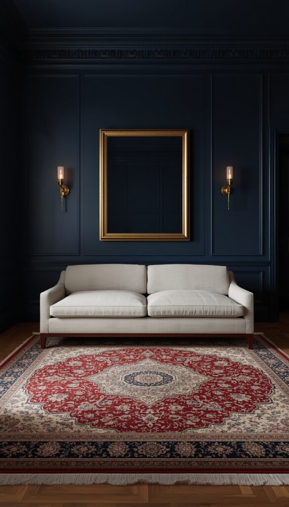
1. A Jewel Toned Sofa as the Room’s Color Anchor
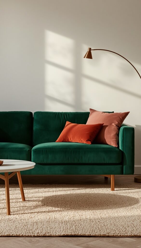
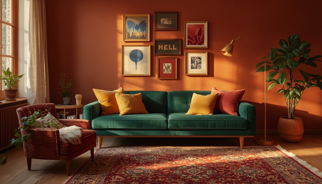
The sofa is the largest piece of furniture in most living rooms, and choosing it in a deep jewel tone is one of the most transformative decisions you can make. Sapphire blue, emerald green, rich amethyst, and deep teal are all colors that look extraordinary in a living room setting. They’re saturated enough to feel bold but dark enough to remain sophisticated — they don’t shout, they command. A jewel toned sofa works as the color anchor for the entire room, meaning every other decision you make — rug, curtains, wall color, cushions — flows outward from it.
The most common mistake people make with a bold sofa is trying to match it too precisely. Don’t buy a sapphire sofa and then fill the room with sapphire accents — it turns into a monochrome exercise that lacks depth. Instead, work with complementary and analogous tones. A sapphire sofa looks stunning with rust orange cushions, brass accents, and a cream wool rug. An emerald sofa comes alive with terracotta, warm wood, and a few dusty pink accents. The sofa sets the key, and everything else harmonizes around it without being identical to it.
Fabric choice matters enormously with jewel toned sofas. Velvet is the classic choice because its natural sheen enhances the depth and richness of saturated colors — an emerald velvet sofa looks more green, a sapphire velvet looks more luminous. Linen and cotton work well too, though they read as slightly more casual. Whatever fabric you choose, select a tight, durable weave for a sofa that will see daily use. Performance velvet, in particular, has become excellent quality in recent years — it handles spills and wear while maintaining that beautiful color saturation that makes jewel tones so compelling.
2. Color Blocking Walls for a Graphic, Contemporary Statement
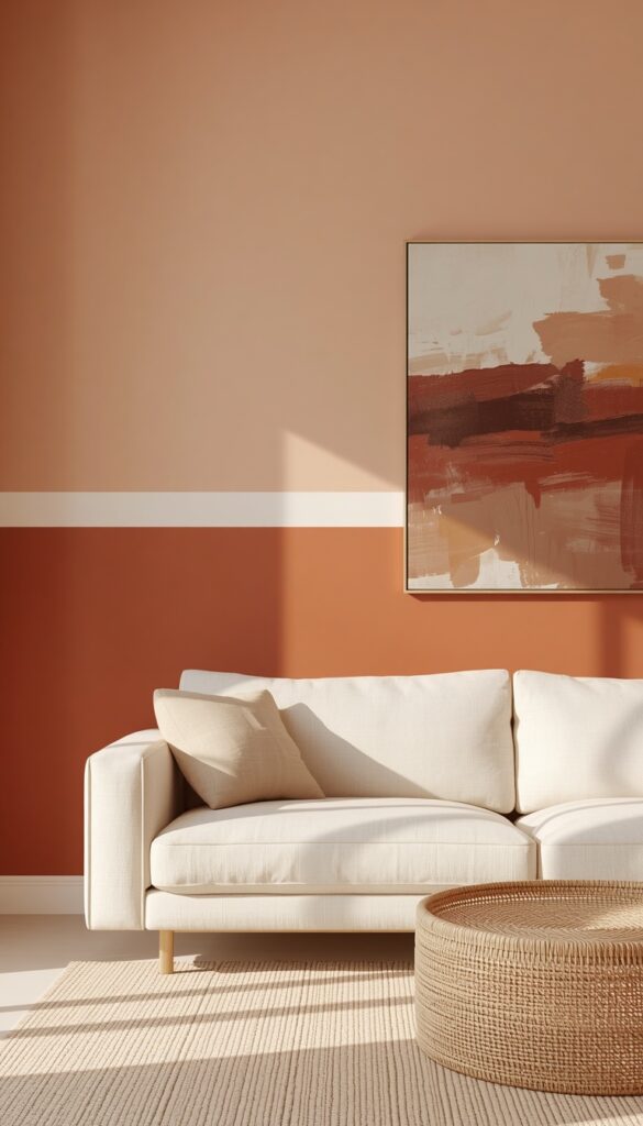
Color blocking on walls — painting two or more distinct sections of a wall in contrasting or complementary colors — is one of the freshest approaches to colorful living room design right now. Unlike a single accent wall, color blocking introduces multiple hues into the space simultaneously and creates a graphic, almost architectural quality. It’s the kind of detail that makes a room look considered and designed rather than casually decorated. Done well, it looks like something out of a design forward interior studio. Done badly, it looks like a mistake — so proportion and color selection are everything.
The most reliable approach is a horizontal divide — painting the lower third or lower half of the wall in a deeper, richer tone and leaving the upper portion in a lighter complementary shade. Think warm terracotta on the lower half with a dusty blush above, separated by a clean painted line at chair rail height. Or a bold chartreuse lower section with a warm cream upper half. The darker shade on the bottom grounds the room visually, the way wainscoting does in traditional interiors. Use a laser level for the dividing line — a slightly uneven edge is immediately noticeable and undermines the whole effect.
You can also block color in more creative configurations — a large rectangle of color centered on a wall to frame a sofa, or alternating color panels that give the wall a gallery-like quality. The key in any configuration is choosing colors that share an undertone. Warm colors should block with warm colors, cool with cool, unless you’re deliberately creating a high contrast graphic effect like cobalt and warm orange. Test large painted samples — at least 12 by 12 inches — on the actual wall before committing. Colors shift dramatically between a paint chip, a small swatch, and a full wall.
3. A Maximalist Gallery Wall in Bold, Varied Frames
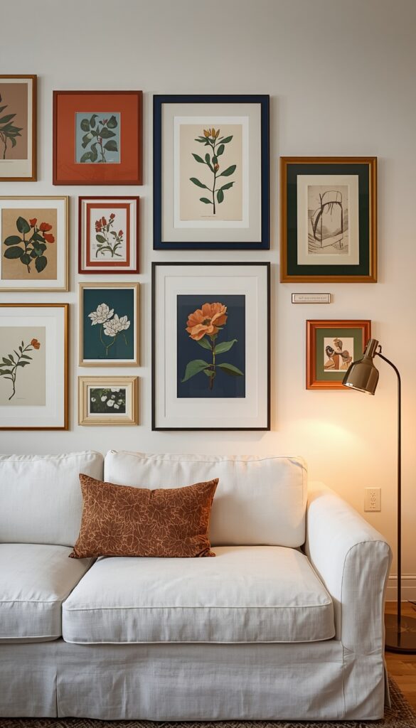
A gallery wall in a colorful living room is most powerful when the frames themselves contribute to the color story rather than staying neutral. Forget the standard black, white, or natural wood frame — lean into colored frames in terracotta, cobalt, forest green, deep mustard, or even a mix of all of them. Colored frames turn a collection of art into a genuine design installation. The frames become part of the composition, adding color and energy to the wall even before you look at what’s inside them. This approach works particularly well on white or pale walls where the frames really pop.
The art itself doesn’t need to be expensive or even original. Botanical prints, abstract poster art, colorful photography, vintage illustrations, and even painted fabric scraps in stretched frames all look beautiful together when they share a cohesive color palette. Limit the palette to three to five colors across the entire gallery wall — if every frame and every piece of art is a different color family, the wall looks frantic rather than collected. When the colors reference each other even loosely, the whole gallery reads as intentional and curated rather than random.
Installation is where gallery walls succeed or fail. Lay the full arrangement on the floor first and take a photo of it before you put a single nail in the wall. Paper template method — tracing each frame on kraft paper, cutting it out, and taping the templates to the wall — saves significant time and wall damage. Start hanging from the center piece and work outward. Keep spacing consistent — two to three inches between pieces creates a tight, collected look; four to six inches gives each piece more breathing room and reads as more gallery-like. Both work, but choose one and stick to it.
4. Colorful Curtains That Treat the Window Like a Feature
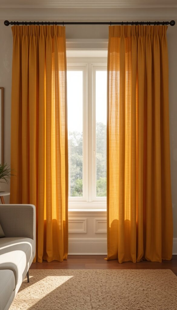
Most people treat curtains as an afterthought — something functional that also happens to fill the window. Flipping that mindset entirely changes what a living room can look like. Bold, colorful curtains — floor to ceiling panels in a rich hue or a vibrant pattern — treat the window as a design feature and introduce significant color to the room in a way that’s surprisingly easy to change if your tastes evolve. Curtains cover a large vertical surface area. The color impact they deliver is far greater than most people expect until they actually hang them.
The single most important rule with colorful curtains is to hang them high and wide. Mount the rod as close to the ceiling as possible — at least six inches above the window frame, ideally at ceiling height. Extend the rod twelve to eighteen inches beyond the window frame on each side so the curtains stack off the glass when open, making the window appear much larger than it actually is. This rule applies to all curtains but matters especially with colorful ones because you want the fabric to read as a full, generous sweep of color rather than a narrow strip of fabric flanking a small window.
For pattern, large scale prints work better in living rooms than small scale ones because the repeat reads from a distance. A large botanical print, an oversized geometric, or a wide stripe curtain in two bold colors all make a strong visual impact. Solid colorful curtains are just as powerful and significantly easier to coordinate. Linen or cotton in a rich saffron yellow, terracotta, dusty blue, or deep sage makes a living room feel immediately more alive and collected. Line your curtains for better drape and longevity — unlined curtains look thin and cheap in most light conditions.
5. A Colorful Rug as the Room’s Starting Point
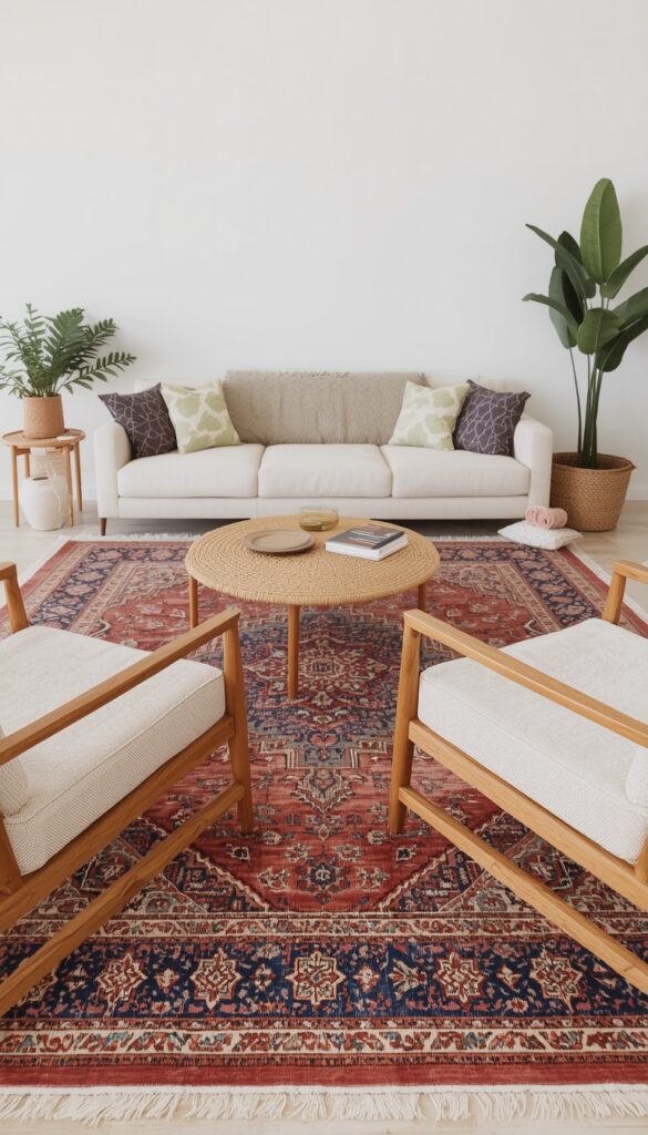
Starting your living room design with a colorful rug rather than building up to it is one of the most practical approaches any designer will tell you. A rug anchors the seating arrangement, defines the space within an open plan layout, and — when it carries multiple colors — gives you a ready made palette to pull from for every other decision in the room. Every cushion color, every paint shade, every accent piece can reference back to a color already present in the rug. It removes the guesswork and makes the whole room feel cohesive without you having to think too hard about why.
Persian and Moroccan style rugs are the classic choice here because their traditional patterns typically carry four to seven distinct colors in a harmonious composition that’s been refined over centuries of use. A vintage or vintage inspired Persian rug with dusty rose, terracotta, navy, and cream gives you an instant palette to work with. Modern abstract rugs in bold color blocks or geometric patterns work equally well and tend to suit more contemporary spaces. The key is choosing a rug with enough color variation to give you flexibility, rather than a two tone rug that locks you into one narrow palette combination.
Scale matters more than most people realize when choosing a colorful rug. Too small and it looks like a mat; too large and it crowds the room. The standard rule — all front legs of your seating on the rug — works for most living rooms. In larger spaces, all furniture legs on the rug creates a more expansive, anchored look. When in doubt, go larger rather than smaller. A larger rug makes the room feel bigger, not smaller, because it increases the sense of defined, intentional floor space. And with a colorful rug, more surface area means more color impact throughout the space.
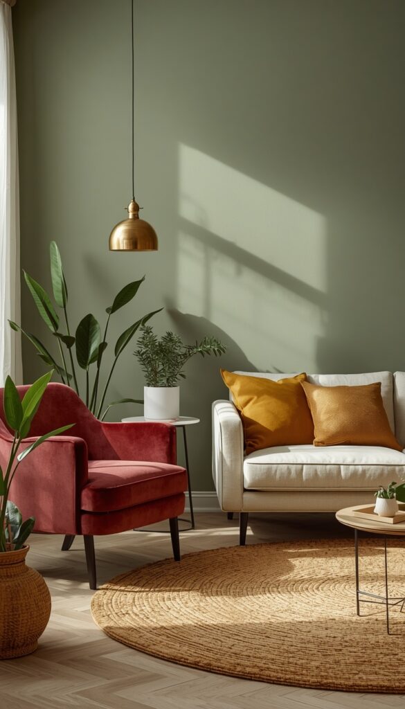
6. Terracotta Walls with Layered Warm Accents
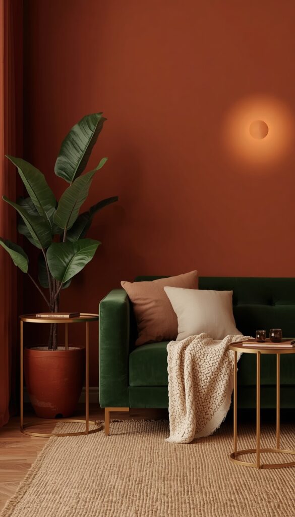
Terracotta is having a genuine design moment, and it deserves every bit of attention it’s getting. It’s a color that manages to feel simultaneously earthy and vibrant — warm without being orange, saturated without being aggressive. Terracotta walls in a living room create a Mediterranean, sun warmed atmosphere that feels deeply welcoming. Unlike stark, trendy colors that date quickly, terracotta has centuries of use behind it in architecture and interiors. It’s a color with roots, which is probably why it feels so inherently livable.
The beauty of terracotta walls is how generously they accept layered accents. Warm rust, burnt sienna, and paprika tones in cushions and throws sit right within the same family and add depth without jarring contrast. Creamy white and natural linen lighten the palette and keep it from feeling too heavy. Brass and copper metal accents catch the warmth of the terracotta and amplify it. Deep forest green is the complementary surprise — a forest green velvet sofa or a collection of plants against terracotta walls creates one of the most naturally beautiful color combinations in interior design.
Terracotta comes in a wide range of intensities — from pale clay to deep burnt orange and choosing the right shade depends on your room’s light quality. North facing rooms with cooler light tend to shift terracotta slightly muddy or brown, so go lighter and warmer in those spaces. South facing rooms with abundant warm light can handle deeper, more saturated terracotta beautifully. Always test with large painted samples across different times of day before committing to the full room. Morning and evening light in particular can transform terracotta from a warm glow into something more rusty or more peach than you intended.
7. Cobalt Blue Accents for a High Impact Punch of Color
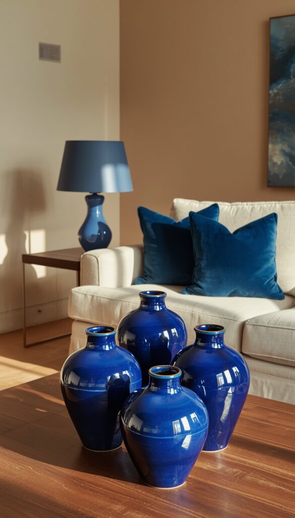
Cobalt blue is one of those accent colors that does disproportionate work relative to how much of it you actually use. Even a small amount of cobalt in a room — a pair of throw pillows, a ceramic vase, a piece of framed art — instantly lifts the entire space. It’s an electrifying color that reads as confident and clean rather than playful or childish, which makes it incredibly versatile across different living room styles. Cobalt works in a traditional room, a coastal room, a maximalist room, and a sleek contemporary room. It just needs different companions in each setting.
The most powerful way to use cobalt in a living room is in ceramic and glass objects. A cobalt glazed ceramic table lamp, a cluster of cobalt blue bottles on a shelf, or a large cobalt vase on the coffee table all carry an intensity of color that fabric simply cannot match. Glazed ceramics have a luminosity to them — the light bouncing off the glaze amplifies the cobalt in a way that makes even a small piece visually powerful. Collect three or four cobalt pieces in varying sizes and shapes and group them together; isolated pieces lose impact, but a cluster feels collected and intentional.
Cobalt pairs extraordinarily well with warm brass, natural terracotta, and warm white. It also works beautifully with coral or saffron yellow in a more vibrant, maximalist palette. Avoid pairing cobalt with cool greys or cool whites unless you want a very graphic, almost clinical result — the coolness of grey and the vibrancy of cobalt don’t warm each other up, they just create contrast. For a truly alive colorful living room, keep cobalt surrounded by warmth — warm wood tones, warm metals, and earthy neutrals — and it will sing rather than simply stand out.
8. Sage Green Walls for a Soft but Genuinely Colorful Room
Sage green occupies a beautiful middle ground in living room design — it’s clearly a color, not a neutral, but it has enough grey and white in it to work as a restful background. That balance is exactly why it’s so popular and so effective. Sage green walls make a living room feel like you’ve brought the garden inside — there’s an organic, botanical quality to the color that automatically makes a space feel calm and alive at the same time. It’s a color that photographs beautifully, which doesn’t hurt its popularity, but it also genuinely lives well day to day.
What makes sage green particularly exciting as a living room color is how many palettes it opens up. Pair it with deep burgundy or dusty rose for a warm, romantic feel. Combine it with warm cream, natural linen, and wood tones for a relaxed organic look. Add mustard yellow and terracotta for an earthy, maximalist palette. Or lean into cool tones — dusty blue, lavender, and soft grey — for a more contemporary muted palette. Sage green genuinely goes in multiple design directions, which is rare for a saturated wall color and makes it a smart investment for people who like to refresh their accessories regularly.
Benjamin Moore’s Saybrook Sage, Farrow & Ball’s Mizzle, and Sherwin Williams’ Retreat are all excellent sage green options worth looking at, though they differ notably in their undertones. Mizzle reads slightly more grey and sophisticated; Saybrook Sage is warmer and more yellow leaning; Retreat sits in the middle and works well in most light conditions. Pull large samples and live with them for a full week before deciding. Sage green in particular shifts considerably between morning light, afternoon sun, and evening artificial light — and that shift can take it from beautiful to dingy if you’ve chosen the wrong shade for your specific room.
9. A Statement Colorful Ceiling to Flip the Room Upside Down
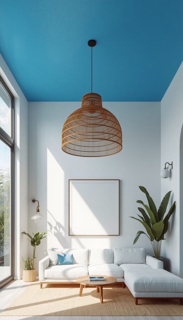
The ceiling is the most neglected surface in almost every living room, and painting it a bold, unexpected color is one of the most transformative moves in interior design. A colorful ceiling — deep sky blue, warm terracotta, sunshine yellow, forest green, or even a deep inky navy — changes the entire emotional experience of a room in a way that wall color alone never achieves. The ceiling becomes what designers call the “fifth wall,” and when you treat it as a design opportunity rather than a functional surface, the whole room shifts. Guests always notice it. It’s a statement that’s impossible to overlook.
The psychology of a colorful ceiling is fascinating. A warm color on the ceiling — terracotta, mustard, warm coral — makes the room feel lower, cozier, and more enveloping. Rooms with high ceilings that feel cold or cavernous benefit enormously from a warm ceiling color that pulls them down to human scale. A cool color on the ceiling — sky blue, sage green, soft lavender — creates an airy, expansive feeling that works beautifully in rooms with standard ceiling heights. Deep, dark ceiling colors create the jewel box effect regardless of height, making the room feel richly enclosed and dramatic.
Keep the wall color neutral or significantly lighter than the ceiling when you commit to this approach — white, off white, or a very soft tinted white. This ensures the ceiling reads as the deliberate design choice and not as a miscalculation. Carry the ceiling color a few inches down the wall about three to six inches past the crown molding or ceiling line — to avoid the ceiling looking like a floating cap disconnected from the room. This technique, sometimes called the “color drip,” softens the transition and gives the whole color treatment a more architectural, finished quality.
10. Warm Mustard Yellow Accents for a Joyful, Energetic Room
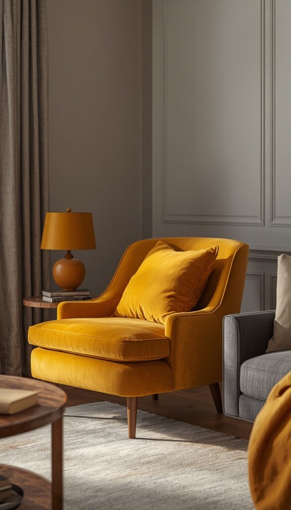
Mustard yellow is one of the most underused accent colors in living rooms, and it’s a genuine shame because it delivers such consistent joy. Unlike primary yellow — which can read as juvenile or overwhelming in quantity — mustard yellow has a warmth and earthiness that makes it feel sophisticated and inviting. It’s the kind of color that makes a room feel like afternoon light is always hitting it, even on grey days. A mustard yellow living room accent doesn’t make you think of a crayon; it makes you think of saffron, of turmeric, of sunflower fields at harvest time.
Use mustard yellow most boldly in large textiles — a mustard yellow throw blanket draped over a sofa, a pair of mustard velvet cushions, or a large mustard accent chair in the reading corner. In textile form, mustard yellow absorbs light beautifully and develops a rich, complex quality that looks very expensive for the price point. A single mustard velvet accent chair can completely change the energy of a neutral living room. Add mustard yellow in smaller doses through ceramic pieces, a table lamp shade, or a vase of dried yellow flowers to layer the color throughout the space.
Mustard yellow pairs beautifully with navy blue, forest green, terracotta, and warm grey. The mustard and navy combination in particular is deeply satisfying — two colors that seem like opposites but share a vintage, heritage quality that feels timeless. Mustard and terracotta create a warm, earthy palette that feels North African or Southwestern depending on the other textures you introduce. Mustard with forest green and warm wood creates an incredibly rich, organic palette. Avoid pairing mustard with cool blues, cool greys, or bright whites — the contrast is jarring and strips the color of its warmth.
11. Layered Colorful Cushions and Throws for an Instant Transformation
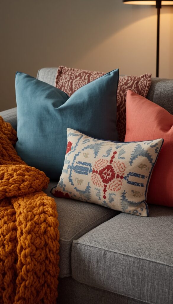
Cushions and throws are genuinely the fastest, most affordable way to introduce serious color into a living room without touching a wall or buying new furniture. Most people underestimate how much color work these pieces can do when they’re chosen and layered with intention. A neutral grey sofa with five perfectly chosen colorful cushions — in varying textures, sizes, and complementary hues — can look as deliberate and designed as a room that took months to plan. The key word is layered. One bold cushion looks lonely. A composed grouping of five or seven looks styled.
The formula that consistently works is mixing patterns and solids within a defined color palette. Choose three to four colors that work well together — say, dusty blue, warm coral, cream, and a touch of forest green. Then build your cushion grouping with some solid pieces in those colors and one or two patterned pieces that carry multiple colors from the palette. A geometric in dusty blue and coral, a floral with green and cream, and solid cushions in each individual color creates a cohesive but layered arrangement that looks genuinely collected. Vary the sizes — two large squares, two standard squares, one lumbar — for a composed arrangement.
Throws add a different dimension than cushions — they bring softness, texture, and casual warmth to the composition. A chunky knit throw in a bold mustard or a woven cotton throw in a vibrant stripe casually draped over one arm of the sofa adds color without symmetry, which is exactly what a room needs to feel lived in rather than showroom staged. Wash your throws regularly and re-drape them casually each time — a perfectly folded throw looks staged; a slightly rumpled, casually arranged throw looks like someone actually lives there and loves the space.
12. Navy Blue Living Room Walls for a Rich, Classic Boldness
Navy blue walls in a living room are one of the most reliably beautiful choices in all of interior design. It’s a color with genuine staying power — not a trend, not a moment, but a classic that has anchored living rooms in European design for centuries and continues to look utterly contemporary when styled with the right pieces. Navy blue creates a room that feels rich, grounded, and serious in the best sense. It’s the color of deep water, of a clear night sky, of beautifully aged denim — and it brings all of those associations with it into the room.
The biggest misconception about navy walls is that they make a room dark. They do absorb light, yes but a well lit navy room feels intimate and rich rather than dark. The key is layering multiple light sources: a floor lamp with a warm shade, table lamps on either side of the sofa, perhaps wall sconces if your layout allows. Warm toned bulbs — 2700K to 3000K — are essential with navy walls. Cool white bulbs turn navy walls cold and somewhat institutional. The right warm light makes the navy feel like you’re in a beautifully appointed study on a winter evening, and that’s exactly the feeling it delivers at its best.
Navy pairs beautifully with almost every warm metal — brass, bronze, aged gold — which look positively luminous against the dark background. White trim and crown molding against navy walls is a classic combination that never fails. Natural wood floors or furniture add warmth and prevent the room from reading too formal or serious. Add generous amounts of cream, ivory, and warm white in soft furnishings to balance the navy’s visual weight. A large, colorful rug in a traditional pattern with red, cream, and gold is the traditional companion to navy walls — and it became a classic because it genuinely works every single time.
13. Colorful Bookshelf Styling for a Living Room Focal Point
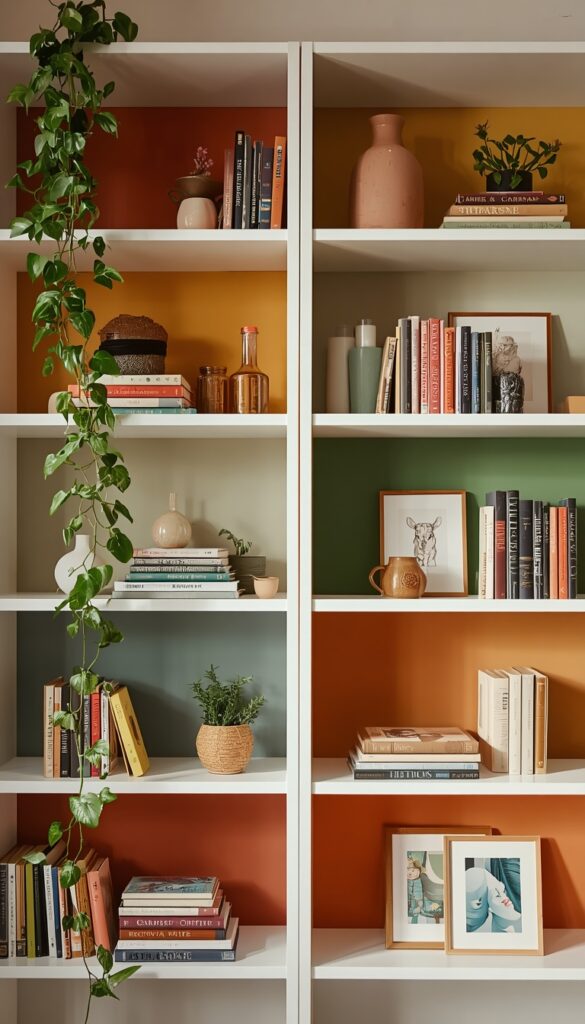
A bookshelf styled with real intention — mixing books, colorful objects, plants, and art — becomes one of the most compelling focal points in a colorful living room. Most people either organize their shelves by book spine color in a rainbow sequence, which looks striking in photos but makes books impossible to find, or they leave shelves entirely functional and undecorated, which wastes enormous visual potential. The sweet spot is somewhere in between: grouping books loosely by color family, interspersing decorative objects at regular intervals, and treating the whole shelf as a composed installation rather than just storage.
Color blocked shelving — painting the interior back panel of each shelf section in a different bold color — is a technique that transforms even a basic IKEA Kallax or Billy bookcase into something genuinely design forward. Choose three or four coordinating colors — warm terracotta, dusty sage, deep mustard, and cream — and paint alternating shelf backs. The colored backs make whatever sits in front of them pop and give the whole unit a rich, layered depth. This approach works particularly well with white or natural wood bookshelves where the painted backs create maximum contrast with the shelf frame.
Style each shelf section with a mix of books (both spine out and stacked horizontally as platforms), one or two decorative objects in complementary colors — a ceramic vase, a sculptural piece, a small framed print — and something living like a trailing plant or a small succulent. Vary the heights within each section by stacking books horizontally under taller objects. Leave deliberate negative space between groupings — empty space is not wasted space on a shelf, it’s visual breathing room that makes the styled sections stand out more clearly. A shelf that’s too full loses its impact; edit ruthlessly.
14. A Colorful Accent Chair as a Room’s Most Surprising Element
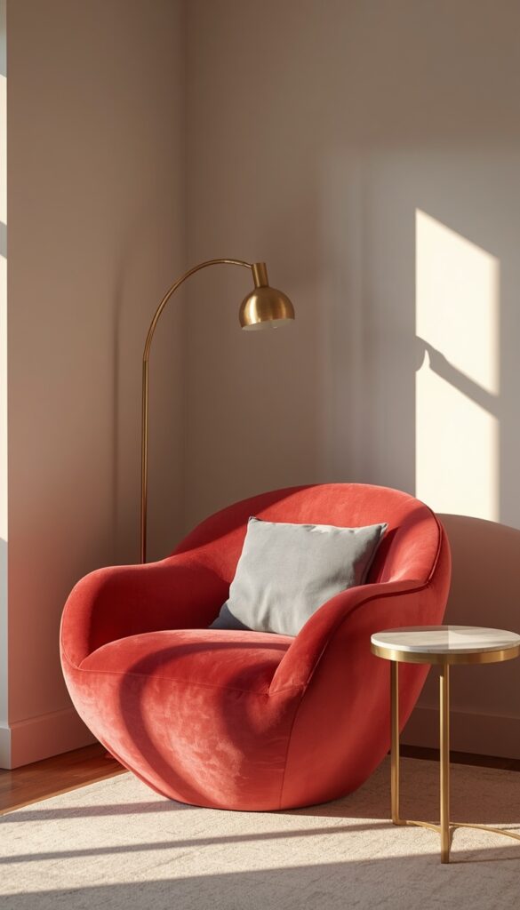
The accent chair is the living room piece that gets to break the rules. It doesn’t have to match the sofa. It doesn’t have to coordinate with the rug. Its job is to introduce a color or a material that the rest of the room doesn’t have — to be the unexpected note that gives the entire composition its energy. An accent chair in a genuinely bold color — deep coral, electric teal, warm tangerine, rich violet — does more for a living room’s personality than almost any other single piece of furniture. It announces that someone with taste and confidence lives in this space.
The most impactful accent chair choices pair an interesting silhouette with a bold color. A curved, organic shaped chair in deep coral velvet. A structured, angular armchair in saturated teal linen. A low slung, wide bucket chair in a warm tangerine boucle. The silhouette gives the chair a sculptural quality; the color gives it presence. Avoid overly predictable shapes — a standard rectangular armchair in a bold color is good, but a distinctive, personality driven shape in a bold color is memorable. Look at designs from West Elm, Article, or Anthropologie Home for chairs that combine interesting shapes with rich color options.
Placement of the accent chair matters as much as its color. Position it at an angle — not parallel to the sofa — so it reads as a deliberate design choice rather than overflow seating. A forty five degree angle toward the coffee table creates a natural conversational grouping and gives the chair a more dynamic presence in the room. Add a small side table beside it, a floor lamp arcing overhead, and a single complementary cushion, and you’ve created a vignette — a mini composition within the larger room that rewards the eye and makes the whole space feel thoughtfully designed from every angle.
Conclusion
A colorful living room isn’t something you achieve all at once — it’s something you build layer by layer, starting with the pieces and decisions that excite you most. Whether that’s a jewel toned sofa, terracotta walls, a curated gallery of colorful frames, or simply the right rug to anchor everything else, every idea in this article is a real, workable starting point. The rooms that feel most alive and most personal are always the ones where someone made a genuine color commitment rather than hedging every decision toward safe neutrals. Your living room should feel like you. Pick the idea that speaks to you first, make that move with confidence, and let the rest of the colorful living room follow naturally.
Frequently Asked Questions
Q: How do I choose a color palette for a colorful living room? A: Start with one piece you already love — a rug, a piece of art, even a cushion — and pull two or three colors from it to build your palette outward. Limiting yourself to three to four main colors keeps the room feeling cohesive rather than chaotic. Always include at least one neutral to give the eye a place to rest.
Q: Can a colorful living room still feel calm and relaxing? A: Absolutely. Muted, earthy versions of color — sage green, warm terracotta, dusty rose, soft cobalt — read as genuinely colorful while remaining restful rather than energizing. The finish and texture of your materials matters too. Matte finishes and natural fabrics soften color significantly and contribute to a calmer, more grounded atmosphere.
Q: What is the easiest way to add color to a living room without painting? A: Textiles are the fastest route — colorful cushions, throws, and curtains introduce significant color with zero wall commitment. A bold colorful rug is the single most impactful non-paint move you can make because it anchors the whole room and gives you a palette to build from. Colorful ceramic objects and lamps add smaller but still meaningful pops of color.
Q: Does a colorful living room make a small room feel smaller? A: Not necessarily. Dark, saturated wall colors do absorb light and can make small rooms feel more enclosed — but that feeling is cozy rather than cramped when balanced with good lighting and lighter soft furnishings. Colorful accents on a lighter wall, or a single colorful feature wall, keep the room bright while still delivering real color personality.
Q: How many colors should a living room have? A: Three to five colors is the most workable range for a colorful living room — one dominant color, two supporting colors, and one or two accent colors. More than five distinct colors without a unifying thread creates visual noise rather than vibrancy. Keep your palette anchored by making sure all your chosen colors share a similar undertone, whether warm or cool.
Q: What colors are trending in colorful living rooms right now? A: Terracotta, sage green, deep cobalt, warm mustard, and rich forest green are all strong right now — and importantly, all five have enough staying power to remain beautiful beyond any single trend cycle. The most reliable approach is choosing colors that genuinely resonate with you personally rather than chasing what’s popular, since you’ll live with these choices for years.
Q: Is it okay to mix warm and cool colors in the same living room? A: Yes, but it requires intention. Mixing warm terracotta with cool sage green, or warm mustard with cool cobalt, creates beautiful complementary contrast — but only when the pieces share similar saturation levels and the room has a clear dominant tone that reads as either warm or cool overall. Mixing equal amounts of warm and cool without a dominant direction creates visual tension rather than vibrancy.
Q: How do I make colorful living room furniture look intentional rather than mismatched? A: Repetition is your most powerful tool — repeat each color at least twice in the room so it reads as a deliberate thread rather than a random accident. If your sofa is emerald green, bring emerald back in a smaller piece elsewhere — a cushion, a vase, a plant. Consistent metal tones throughout the room — all brass, all black, all warm wood — also unify diverse color pieces into a cohesive whole.