
The kitchen backsplash is one of the most underestimated design decisions in the entire home. It’s the first thing you actually see when you walk into a kitchen — before the countertops, before the cabinets, before anything else. A great backsplash pulls a whole kitchen together. A boring one makes even expensive cabinetry feel flat and forgettable. The good news is that the range of backsplash options available right now is genuinely exciting, and you don’t need a massive budget to make a serious visual impact.
I’ve renovated two kitchens of my own and helped plan several more for family and friends. What I’ve learned is that the backsplash is where most people play it too safe — and then regret it later. This is your chance to inject real personality into a space that gets used every single day. Whether you want something timeless or something that stops guests mid sentence, these 14 kitchen backsplash ideas give you real options with real details you can take straight to your contractor or tile store.
1. Zellige Tile Backsplash — The Handmade Look That Transforms Kitchens
Zellige tile is having a well deserved moment, and if you’ve ever seen it in person you understand why. These Moroccan origin clay tiles are handmade and hand glazed, which means every single piece has slight variations in surface texture, color depth, and edge shape. When installed together, that variation creates a backsplash that catches light differently throughout the day — almost like the wall is alive. No two zellige installations ever look exactly alike.
The most popular zellige colors right now are warm white, soft sage, deep teal, and rich terracotta. For a classic, understated kitchen, warm white zellige laid in a simple brick pattern is extraordinarily beautiful — the subtle surface movement gives it far more visual interest than standard subway tile while still reading as clean and timeless. If you want something bolder, deep teal zellige against white cabinetry with brass hardware is genuinely one of the most stunning kitchen combinations available at any price point.
One practical note: zellige tiles are slightly irregular in thickness, which means they require a skilled installer who understands the material. Budget a little more for labor than you would for standard tile, and choose a grout color that complements rather than contrasts — warm white grout with white zellige, charcoal with dark tones. The maintenance is straightforward; seal the grout at installation and wipe down regularly. The visual return on investment here is extraordinary for how livable and beautiful this tile actually is day to day.
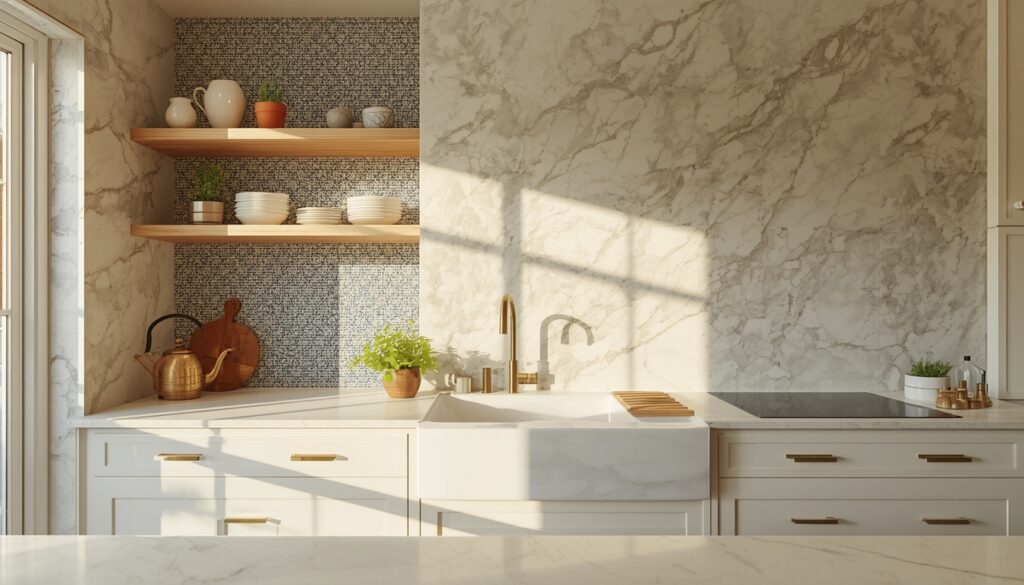
2. Full Height Slab Backsplash for a Seamless, Luxurious Look
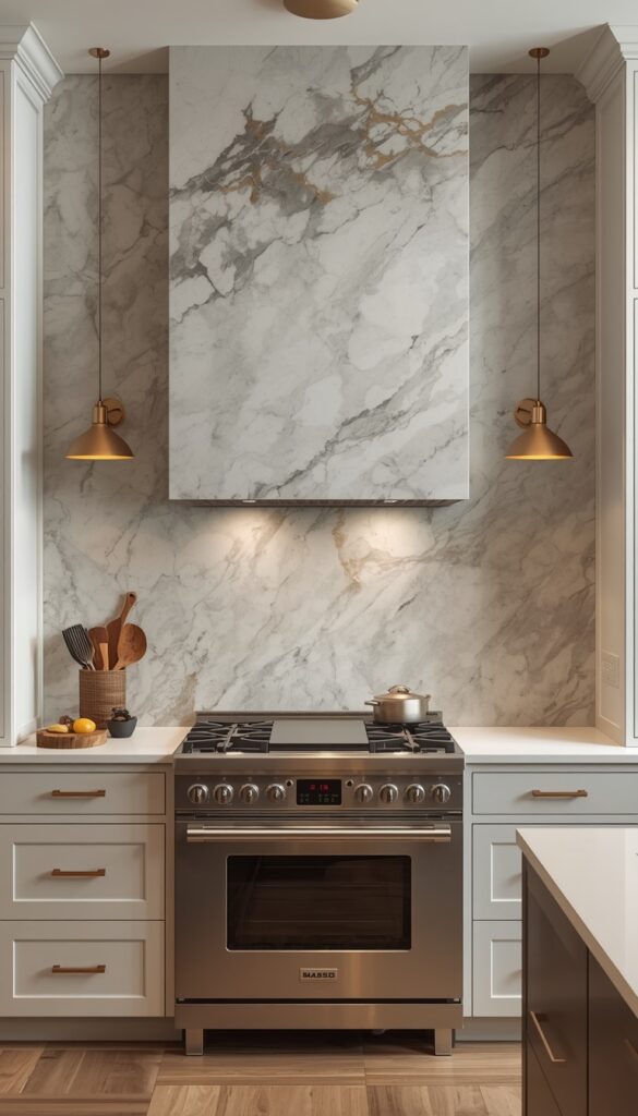
A full height slab backsplash — running from the countertop all the way up to the underside of the upper cabinets, or even to the ceiling — creates a continuous, unbroken surface that feels genuinely luxurious. This works with natural stone like marble, quartzite, and slate, but also with porcelain slabs that convincingly mimic those materials at a lower cost and with better stain resistance. The effect is dramatic and clean in a way that individual tiles simply can’t replicate.
The real magic of a slab backsplash is book matching — when two adjacent slabs are cut from the same block and installed as mirror images of each other, the veining flows across the seam in a way that looks like art. This is especially stunning behind a range or cooktop, where you want a strong visual focal point. Quartzite in soft grey white with dramatic veining is a favorite for this application. So is dark Nero Marquina marble, which makes white or light grey cabinetry look incredibly expensive without any other changes.
Porcelain slab alternatives from manufacturers like Dekton, Neolith, and Lapitec have genuinely closed the gap on the look of natural stone while offering near indestructible performance — no sealing, no worrying about oil splashes or wine staining the material. For a family kitchen that sees heavy use, a honed porcelain slab in a marble look gives you the high end aesthetic with none of the anxiety. Budget for professional installation regardless of which material you choose; slab installation requires specialist tools and experience that aren’t forgiving of mistakes.
3. Handpainted Ceramic Tile Backsplash with Pattern and Color
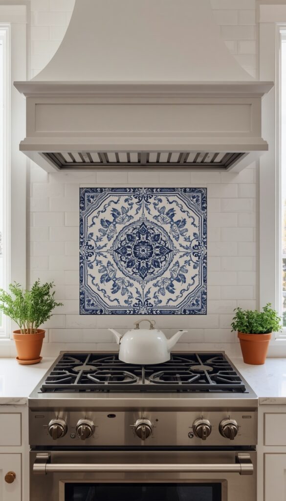
Hand painted ceramic tiles bring something into a kitchen that manufactured tiles simply can’t — genuine artistry. Whether they’re Spanish Talavera style tiles in cobalt and yellow, Portuguese azulejo inspired patterns in deep blue and white, or Italian Vietri tiles in earthy warm hues, hand painted ceramics give a kitchen immediate character and soul. They feel like they were chosen by a person with taste, not selected from a showroom floor.
You don’t have to tile an entire backsplash with painted tiles to get the impact — in fact, restraint often works better. Consider using hand painted tiles only for the section directly behind the range as a focal point feature, surrounded by a simpler complementary tile on the remaining backsplash. A panel of six to twelve decorative tiles framed by plain white subway tile focuses attention beautifully and also keeps the budget manageable, since hand painted tiles range from $8 to $40 per tile depending on origin and artisan.
For sourcing, look beyond big box stores. Small ceramic studios in Spain, Portugal, and Mexico produce genuinely hand painted tiles and ship internationally at reasonable prices. Etsy has reliable artisan sellers with strong track records. When installing, lay out the full pattern on the floor before grouting to check the visual flow and catch any tiles that don’t read well next to each other. Seal with a penetrating tile sealer after installation, and use a grout color that echoes the dominant tile color so the pattern reads as continuous rather than fragmented.
4. Unlacquered Brass and Mirror Mosaic Tile for Maximum Drama
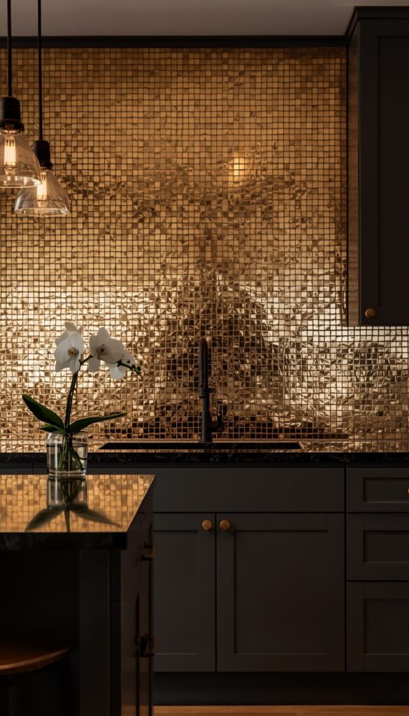
A mosaic backsplash with metallic or mirror elements is one of the fastest ways to make a kitchen feel genuinely dramatic and special. Unlacquered brass mosaic tiles — small penny tiles or stacked rectangles in warm brass — patina naturally over time, which means the backsplash actually gets more beautiful the longer you live with it. Mirror mosaic tiles, especially in an antique or aged mirror finish, add light and depth to a kitchen in a way that no other material does.
The application matters here. Full coverage in metallic mosaic tile works best in smaller kitchens where you want to maximize the sense of space and light — the reflective surface does real work in a compact galley kitchen, bouncing light and making the room feel wider and taller. In a larger kitchen, a metallic mosaic backsplash works beautifully as a dedicated feature behind the range, running floor to ceiling in a single column for maximum visual impact while keeping the surrounding backsplash simpler.
Cleaning metallic tile requires a bit more care than ceramic. Avoid abrasive cleaners on brass mosaic tiles; a soft cloth with mild dish soap and warm water is all you need. Antique mirror tiles are sealed and can be wiped down normally. When choosing grout for metallic mosaic work, a matching metallic epoxy grout looks seamless and professional — or a contrasting dark grout in charcoal creates a grid pattern that feels more graphic and intentional. Either approach is valid; it depends entirely on whether you want the tile to read as texture or as pattern.
5. Limewash Plaster Backsplash for a Soft, Artisan Finish
Not every backsplash has to be tiled. Limewash plaster applied to a properly waterproofed backsplash surface creates a finish that is matte, layered, and breathtakingly beautiful — especially in kitchens with a Mediterranean, farmhouse, or rustic modern aesthetic. The natural mineral pigments in quality limewash products like Portola Paints’ Roman Clay or Bauwerk’s Colour Lime Paint develop subtle depth and variation that makes a wall look genuinely ancient and considered rather than freshly painted.
The practical question everyone asks is: can you really use plaster behind a kitchen sink or stove? The answer is yes, with the right prep. The wall must be properly sealed with a moisture barrier before application, and the plaster itself needs to be sealed with a matte penetrating sealer once cured. This creates a surface that handles normal kitchen splashes without absorbing them. It is not appropriate directly behind a cooktop without a sealed waterproof backing — but for the sink surround, side walls, and general backsplash areas it performs beautifully with basic care.
Colors that work especially well in limewash for a kitchen setting include warm white, aged plaster cream, soft mineral green, and dusty terracotta. Apply in two or three thin coats with a Venetian plaster trowel, working in circular and random stroke patterns to build the layered depth. The finish looks best when it shows slight variation in tone across the surface — that organic imperfection is the entire point. For a kitchen renovation that wants soul and texture without tile grout lines, this is honestly one of the most underrated backsplash options available.
6. Stacked Vertical Subway Tile for a Fresh Take on a Classic
Subway tile is a genuine classic, and there’s nothing wrong with that. What does feel tired is the standard horizontal brick lay pattern in glossy white — it’s been so widely used that it no longer reads as a design choice. But rotate those same subway tiles to a vertical stacked orientation and the entire feeling changes. Vertical stacking draws the eye upward, makes ceilings feel taller, and gives a clean modern crispness that the horizontal version has largely lost through overexposure.
The best subway tile profiles for vertical stacking are beveled edge tiles in 3×6 or 3×12 inch sizes. The longer 3×12 tile in vertical orientation is particularly strong — it reads almost like a series of narrow columns moving up the wall, which suits kitchen designs with strong vertical lines in the cabinetry. A 3×6 stacked vertically is sharper and more graphic. Both work well. In terms of finish, matte glazed subway tile in a stacked vertical pattern has a sophisticated restraint that glossy tile in the same layout doesn’t quite achieve.
Color choice is where vertical subway tile really distinguishes itself from the standard version. Deep sage green in a vertical stack with dark grout reads as genuinely design forward. Warm off white with a bone or greige grout feels luxurious and quiet. Even classic white subway tile in a vertical stack looks more intentional and purposeful than horizontal. For grout line size, keep it tight — 1/16 inch or 1/8 inch at most — to maintain the clean column effect rather than letting the grout become a visual element that competes with the tile itself.
7. Terrazzo Tile Backsplash for Bold, Playful Color
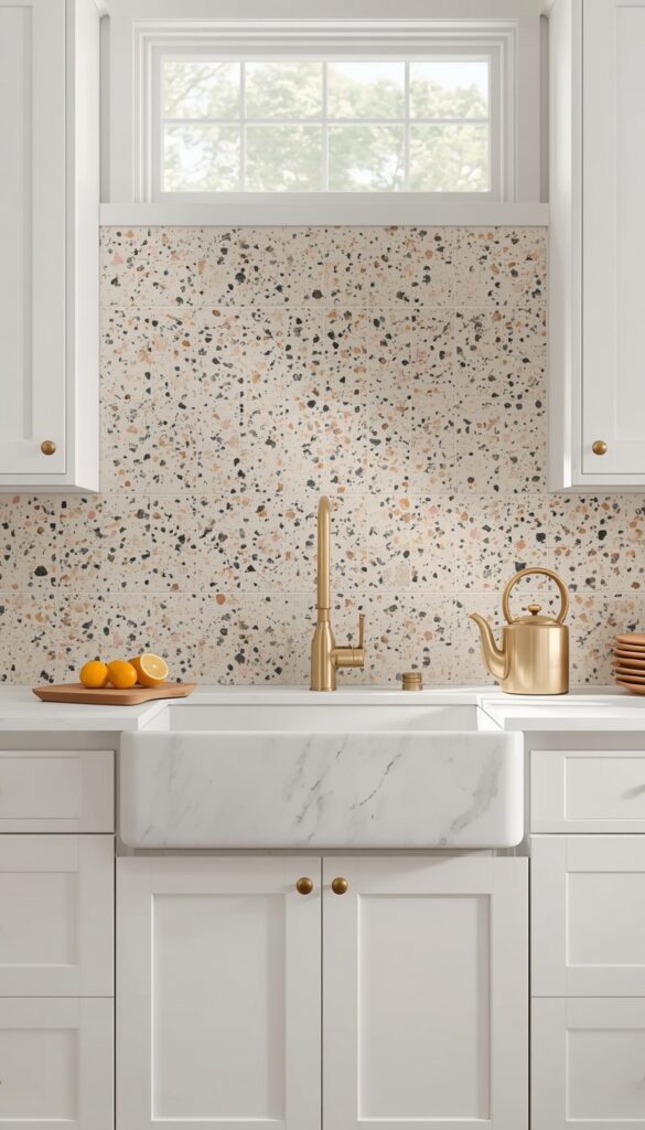
Terrazzo has moved firmly from floors into backsplash territory, and the results are genuinely joyful. Modern terrazzo tile — featuring chips of marble, glass, and stone suspended in a cement or resin base in almost any color combination imaginable — brings a graphic liveliness to a kitchen that very few other materials can match. It’s especially powerful in kitchens that already have strong, clean lines and minimal visual clutter, where the terrazzo becomes the single expressive element in an otherwise restrained space.
The chip size and base color are the two decisions that define the entire look. Large chip terrazzo in a white or light grey base reads as bold and modern — almost like confetti against a clean background. Small chip terrazzo in a warm cream or blush base reads as softer and more organic, closer to vintage Italian flooring. For a kitchen backsplash, rectified terrazzo tiles in 12×12 or 12×24 inch sizes install cleanly with tight grout joints that let the pattern dominate without interruption.
Color coordination with the rest of the kitchen is the key to making terrazzo work rather than compete. A terrazzo tile with chips of black, white, and warm gold works beautifully in a kitchen with black hardware and warm wood open shelving. A terrazzo in mint, cream, and blush suits a light, airy kitchen with white cabinetry and brushed nickel fixtures perfectly. Pick one or two of the chip colors that already appear somewhere in your kitchen — in the countertop, the hardware, or even a rug — and the terrazzo will feel like it belongs rather than being imposed on the space.
8. Reclaimed Wood Backsplash for Warmth and Unexpected Texture
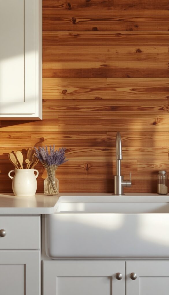
Wood behind a kitchen sink or stove sounds risky, and honestly it does require some thought. But a properly installed reclaimed wood backsplash — finished with multiple coats of a food safe, water resistant finish like Rubio Monocoat or a high solids polyurethane — performs surprisingly well in normal kitchen use and adds a warmth and organic texture that no tile or stone can replicate. This idea is particularly compelling in farmhouse, cabin, industrial, and rustic modern kitchens.
Reclaimed barn wood, shiplap, and tongue and groove pine are all strong backsplash candidates. The wood should be installed horizontally in most kitchens for a classic look, though a vertical orientation can work beautifully in a range hood surround or behind open shelving where the vertical lines echo the shelf brackets. Whittle the material down to a consistent thickness before installation and check for structural integrity — no soft spots, no active insect damage. Sand smooth enough to accept finish evenly, then apply at least three protective coats.
Place this backsplash surface away from direct cooktop splatter. It works best behind a sink, on side walls, as a range hood surround, or between open shelving above the counter. Clean with a barely damp cloth and a small amount of mild dish soap — never saturate the surface. Refresh the protective finish every two to three years depending on how hard the kitchen gets used. The visual warmth a wood backsplash contributes to a kitchen is genuinely striking — it’s the kind of feature that makes people walk in and immediately say “I love this kitchen.”
9. Chevron or Herringbone Pattern Tile for Geometric Impact
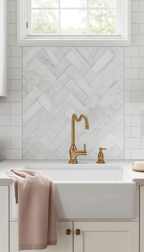
The way tile is laid changes its entire personality. The same simple rectangular tile laid in a herringbone or chevron pattern immediately becomes something much more sophisticated and interesting. Herringbone — where rectangular tiles meet at 90 degree angles to create a V shape — has a sense of movement and energy that horizontal or vertical stacking simply doesn’t achieve. Chevron is the sharper, more graphic version, where tiles are cut at precise angles so the pattern locks into perfectly aligned arrows.
White marble hexagon tiles in a herringbone pattern behind a farmhouse sink is a classic combination that ages beautifully. Matte black square tiles in a herringbone arrangement for a kitchen with dark cabinetry create a rich tonal effect that reads as genuinely luxurious. For a more colorful approach, terracotta rectangular tiles in a herringbone pattern on a warm plastered wall bring Mediterranean warmth to any kitchen style. The pattern works at any scale — from 2×4 inch mosaic tiles to larger 4×12 inch field tiles.
One important installation note: both herringbone and chevron patterns generate more waste during cutting than standard brick lay installations — budget for 15 to 20 percent extra tile beyond your measured coverage area. The cuts are more complex and require a wet saw with a clean blade rather than a basic tile cutter. This is not a beginner DIY project; the angles need to be accurate and consistent throughout the full installation for the pattern to read correctly. A skilled tile installer will quote you more for the labor on a pattern layout, and it’s worth every penny.
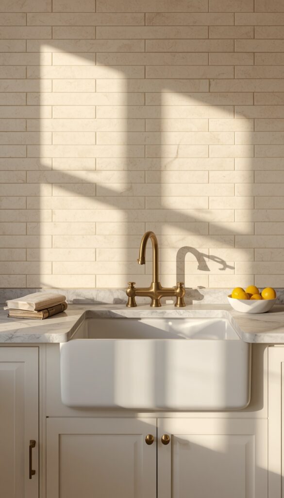
10. Dark Grout with White Tile for Graphic, Modern Impact
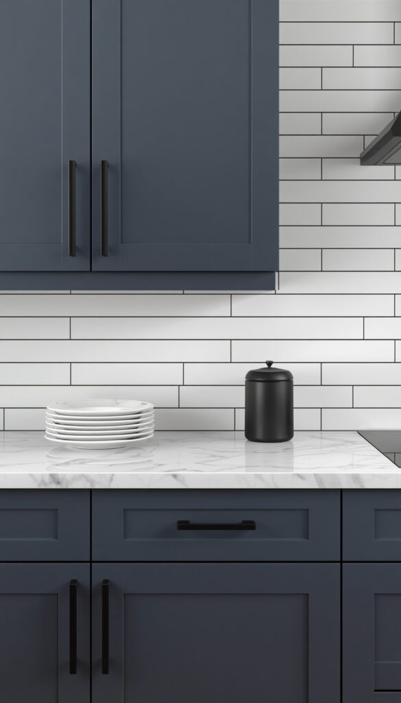
Here’s a backsplash idea that doesn’t require buying different tile — just different grout. Dark charcoal or black grout with white or off white tile creates a graphic grid effect that completely transforms the visual character of a standard tile installation. The same 3×6 white subway tile that reads as completely conventional with white grout becomes bold, modern, and intentional with charcoal grout. It’s one of the most affordable ways to make a strong design statement in a kitchen.
The tile format that benefits most dramatically from dark grout is the traditional white subway tile in a brick lay pattern — the contrast makes the grid geometry legible and graphic in a way that feels designed rather than default. White penny tile with black grout creates a bold retro effect with genuine personality. White large format tile with dark grey grout has a more architectural, restrained quality. The rule is simple: the more contrast between tile color and grout color, the bolder and more graphic the result.
One practical consideration: dark grout shows efflorescence and mineral deposits from water less than white grout, which means it can actually be easier to keep looking clean around a kitchen sink. Use an epoxy based dark grout for the best stain resistance and longevity — standard cement grout in dark colors can fade slightly over time with regular cleaning. Apply a grout sealer at installation even on epoxy grout, and use a pH neutral cleaner on the grout lines to preserve the color depth. This backsplash update can be done over a single weekend and makes an enormous visual difference.
11. Scallop and Fan Tile Backsplash for Vintage Charm
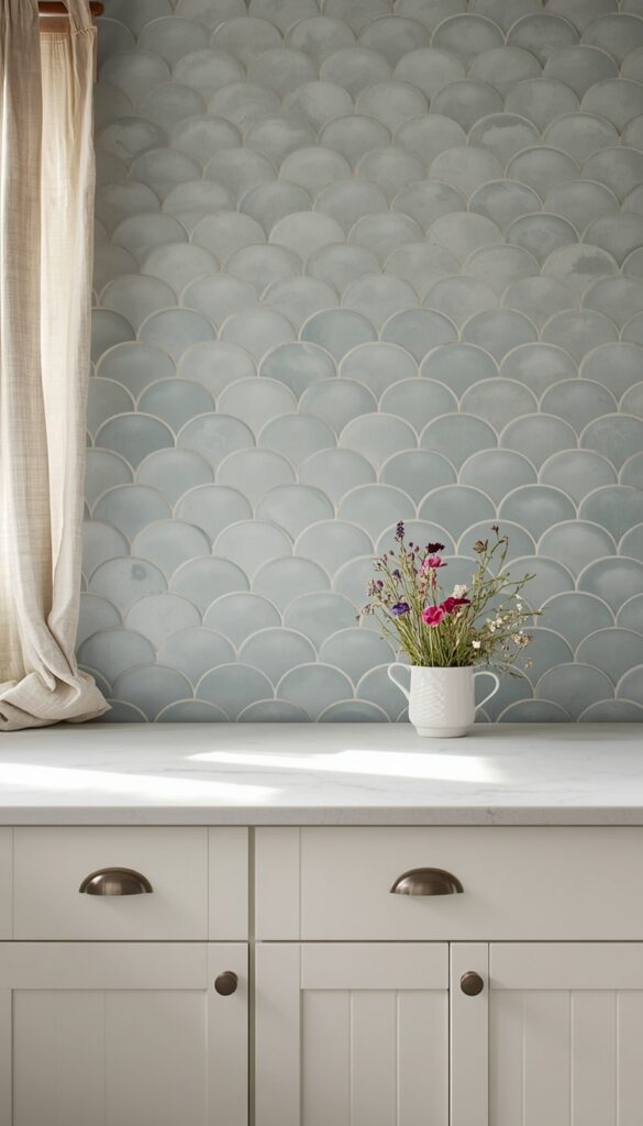
Scallop tile — also called fan tile or fish scale tile — is one of the most charming backsplash choices available, and it’s far more versatile than its delicate appearance suggests. Each curved, overlapping tile creates a pattern that looks almost like fish scales or flower petals covering the wall, adding dimensional interest and graceful movement to a flat surface. It works in vintage, coastal, cottage core, and even modern spaces depending on the color and finish you choose.
Matte white scallop tile with soft white grout creates a subtle textural effect that’s almost tone on tone — beautiful and quiet in a light kitchen that doesn’t want the backsplash to compete for attention. Dusty blue or sage green scallop tile in a matte finish suits a cottage or coastal kitchen perfectly and gives the backsplash a painterly, handcrafted quality. For something more dramatic, deep emerald green glazed scallop tile with dark grout makes an extraordinary statement in a kitchen with brass hardware and warm wood accents.
The overlapping nature of scallop tile means grout lines are curved and more abundant than with rectangular tile — factor that into your cleaning considerations. Use a soft grout brush and a mild cleaner to keep the curves clean without damaging the glaze. Installation requires an experienced tiler who has worked with fan tile before — the pattern alignment is critical and mistakes are immediately visible. Order at least 12 to 15 percent overage since curved tile cuts generate significant waste. The result is a backsplash that feels genuinely special and is almost impossible to replicate with any other material.
12. Painted Brick Backsplash for Rustic Character at Low Cost
If your kitchen has an existing brick wall or exposed brick section behind the range or sink, you already have one of the most characterful backsplash surfaces available. Painted brick — sealed properly and finished in a color that complements the kitchen — is a genuinely beautiful and very durable backsplash material that costs almost nothing if the brick already exists. Even faux brick panels or real thin brick veneer tiles offer the same textured, rustic look at a fraction of the cost of full masonry.
The color of painted brick matters more than almost any other single decision in a brick backsplash project. Crisp white creates a bright, Scandinavian farmhouse feel. Warm cream or aged white has a softer, more Italian countryside quality. Deep charcoal or black painted brick behind a matte black range looks outrageously good and very sophisticated. Sage green brick with brass fixtures is a genuinely beautiful combination that’s still unusual enough to feel fresh. The brick texture shows through all of these finishes and provides the visual interest — the paint just sets the color mood.
Use a masonry primer before any paint application on bare brick to prevent efflorescence and ensure proper adhesion. Two coats of a high quality, washable interior paint in a matte or satin finish work well. For brick that will be directly behind a cooktop, apply a masonry sealer before painting and use a heat resistant paint rated for that proximity. Clean brick backsplashes with a slightly damp cloth — don’t scrub aggressively as this can degrade the mortar surface over time. Brick gives a kitchen more character per dollar than almost any other backsplash option.
13. Glossy Maximalist Tile in Deep Jewel Tones
There’s a quiet confidence required to choose a deep jewel toned backsplash, and kitchens that have it look genuinely extraordinary. Deep emerald green, rich sapphire blue, moody plum, and dark amber — these colors in a high gloss glazed tile transform a kitchen wall into something that feels painterly and intentional. The gloss amplifies the depth of the color in a way that matte tile simply can’t, and the light reflection changes the mood of the whole room at different times of day.
This approach works best in kitchens with clean, minimal cabinetry in white, warm grey, or natural wood. The color in the backsplash becomes the focal point of the entire kitchen, so everything else should support rather than compete. Flat fronted cabinetry, simple hardware in one finish — brushed brass with jewel tones is particularly beautiful — and an uncluttered countertop let the backsplash do its full work. Keep the grout close to the tile color so the surface reads as one rich field of color rather than a grid.
The specific tile format matters here too. Large format glossy tiles in 4×12 or 6×12 laid in a vertical stack maximizes the painterly effect — the color reads almost like a watercolor wash across the wall. Smaller mosaic tiles in jewel tones create a more intricate, almost Byzantine quality. For a range hood wall, running the jewel toned tile floor to ceiling in a single column frames the range in a way that looks deliberately architectural and extremely high end. This is a committing choice, but every kitchen that makes it with confidence looks unforgettable.
14. Open Shelf with Integrated Tile Niche Backsplash
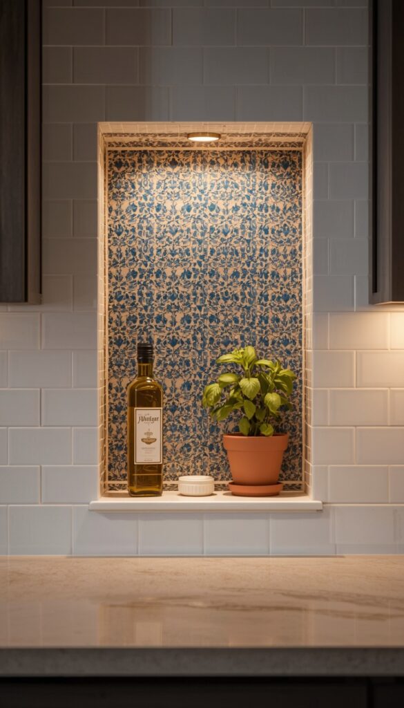
The combination of a tile backsplash with a built-in recessed niche — a shallow inset shelf in the wall, typically 3 to 4 inches deep — creates a feature that is both beautiful and genuinely functional. The niche can hold everyday items like olive oil, a small potted herb, a beautiful soap dispenser, or a collection of matching spice jars. The tile inside the niche is often a different, more decorative tile than the surrounding backsplash, creating a framed focal point that reads as an architectural detail rather than just a storage solution.
The niche works best when built between wall studs — a standard 16 inch stud spacing allows for a niche roughly 14 inches wide, which is generous enough to hold a small collection of useful items. Tile the interior of the niche in a contrasting material: if the surrounding backsplash is simple white subway tile, tile the niche interior in a mosaic, a decorative pattern tile, or a richly colored field tile. A single LED strip light inside a deep niche adds a warm glow that makes the whole backsplash area feel luxurious after dark.
Placement is everything with a tile niche. Install it at counter height or just above it — roughly 6 to 12 inches above the countertop surface — in a location that doesn’t interrupt the primary cooking workflow. The area beside a range rather than directly behind it works well. Between two windows above a sink is another strong placement. When designing a kitchen from scratch or doing a full renovation, a tile niche backsplash is the kind of custom detail that makes the space feel genuinely architect designed. It’s a conversation piece, a functional surface, and a beautiful design moment all at once.
Conclusion
The kitchen backsplash is a small surface with a big responsibility — it sets the tone for your entire kitchen and gets looked at every single day. Whether you go bold with deep jewel toned gloss tile, timeless with handmade zellige, or creative with a built in niche or limewash plaster, the most important thing is choosing something that genuinely reflects your taste rather than defaulting to the safest option. Every idea in this article can be adapted to different budgets, kitchen styles, and skill levels. The kitchen backsplash you actually love is the one you’ll never regret. Pick your favorite, get a sample, hold it up in your actual kitchen light, and go from there.
FAQs
Q: What is the most popular kitchen backsplash tile right now? A: Zellige tile is one of the most searched and installed backsplash choices right now, thanks to its handmade texture and the way it interacts with light. White subway tile remains consistently popular for its versatility, but the preference has shifted toward matte finishes, vertical stacking, and darker grout colors that give it a more modern and intentional feel.
Q: How much does it cost to tile a kitchen backsplash? A: Most kitchen backsplash projects fall between $400 and $1,500 for materials and labor combined, depending on the tile type and kitchen size. Basic ceramic tile is the most affordable option, starting around $2 to $5 per square foot. Natural stone, handmade zellige, and specialty tiles can run $15 to $50 per square foot or more, with labor adding roughly $10 to $25 per square foot on top.
Q: Can I install a kitchen backsplash myself? A: Simple rectangular tiles in a straight horizontal or stacked layout are genuinely manageable as a DIY project for someone with patience and basic tools. Pattern layouts like herringbone, chevron, or fan tile require more experience and a wet saw, and are better left to a professional. Slab installation with natural stone is always a job for a specialist — the material cost alone makes mistakes too expensive to risk.
Q: What backsplash is easiest to keep clean? A: Large format tiles with fewer grout lines are the easiest to maintain — more tile surface and less grout means fewer places for grease and grime to collect. Glossy tile wipes clean faster than matte tile in high splash zones. Epoxy grout in any color resists staining better than standard cement grout and is worth the extra cost in a kitchen that sees heavy daily cooking.
Q: How high should a kitchen backsplash go? A: Standard kitchen backsplash height runs from the countertop to the underside of the upper cabinets, typically 15 to 18 inches. Full height backsplashes that run all the way to the ceiling are a strong design choice in kitchens without upper cabinets or in a dedicated range hood feature wall. Taking tile all the way up creates a more seamless, high end look and protects more wall surface in cooking areas.
Q: What color backsplash goes with white cabinets? A: White cabinets are genuinely flexible — they pair well with almost any backsplash color. Cool grey and white marble or stone looks classic. Deep teal, navy, or emerald zellige against white cabinets looks dramatically beautiful. Warm terracotta or sage green adds personality and warmth. The best approach is to choose a backsplash color that connects to another element in the kitchen — the countertop, flooring, or hardware — so everything reads as a considered whole.
Q: Should backsplash tile match countertops? A: Matching isn’t necessary — and often matching too closely makes the kitchen feel flat and one dimensional. The goal is coordination rather than matching. Choose a backsplash that picks up one or two tones from the countertop rather than replicating the entire pattern. A simple backsplash pairs beautifully with a busy countertop, and vice versa. The most visually interesting kitchens balance busy and quiet surfaces rather than repeating the same pattern everywhere.