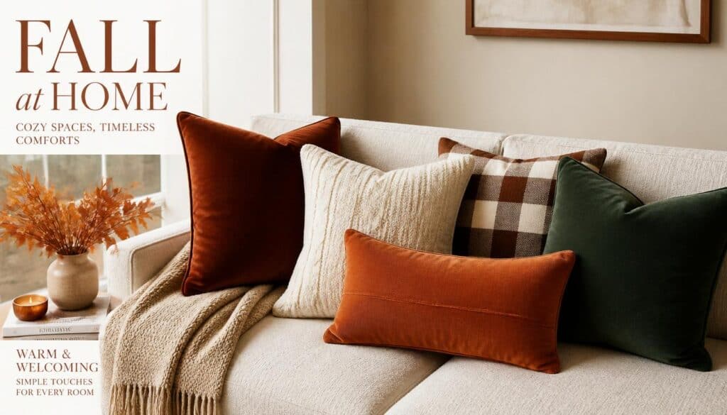
Pillow covers are the fastest seasonal update you can make to a living room or bedroom, and fall is genuinely the best time to use them intentionally. A sofa that felt bright and breezy all summer transforms completely with a few well chosen covers in the right textures and tones. I’ve swapped pillow covers seasonally for years now, and the difference between a room that feels like autumn and one that just has some pumpkins on the porch always comes down to what’s actually on the cushions.
The key is understanding that fall pillow styling isn’t just about color. Texture does as much work as tone in this season, and the combination of the two is what creates that genuinely layered, cozy feeling that makes a room smell like a candle even when one isn’t burning. These 15 ideas cover specific fabrics, patterns, and styling combinations I’ve actually used and lived with through real fall seasons, with the honest details that make each one worth your consideration.
1. Choose a Rust Velvet Cover for Instant Autumn Warmth
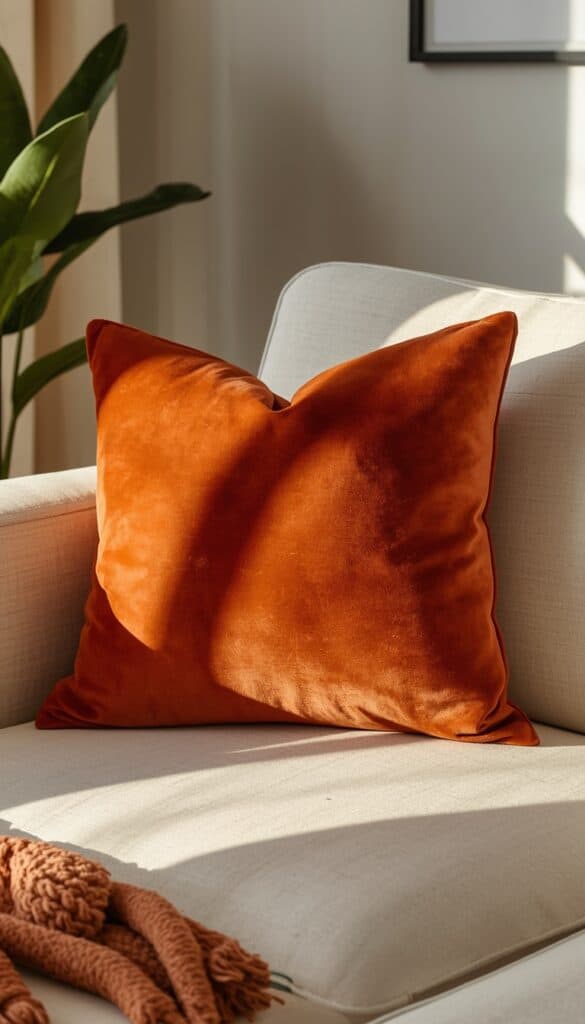
A rust toned velvet pillow cover does more for a fall sofa than almost any other single piece, because the combination of the color and the material works together rather than independently. Rust sits right in the sweet spot of fall color, warm enough to feel seasonal without tipping into a Halloween palette, and velvet’s pile catches light in a way that makes even a simple solid color look dimensional and rich rather than flat.
Pile direction matters more with velvet pillow covers than most people expect once they’re actually styling them on a sofa. I always smooth the pile in one consistent direction after fluffing, since inconsistent pile direction creates patchy light and dark spots across the cover’s surface that look unintentional rather than textural. A quick, gentle brush with your hand in one direction every few days keeps this looking polished.
Size selection affects the styling impact significantly. I recommend a 22 inch square velvet cover specifically for a primary sofa pillow, since this larger size lets the color make a genuine visual statement rather than a smaller cover getting lost among other competing textures. Pair it with a 20 inch lumbar in a complementary woven texture to build immediate depth across the whole arrangement.
2. Add a Chunky Knit Cover for Tactile Fall Coziness
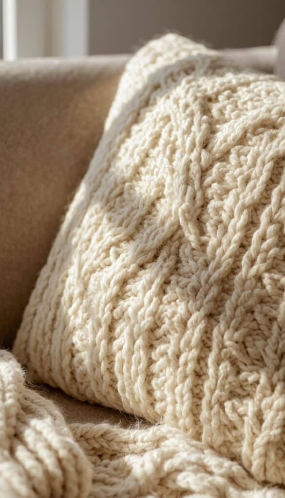
A chunky knit pillow cover brings an immediately tactile quality to fall styling that no printed or woven cover can replicate, because this is a texture people actually want to touch. I look for covers with a genuine cable knit or seed stitch pattern rather than a loosely looped design that pills and snags quickly with regular handling. The pattern should hold its shape visibly rather than flattening out with use.
Fiber content determines long term quality here more than price alone. I specifically choose a wool or cotton wool blend over purely synthetic chunky knit, since acrylic versions tend to flatten and lose their dimensional texture after just a few weeks of regular use. A natural fiber maintains the lofty, substantial look that makes this cover worth adding to a seasonal arrangement in the first place.
Color works differently with chunky knit than with smoother fabrics. I recommend cream, oatmeal, or a warm caramel specifically for chunky knit covers, since these lighter tones let the texture itself become the visual focus rather than competing with a bold color. Pairing a cream knit beside a rust velvet and a deep plaid creates genuine textural contrast that photographs beautifully and feels even better in person.
3. Use a Buffalo Check Cover in Brown and Cream
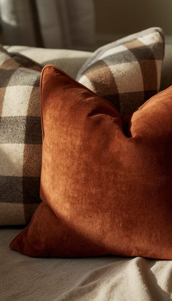
Buffalo check in brown and cream reads as distinctly autumnal without veering into Christmas territory, which makes it one of the most useful fall pillow patterns for anyone who wants a seasonal update that works from September straight through November without needing another swap. I choose a medium scale check specifically, around two inches per square, since very small checks read as busy from across a room while very large ones can feel visually overwhelming.
Fabric weight affects how well a check pattern holds its shape once stuffed. I look for a mid weight woven cotton or a cotton linen blend specifically, since lightweight check fabrics tend to pucker slightly at the seams once they’re under tension from the insert, which distorts the pattern’s clean geometric lines and makes the whole cover look slightly off. Heavier fabric sits better and holds the pattern crisply throughout the season.
Styling this cover works best when it’s positioned as a secondary piece rather than the dominant one in an arrangement. I tuck a buffalo check cover behind a larger solid velvet or lumbar front center, letting the pattern peek out at the sides and add visual interest without completely taking over the grouping. This layering technique consistently looks more intentional than placing the check pillow front and center.
4. Try a Deep Plum or Burgundy Linen Cover
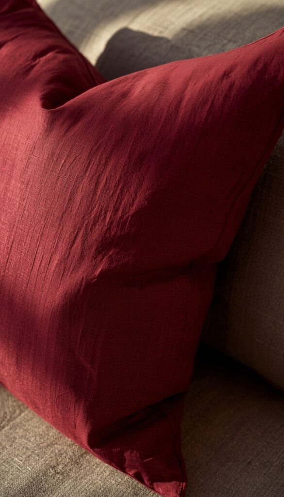
Deep plum and burgundy linen covers bridge the gap between fall’s warm tones and winter’s richer, deeper palette in a way rust and orange can’t quite manage alone. I use these specifically in late October through November, when the broader color story in a room needs to shift slightly deeper and more moody without yet becoming fully festive or holiday oriented in feeling.
Linen’s natural texture adds subtle visual interest to these deeper tones in a way that a smooth cotton or polyester cover in the same color wouldn’t achieve. The slight slub and weave variation inherent in genuine linen fabric catches light differently across the cover’s surface, keeping the color from reading as flat or overly solid even in a rich, saturated burgundy or plum shade.
Washing linen before using it matters genuinely, since most linen covers soften and develop a more relaxed, lived in drape after one or two washes compared to straight out of the packaging. I always pre-wash and line-dry these covers specifically before their first use, since the pre-washed texture is genuinely what makes linen feel appropriately relaxed and cozy rather than stiff and slightly formal.
5. Layer a Woven Jacquard Cover with a Leaf or Botanical Print
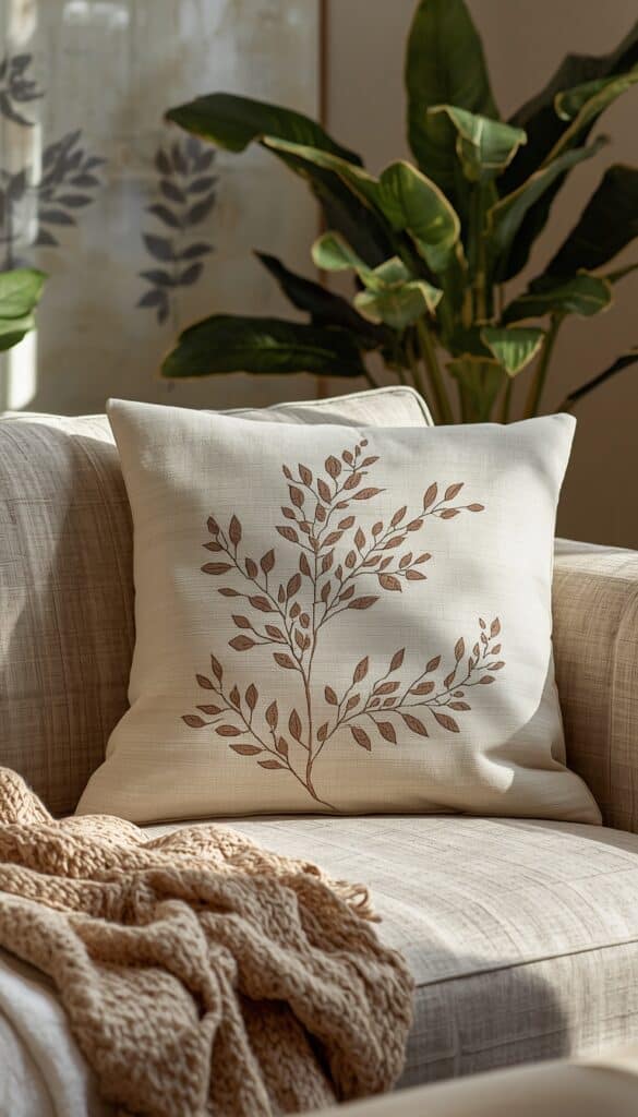
A woven jacquard cover with a subtle leaf or botanical print brings a fall pattern into a room without the flatness of a printed cover, because the pattern is built directly into the weave structure rather than sitting on top of the fabric. I look for designs where the pattern is tone on tone or uses closely related values rather than high contrast colors, since this keeps the botanical print feeling sophisticated rather than obviously seasonal.
Thread count and weave density affect how crisp the pattern reads from across a room. I check that the jacquard pattern is clearly legible at arm’s length before buying, since very dense, fine jacquard patterns sometimes read as texture rather than identifiable pattern at normal viewing distances, losing the design detail that justifies choosing this specific cover type.
Pairing a woven jacquard with solid textured covers around it keeps the arrangement from looking too busy. I place one jacquard cover beside two solid covers in colors pulled directly from the jacquard’s pattern, since this disciplined color coordination makes the whole grouping feel collected rather than chaotic. This technique consistently produces more intentional looking arrangements than mixing several different patterned covers.
6. Add a Sherpa or Teddy Fleece Cover for Maximum Coziness
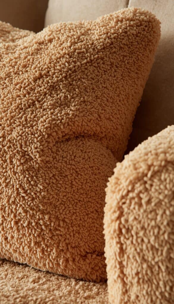
Sherpa and teddy fleece pillow covers sit at the absolute peak of tactile coziness for fall and winter, and I genuinely think these deserve more styling consideration than they typically get in home decor conversations. The dense, nubby texture reads as instantly warm, which is exactly the sensory signal a fall living room should send before anyone even sits down. I use these as accent pieces rather than the dominant cover in an arrangement specifically to keep the look balanced.
Color selection matters more for this material than for smoother fabrics. I steer toward warm ivory, caramel, or a deep chocolate brown specifically, since these tones echo natural fleece and keep the overall look grounded rather than making the pillow look like a stuffed animal accidentally placed on the sofa. The material itself is tactile enough to carry the styling load without needing a bold color to do additional visual work.
Maintenance for sherpa and teddy fleece requires slightly more care than woven covers to keep this texture looking genuinely lush rather than matted. I wash these on a gentle cold cycle and never put them in a hot dryer, since heat mats the fibers permanently and destroys exactly the dimensional, plush texture that makes this cover worth using in the first place.
7. Use a Rust and Cream Stripe for Fresh Fall Pattern
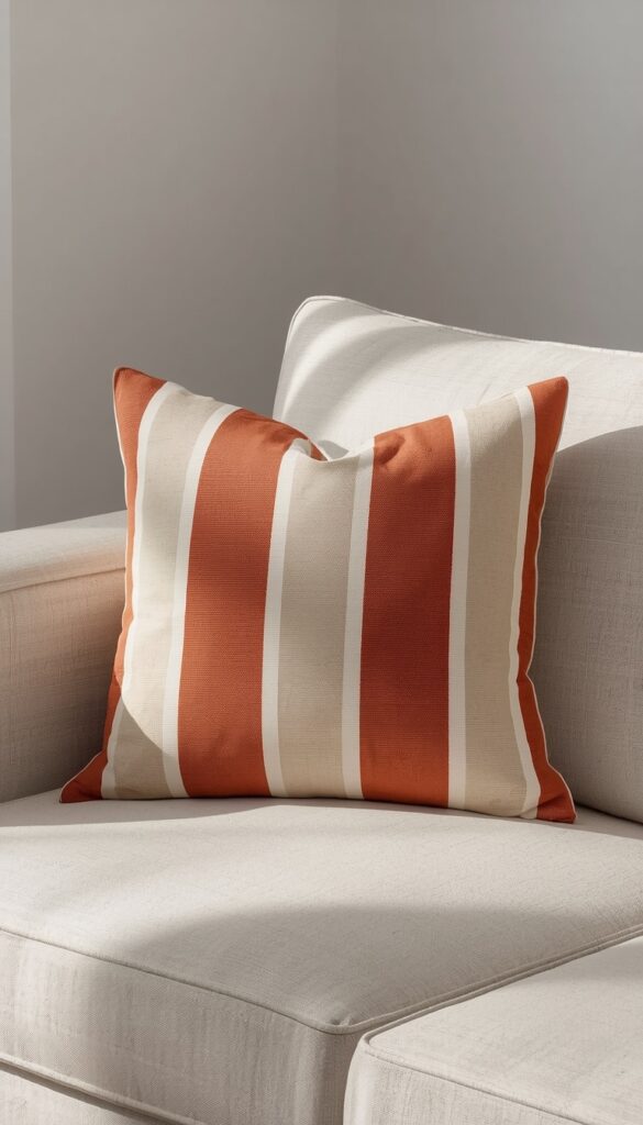
A stripe pillow cover in rust and cream offers a cleaner, more graphic alternative to plaids and botanicals while still delivering a distinctly fall color story. I look for a vertical stripe specifically rather than horizontal, since vertical stripes tend to elongate a pillow’s silhouette slightly and feel more current in contemporary fall styling than the wider, more traditional horizontal stripe.
Stripe width affects the overall visual weight of the cover significantly. I choose medium width stripes, roughly one to two inches each, rather than very narrow pinstripes that get lost at a distance or very wide stripes that can feel more like color blocking than genuine stripe pattern. This medium width reads clearly from across a room and creates the right level of visual interest without overwhelming adjacent solid covers.
Fabric choice for this pattern should lean toward a slightly heavier woven cotton or canvas rather than a thin, lightweight fabric, since thinner stripe fabrics tend to show fullness or lumps through the cover, which distorts the clean geometry of the stripe pattern. I always use a quality feather down or down alternative insert specifically with stripe covers to ensure the surface stays smooth and the pattern reads crisply.
8. Choose a Dark Forest Green Cover for Earthy Fall Depth
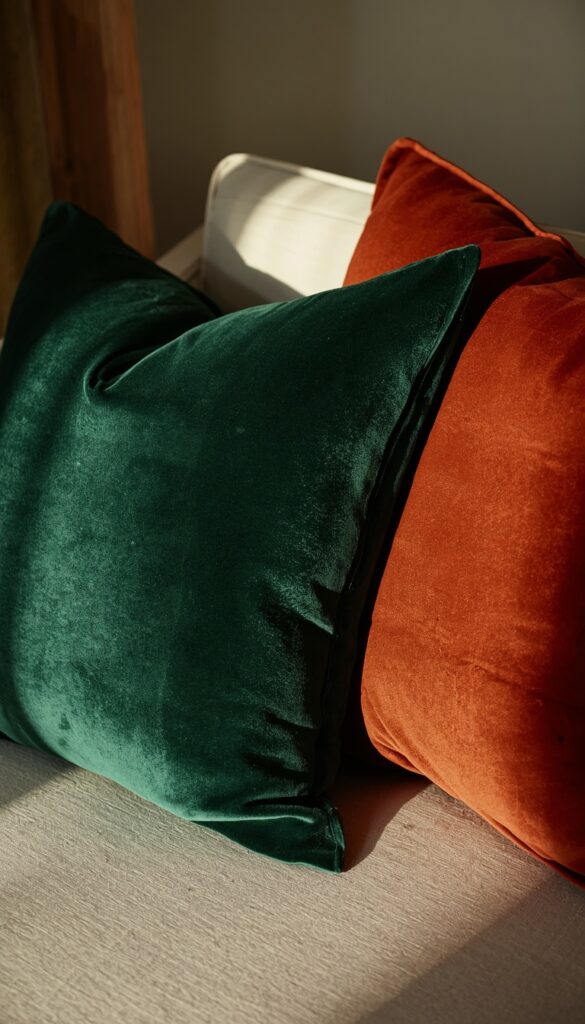
Dark forest green is criminally underused in fall pillow styling, where rust and orange get all the attention, and I genuinely wish more people would reach for this shade in their seasonal refresh. It echoes the deep, rich greens of evergreen foliage and pine trees that become more prominent visually as deciduous trees lose their leaves, making it feel authentically seasonal in a way that goes beyond the obvious warm color palette most people default to.
Pairing forest green with rust creates a fall color combination that feels fresher and less expected than the standard rust and cream or rust and plaid combinations everywhere this season. I use a deep green velvet or linen cover as a grounding element in an arrangement that also includes lighter, warmer tones, since the contrast makes each color more vibrant than it would appear surrounded by similar tones.
Shade selection within the green family matters for keeping this feeling autumnal rather than drifting into Christmas territory. I look for greens that lean slightly toward olive or hunter rather than the brighter, more saturated emerald shades that read more festive. This subtle distinction in tone genuinely changes how the whole arrangement feels throughout the fall season.
9. Add a Lumbar Cover in Burnt Orange for Layered Interest
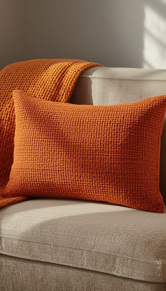
A lumbar pillow cover in burnt orange occupies a unique styling role that a square pillow simply can’t fill the same way, providing horizontal visual interest at the front of a sofa arrangement that draws the eye across the whole composition rather than just upward to the larger pillows behind. I always use a lumbar as a layering piece placed front center, slightly in front of the larger square pillows, for the most intentional looking result.
Burnt orange reads differently depending on the fabric it’s printed or woven on. I choose a slightly textured woven cotton or a matte canvas for this specific color, since the texture softens burnt orange’s natural vibrancy just enough to keep it feeling warm and autumnal rather than overly bright or energetic for a relaxed fall living room setup.
Size selection for a lumbar cover affects the overall proportion of the arrangement significantly. I recommend a 14×26 inch lumbar specifically rather than the smaller 12×20 inch option, since the larger size fills the front of a standard sofa section without looking undersized relative to the larger square pillows it’s meant to complement and anchor throughout the composition.
10. Try a Mudcloth Inspired Print for Global Boho Fall Texture
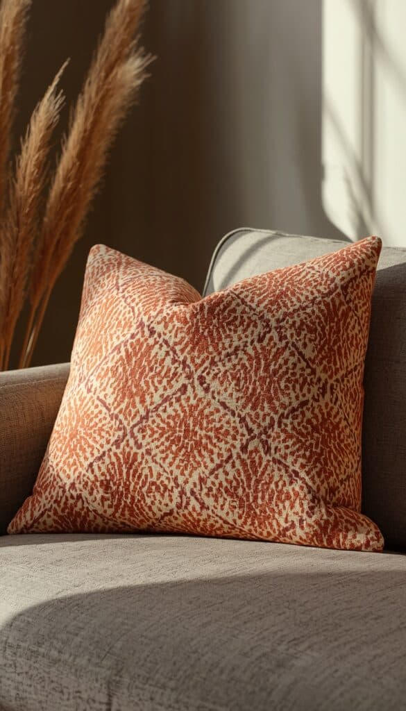
Mudcloth inspired prints, with their geometric, hand drawn quality and warm earth toned patterns, bring genuine visual complexity into a fall arrangement without relying on specifically seasonal imagery like leaves or pumpkins. I use these specifically for a more collected, boho leaning fall aesthetic, pairing them with solid texture forward covers rather than other patterned pieces that would compete visually with the mudcloth’s strong graphic quality.
The colorway within the mudcloth pattern matters significantly for whether it reads as fall appropriate. I look specifically for versions in cream on rust, cream on brown, or black on warm oatmeal, since these tonal combinations feel grounded and autumnal without looking like a deliberate fall decoration. Avoid mudcloth prints with cooler, more blue toned backgrounds specifically for this seasonal application.
Fabric quality varies considerably in this category specifically, since the mudcloth inspired pattern has been applied to everything from quality woven cotton to thin printed polyester. I always check the fabric weight in hand before buying, since heavier woven versions with the pattern built into the fabric structure feel genuinely artisan and substantial, while thin printed versions can look cheap once they’re stuffed and the fabric pulls across the seams.
11. Choose a Plaid Flannel Cover for Classic Fall Warmth
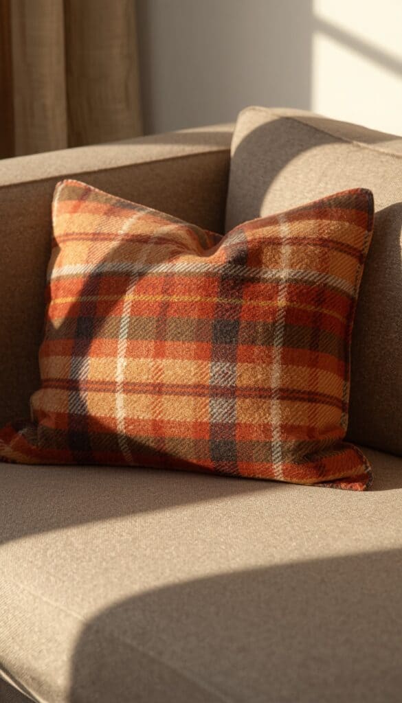
Flannel plaid brings a genuine warmth and familiarity to fall pillow styling that more formal fabrics simply can’t replicate, because the brushed surface of flannel has an almost inherently cozy quality before you even consider the pattern. I look for a plaid that combines at least three tones, a deep background with two accent colors woven through it, since this complexity gives a plaid cover visual depth that a simpler two color check doesn’t quite achieve.
Colorway selection within plaid should anchor to your room’s existing palette rather than starting fresh. I check whether the plaid’s background color coordinates with my sofa’s neutral tone before buying, since a plaid that clashes with the sofa fabric itself looks accidental rather than intentional regardless of how well it might work in isolation.
Flannel’s brushed surface does attract lint and pet hair more readily than smoother fabrics, which is an honest trade off worth knowing before committing to this cover type for a high traffic sofa. I keep a fabric brush specifically for these covers, doing a quick pass before guests arrive, since freshly brushed flannel looks genuinely rich and intentional while lint covered flannel undermines the whole cozy effect you’re working toward.
12. Use a Patchwork or Quilted Cover for Handmade Fall Character
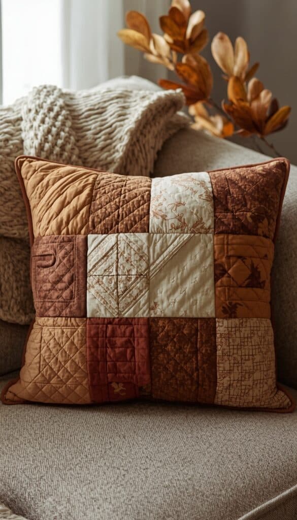
A patchwork or quilted pillow cover brings a handmade, heirloom quality into fall styling that printed or woven covers genuinely can’t replicate, because the visible stitching and pieced construction is itself part of the visual interest. I use these as statement pieces in an arrangement rather than multiples, since one strong quilted cover with personality does more than several matching ones that end up looking like a theme rather than a collection.
Colorway matters enormously for keeping patchwork feeling current rather than dated. I look for quilted covers that use a limited, coordinated fall palette, three or four tones maximum, rather than random multicolor patchwork that can read as visually chaotic in a modern living room. A patchwork combining rust, cream, and deep brown in simple geometric or square patches feels contemporary and grounded simultaneously.
Backing fabric and closure quality affect how well a quilted cover wears over a full season of daily use. I always check that the back panel uses a similar weight fabric to the front, since a lightweight backing can pucker or pull against a heavier quilted front once the insert is inside. An envelope or zipper closure both work, though I personally prefer a zipper specifically for quilted covers that I’ll launder mid season.
13. Add a Faux Suede Cover in Caramel or Tan
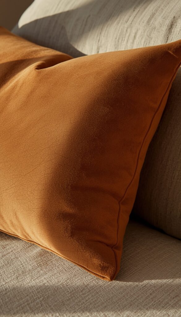
Faux suede pillow covers bring a smooth, matte warmth into fall arrangements that sits beautifully beside chunkier, more textural covers without competing with them. The soft, slightly napped surface absorbs light rather than reflecting it, which creates a quiet, grounded presence in an arrangement that busier textures often need beside them for visual balance. I use caramel and tan specifically because these tones echo natural leather and dried grass in a way that feels genuinely autumn appropriate.
Faux suede’s durability surprises people who expect it to show wear quickly. Quality faux suede holds up remarkably well to daily use and wipes clean relatively easily, making it one of the more practical fall cover options for households with children or pets. I always check that the suede surface has a consistent nap direction before buying, since inconsistent nap creates visible color variation that can look like staining even on a brand new cover.
Sizing and insert firmness affect how faux suede covers look in practice. I use a slightly overstuffed insert specifically with suede covers, since the smooth, non-stretch surface shows insert flatness or lumpiness more clearly than a textured fabric that visually disguises minor filling inconsistencies. A quality down alternative insert two inches larger than the cover size creates the full, plump look this material requires to look genuinely luxe.
14. Try a Deep Teal or Moody Blue Cover for Unexpected Fall Depth
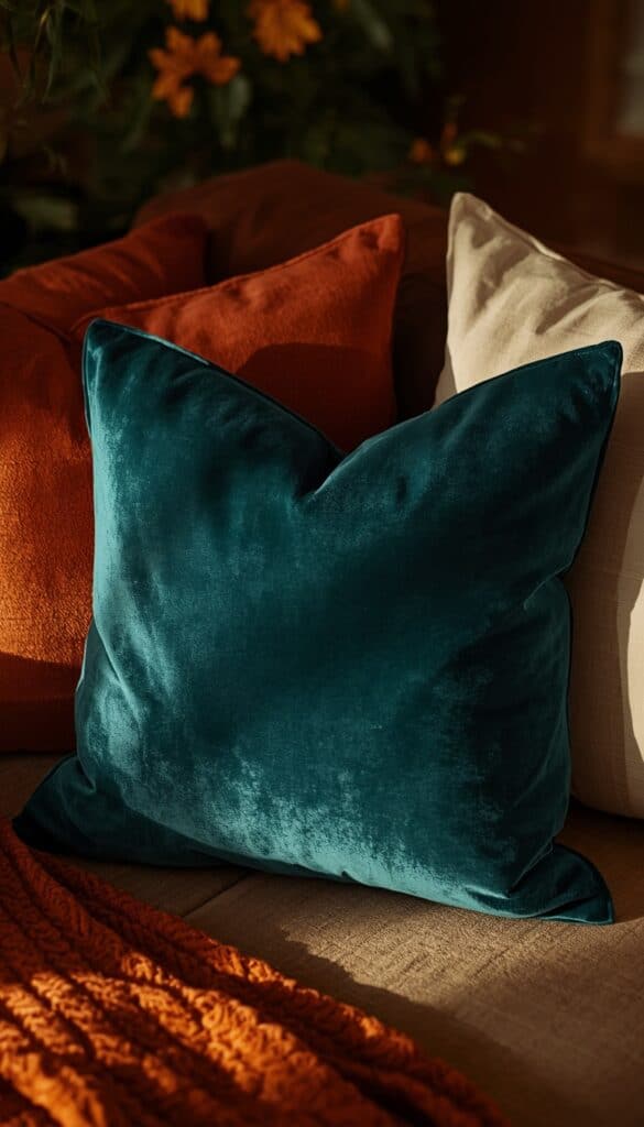
Deep teal and moody navy covers challenge the all warm fall palette in a way that genuinely elevates a room’s seasonal look beyond the expected. I use these specifically as the grounding tone in an arrangement that otherwise leans warm, since the cool depth of a deep teal actually makes adjacent rust and burnt orange covers appear richer and more vibrant through color contrast rather than color harmony.
Fabric choice significantly affects how a cool tone reads in a warm fall context. I choose velvet or a textured woven for this shade specifically, since the material’s warmth softens the cool color temperature enough to keep it feeling cozy rather than cold within an otherwise autumnal arrangement. A flat, smooth fabric in the same deep teal tends to feel slightly clinical rather than the moody, atmospheric quality you’re actually going for.
This cover type requires the most intentional placement within a fall arrangement compared to the warmer tones on this list. I always position it as one of the back pillows rather than the front lumbar or center piece, letting it provide depth and contrast from behind while warmer tones take the visual lead in the foreground of the whole composition.
15. Use a Printed Botanical or Acorn Pattern for Subtle Seasonal Nod
A printed botanical or acorn pattern cover gives you a genuinely seasonal design without the visual heaviness of a large scale pumpkin or leaf print that can sometimes read as more Halloween decoration than considered home styling. I look for prints where the botanical imagery is scaled small to medium, scattered across the fabric rather than large and centered, since this scale keeps the pattern feeling like texture from across the room rather than an obvious seasonal motif.
Background color carries the same weight as the print itself for how the finished cover reads in context. I choose prints on a warm cream, soft oatmeal, or muted rust background specifically, since these grounds immediately connect the pattern to an autumnal palette even before the actual printed motif registers consciously. A botanical print on a stark white or cool gray background can read as spring or generic rather than distinctly fall.
Pairing this printed cover with two or three solid texture forward covers in colors pulled directly from the print’s palette creates the most cohesive fall arrangement. I pull one or two accent colors from the print, match them to solid velvet or knit covers beside it, and let the printed cover serve as the palette anchor for the whole grouping. This approach works for any printed cover, but it’s especially effective here where the print itself sets the seasonal mood.
Bringing It All Together
Fall pillow covers earn their place in seasonal styling because they genuinely shift a room’s mood faster than almost any other single change. The difference between a room that feels like fall and one that simply has fall colors nearby usually comes down to texture, layering, and the specific combinations working together rather than independently. Every cover on this list comes from real arrangements I’ve built and adjusted through actual autumns, not just theory. You don’t need all fifteen to set the right vibe. Pick three or four that speak to your existing palette, layer them thoughtfully, and let your fall pillow covers do exactly the seasonal work they’re made for.
Frequently Asked Questions
Q: How many fall pillow covers should I use on a sofa? A: Most sofas look best with five to seven pillows total, using a mix of sizes, two large squares in back, two medium squares in the middle, and one lumbar up front. This odd number, varied size approach creates more visual interest than an even number of matching pillows lined up symmetrically across the whole sofa.
Q: What fabric is best for fall pillow covers? A: Velvet, linen, chunky knit, and flannel all suit fall styling particularly well, since each adds genuine warmth through both material and texture. Mixing two or three different fabrics within one arrangement creates more depth than using a single fabric type throughout, even when all the colors stay within the same seasonal palette.
Q: Can I mix patterns in fall pillow covers? A: Yes, but limit active patterns to one or two within any single arrangement, surrounding them with solid textured covers in coordinating colors. A plaid paired with a solid velvet and a chunky knit creates intentional variety, while three competing patterns together tend to read as visually chaotic rather than thoughtfully layered.
Q: How do I choose fall pillow cover colors if my sofa is gray? A: Gray sofas work beautifully with the full fall palette, since most autumnal tones, rust, burnt orange, deep green, caramel, contrast warmly against gray’s cool neutrality. I’d start with one rust or burnt orange cover as the anchor, then add a cream or oatmeal texture beside it, and finish with a deeper tone for grounding.
Q: What size pillow inserts work best with fall covers? A: Using an insert one to two inches larger than your cover size creates a full, plump appearance that looks more intentional and luxurious than a perfectly matched or undersized insert. This slight overstuffing prevents the flat, sad pillow look that undermines even genuinely beautiful cover fabrics during everyday use on a sofa.
Q: Are faux fabrics like faux suede or sherpa good quality for seasonal pillow covers? A: Quality faux suede and sherpa covers are genuinely durable and practical, holding up well to daily use and washing better than some natural fabrics at similar price points. The key is checking fiber density and backing quality before buying, since thin or loosely constructed versions flatten quickly and lose exactly the texture that made them appealing initially.
Q: When should I switch out my fall pillow covers? A: Most fall pillow collections work well from early September through late November, transitioning into deeper, richer tones closer to December if you want to extend the seasonal feeling slightly longer. Swapping the lightest, most obviously autumn specific covers first, like printed botanicals, while keeping solid velvets and knits through early winter extends the useful life of the whole collection.