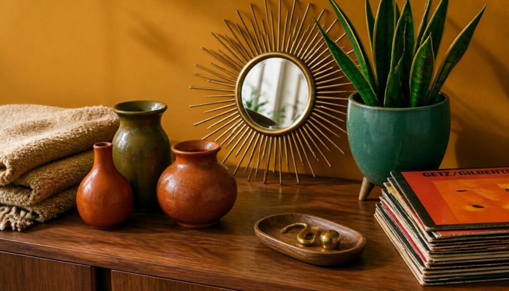
Mid century modern design has staying power for a reason. It’s not a fleeting trend chasing the next big thing. It’s a style built on honest materials, warm wood tones, and furniture that actually earns its place in a room. I’ve styled this aesthetic in tiny apartments and sprawling living rooms, and it works in both because the principles are simple: clean lines, organic curves, and nothing that feels fussy or overdone.
What makes mid century modern so satisfying to decorate with is the balance. It’s warm but not cluttered, retro but never costume-like, and minimal without feeling cold. These 14 ideas come from real styling experience, not a mood board scroll. Each one is something you can actually do this weekend, with details that matter and mistakes worth avoiding before you start.
1. Choose a Walnut or Teak Credenza as Your Anchor Piece
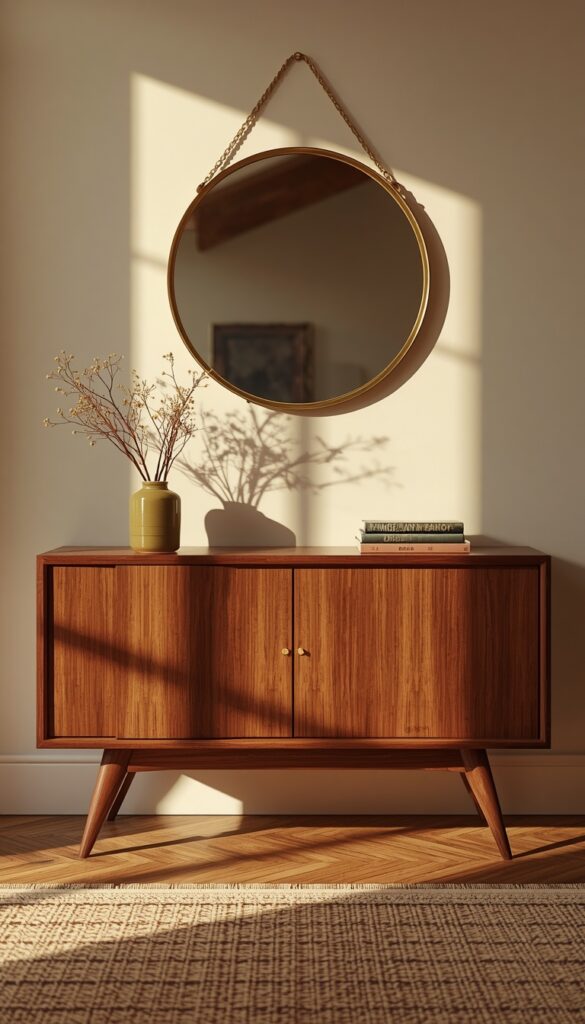
A low credenza in walnut or teak is the single most recognizable mid century modern furniture piece, and it works as a TV stand, dining buffet, or entryway storage. Look for tapered legs, often angled outward at the base, and clean horizontal lines across the front. Real wood veneer over solid wood construction was actually common in the original era, so don’t dismiss a piece just because it isn’t solid walnut throughout.
Hardware matters more than people expect here. Original mid century pieces favored recessed pulls, sculptural wood handles, or minimal brass accents instead of bulky modern hardware. If you’re restoring a vintage find, avoid stripping the original finish unless it’s genuinely damaged. A light coat of Danish oil often revives dull walnut better than a full refinish, and it preserves the patina that gives vintage pieces their character.
Placement makes or breaks the impact. Keep the wall behind it relatively clear, maybe one piece of art or a round mirror, so the credenza’s clean lines stay the visual focus. I always measure leg clearance before buying. Many credenzas sit on legs that are 4 to 6 inches tall, which means a rug underneath needs to clear the legs without bunching against them.
2. Add a Sculptural Accent Chair in Bouclé or Leather
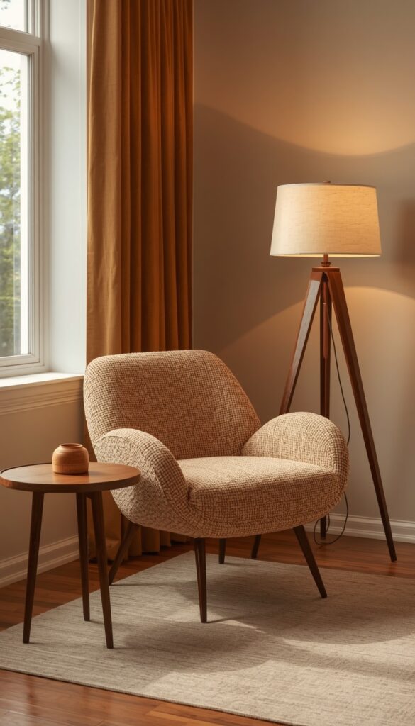
An accent chair is where mid century modern gets to show off its sculptural side. Look for curved backs, tapered wood legs, and a silhouette that feels like it could sit in a gallery. Bouclé upholstery has made a real comeback for this style, adding texture without competing with the wood tones already in the room. Leather, particularly in cognac or warm brown, gives the same era an accurate feel with a different tactile quality.
Scale is where most people go wrong. A mid century accent chair should feel light and slightly elevated off the floor, not bulky or overstuffed like a contemporary recliner. I always check the arm height too , original designs typically kept arms low, around 24 to 26 inches, to maintain that open, airy silhouette the style is known for. Bulky arms ruin the proportions instantly.
One chair placed at an angle, rather than squared off against a wall, creates a more dynamic conversation area. Pair it with a small round side table in matching wood tone and a single floor lamp with a tripod base for an instantly cohesive vignette. This combination works in a living room corner, a bedroom reading nook, or even a wide hallway with enough floor space.
3. Layer in Warm Walnut Tones Through Smaller Furniture Pieces
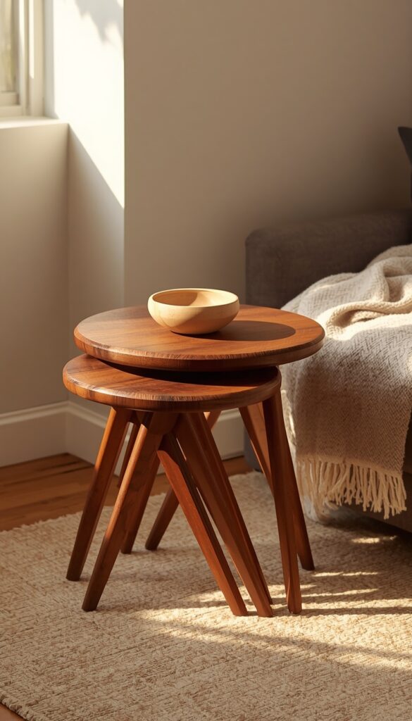
You don’t need a full room of vintage furniture to get the mid century look right. Warm walnut tones woven through smaller pieces , a side table, a record cabinet, a set of nesting tables , build the foundation just as effectively. The key is consistency. Mixing five different wood tones in one room reads as accidental, while sticking to one or two warm, medium toned woods throughout creates real cohesion.
Nesting tables deserve more attention than they get. A set of two or three round wood nesting tables, often with angled tripod legs, gives you flexible surface area without crowding a room. I use them constantly in smaller living rooms where a traditional coffee table would feel too bulky. Pull them apart for guests, tuck them back together when you need open floor space.
Pay attention to grain direction and finish sheen when buying separate pieces. A satin finish reads as more authentic to the era than high gloss lacquer, which tends to look more contemporary. If you’re buying new reproduction furniture rather than vintage, check the wood species listed. Genuine walnut and teak cost more but age beautifully, while cheaper wood veneer alternatives can look slightly plasticky under direct light.
4. Introduce Organic Curves Through Lighting Fixtures
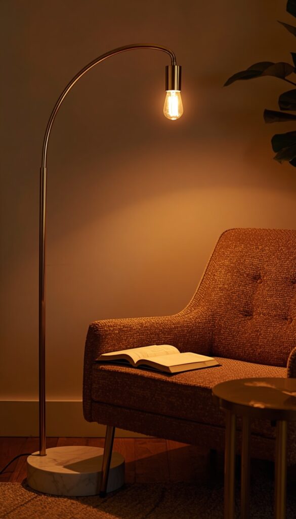
Mid century lighting design broke away from rigid, boxy shapes in favor of organic curves and sculptural silhouettes. A globe pendant, an arc floor lamp, or a table lamp with a tripod wood base instantly signals this era better than almost any other single element. I’ve swapped out a single overhead fixture in a dining room and watched the entire space transform from generic to genuinely styled.
Arc floor lamps deserve special mention because they solve a real functional problem. The curved arm extends over a sofa or chair, putting light exactly where you read or work without needing a side table underneath. Look for a heavy marble or weighted metal base, since lightweight versions tip easily when the arm extends fully over furniture. This is a detail people learn the hard way.
Bulb temperature changes everything about how these fixtures feel. A warm 2700K bulb gives that golden, nostalgic glow mid century spaces are known for, while cooler white bulbs make the same fixture feel sterile and modern in the wrong way. Brass, walnut, and smoked glass finishes on these fixtures all read as authentic. Avoid anything in chrome or stark white plastic, which feels more like 1990s office decor.
5. Use a Geometric Area Rug to Ground the Room
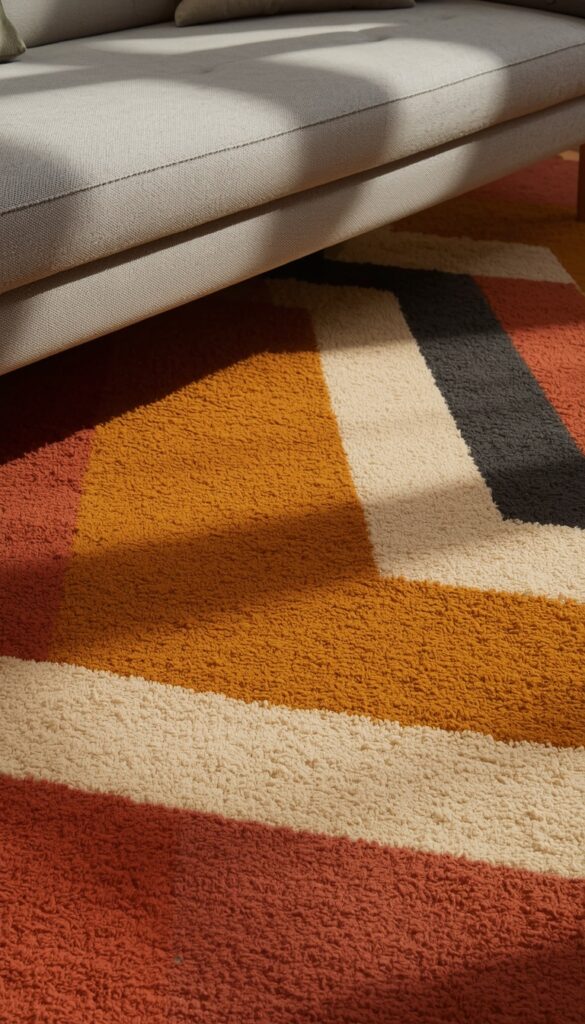
Mid century rugs lean into bold geometric patterns, abstract shapes, and a confident color palette rather than the muted, busy patterns common in traditional decor. Think mustard yellow, burnt orange, and deep teal paired with cream or charcoal backgrounds. A rug like this becomes a genuine focal point, not just a soft surface underfoot, which is exactly the point in this design style.
Wool is the traditional material here, and it holds color saturation better than synthetic blends, which matters enormously for these bold geometric patterns. A flat weave or low pile wool rug also keeps furniture legs visible, which is important since mid century furniture’s tapered legs are part of the visual appeal. A thick, plush rug tends to swallow that detail and hide the very feature you’re trying to show off.
Sizing follows the same rule as any living room rug: furniture legs should rest on top of it, not beside it. I typically recommend an 8×10 for an average living room with a credenza, sofa, and accent chair all needing to sit within the rug’s boundary. Anything smaller makes a confident, bold pattern feel cramped instead of intentional.
6. Display Studio Pottery and Ceramics on Open Surfaces
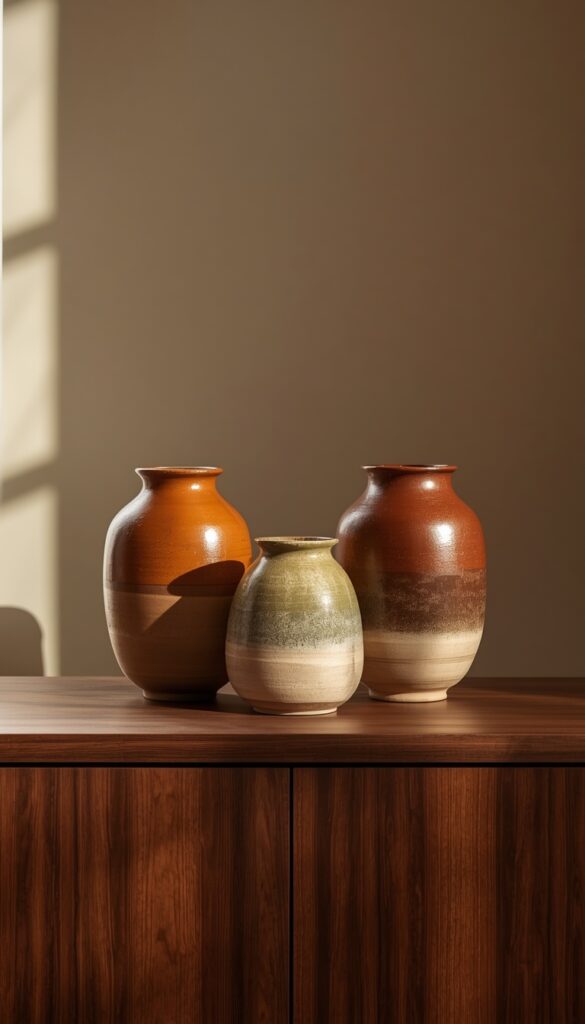
Studio pottery is one of the most underrated mid century styling tools, and it’s far more affordable than furniture if you’re building this aesthetic on a budget. Look for organic, hand thrown shapes in earthy glazes , burnt orange, olive green, warm brown , rather than perfectly symmetrical, machine made ceramics. Imperfection is actually the point here; it shows the human hand behind the piece.
Grouping matters more than any single piece. Three ceramic vessels of varying heights, clustered slightly off center on a credenza or shelf, reads as intentional and collected over time rather than bought as a matching set. I avoid uniform sets entirely. Real mid century collections were built piece by piece, often from different makers, and that visual variety is what makes a shelf feel authentic rather than staged.
Texture variation adds depth to a grouping that’s otherwise monochromatic in color. Mix a matte stoneware vessel with one glossy glazed piece and maybe a rough unglazed clay texture. Light from a nearby window or lamp catches each surface differently, which makes the whole arrangement feel richer. This trick costs almost nothing if you’re sourcing from thrift stores or estate sales.
7. Choose Tapered, Angled Legs on Every Furniture Piece
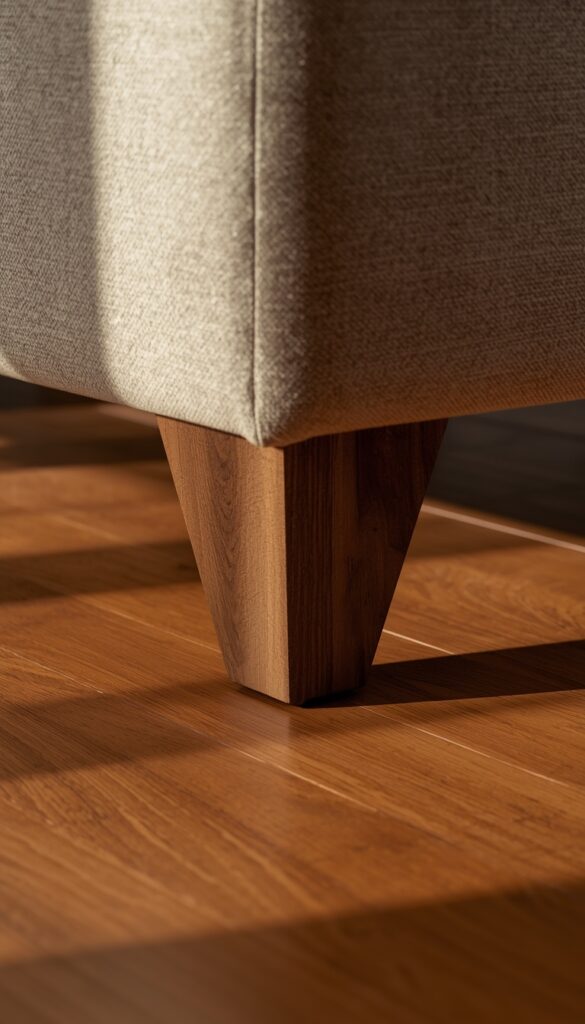
If there’s one visual thread that ties mid century modern furniture together, it’s the leg. Tapered, angled legs , often splayed outward at roughly 10 to 15 degrees , appear on sofas, chairs, credenzas, and tables alike. This detail lifts furniture visually off the floor, creating an airy feeling that’s the opposite of heavy, skirted furniture common in traditional design.
When shopping for new pieces, check the leg material and joinery closely. Solid wood legs, even on upholstered furniture, read as more authentic than the molded plastic look legs found on some budget reproductions. I always run my hand along the taper. A genuine wood leg has slight grain variation and weight to it, while a cheap composite leg often feels uniformly smooth and surprisingly light.
Consistency across a room ties the whole look together. If your sofa has tapered walnut legs but your coffee table has chunky square legs, the mismatch undercuts the cohesion you’re after. I’m not saying every leg needs to match exactly, but they should share a similar angle and wood tone. This single detail does more to unify a mixed furniture room than almost anything else.
8. Add a Sunburst or Starburst Mirror as a Focal Point
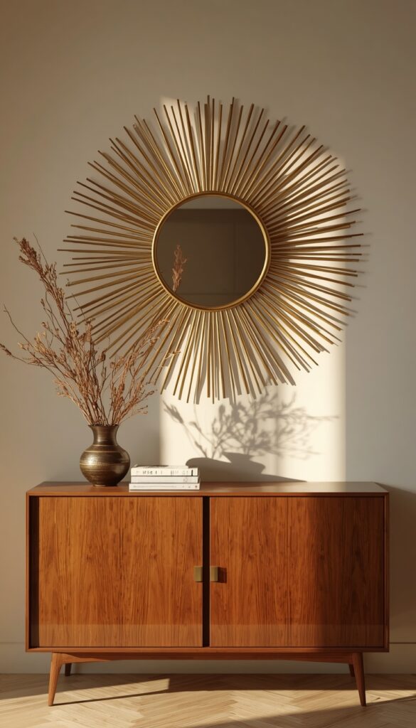
A sunburst mirror is mid century shorthand for confident, sculptural wall decor, and it works as a focal point above a credenza, a fireplace, or in an entryway. The radiating metal spokes, traditionally in brass or gold tones, catch light beautifully and add dimension to an otherwise flat wall. I’ve hung these in entryways specifically because the reflective surface also makes a small space feel brighter.
Size scaling matters here more than with flat artwork. A sunburst mirror needs breathing room around it, since the spokes extend well beyond the central mirror glass. I generally recommend leaving at least 12 inches of clear wall space on all sides so the radiating points don’t feel cramped against the ceiling, an adjacent doorframe, or nearby furniture.
Finish choice changes the mood significantly. Aged brass or warm gold feels more authentically vintage, while a matte black sunburst reads as a more contemporary, moodier take on the same shape. Either works within mid century styling, but mixing too many metal finishes throughout the room dilutes the effect. Pick one metal tone and repeat it through your lighting and hardware for real cohesion.
9. Bring in Warm Wood Paneling or a Slatted Wood Accent Wall
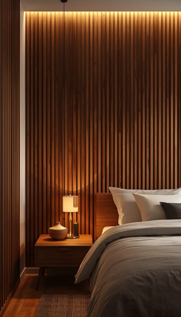
Wood paneling has a complicated reputation, mostly thanks to dated 1970s basements, but a slatted wood accent wall done right is genuinely one of the most striking mid century updates you can make. Vertical wood slats, evenly spaced with small gaps between them, create texture and rhythm on an otherwise flat wall. This works especially well behind a bed headboard or as a backdrop for a credenza and TV setup.
Spacing and slat width determine whether this reads as elegant or busy. I typically recommend slats between 2 and 4 inches wide with consistent gaps of about half an inch, mounted onto a plywood backing panel rather than directly into drywall. This approach also makes the whole panel removable as one unit, which matters enormously if you’re renting or might move it later.
Stain choice should echo the wood tone already present in your furniture. A warm mid tone walnut stain ties a slatted wall directly to a credenza or coffee table in the same room, creating a cohesive sightline. Avoid going too dark or too light relative to your existing furniture; mismatched wood tones in the same room are one of the fastest ways to undercut an otherwise well styled space.
10. Use Bold Color Blocking on a Single Accent Wall
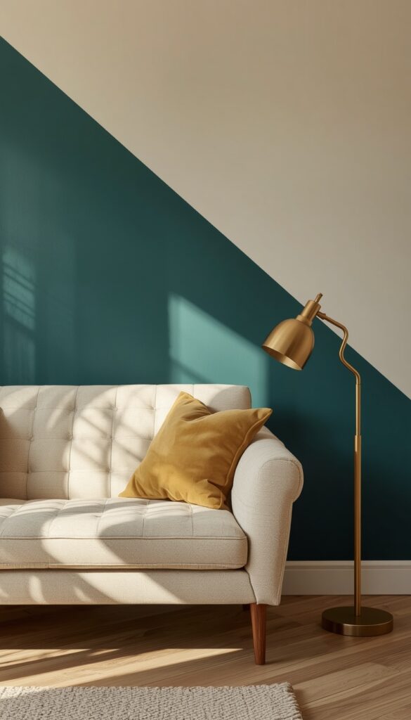
Mid century color palettes were confident, not muted. Mustard yellow, burnt orange, avocado green, and deep teal all show up repeatedly in original era interiors, and a single bold accent wall in one of these tones instantly signals the style without overwhelming the whole room. I always pair the bold wall with otherwise neutral surroundings; white trim, cream furniture, warm wood tones, so the color reads as a deliberate accent.
Sheen matters as much as color choice. A matte or eggshell finish feels more true to the era than a high gloss paint, which can look almost plastic under bright light. I’ve found that testing a paint swatch at different times of day genuinely changes the perceived color, especially with saturated tones like mustard or teal, since they shift noticeably under warm evening light versus cool morning daylight.
Pick the wall strategically. A wall behind a sofa, a dining room’s back wall, or the wall facing your entryway as you walk in all create immediate visual impact. I’d avoid color blocking every wall in a small room; it overwhelms the space fast. One confident wall, paired with the neutral furniture and warm wood tones already discussed, is genuinely enough.
11. Incorporate Brass or Walnut Hardware Throughout the Space
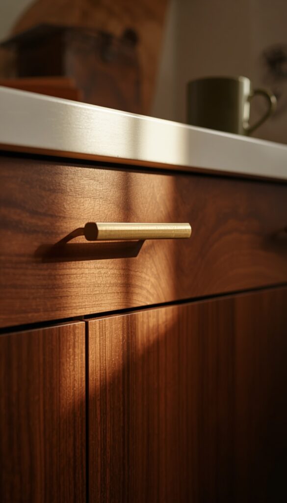
Hardware finish is a small detail that quietly ties an entire room together, and mid century design favored warm brass and walnut wood over the cold chrome and stainless steel common in other eras. Cabinet pulls, light switch covers, door handles, and even curtain rod finials all offer small opportunities to reinforce the aesthetic without major furniture investment.
I always recommend picking one primary metal tone, brass or matte gold typically, and repeating it consistently across a room’s hardware, light fixtures, and any decorative metal accents. Inconsistent metal finishes, a chrome faucet next to brass cabinet pulls next to a black light fixture, create visual noise that undercuts an otherwise well considered room, even when every individual piece is genuinely well chosen.
Budget wise, this is one of the most affordable updates on this entire list. Swapping cabinet knobs or a single light fixture costs far less than new furniture, yet the cumulative effect across a whole room is surprisingly significant. I’ve transformed kitchens and bathrooms almost entirely through hardware and fixture swaps alone, without touching a single wall, cabinet, or major furniture piece.
12. Add a Low Profile Sofa with Exposed Wood Legs
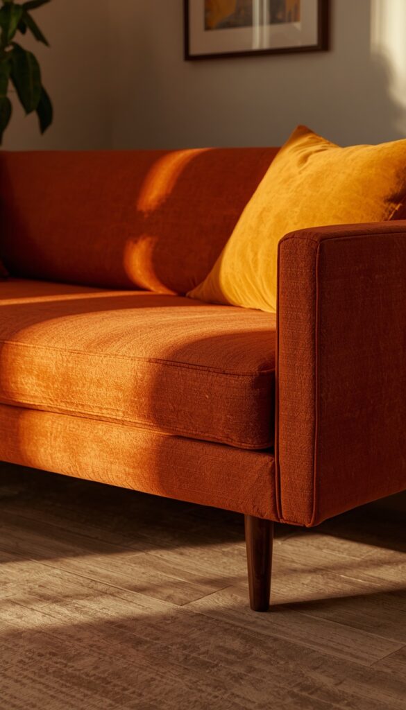
Mid century sofas sit lower to the ground than most contemporary options, typically with a seat height around 16 to 18 inches, and exposed tapered wood legs instead of a skirted base. This lower profile is part of what makes rooms in this style feel open and airy rather than heavy. Look for clean lined arms, either completely absent or kept low and minimal, rather than rolled or overstuffed arm designs.
Upholstery choice affects authenticity significantly. Boucle, wool blends, and performance velvet in warm, muted tones like burnt orange, olive, or warm mustard all read as era accurate. I steer people away from heavily tufted or button back designs, which belong more to traditional or chesterfield styling than mid century. The cleaner, smoother the back cushion, the more accurate the silhouette.
Don’t overlook depth when shopping. Many mid century sofas have a shallower seat depth, often 30 to 32 inches, compared to today’s deep, lounge style sofas built for sprawling out. This shallower depth keeps posture more upright and the overall silhouette trimmer. If deep lounging comfort matters more to you than authenticity, that’s a fair trade off worth knowing about before you buy.
13. Style a Gallery Wall with Abstract or Minimalist Art
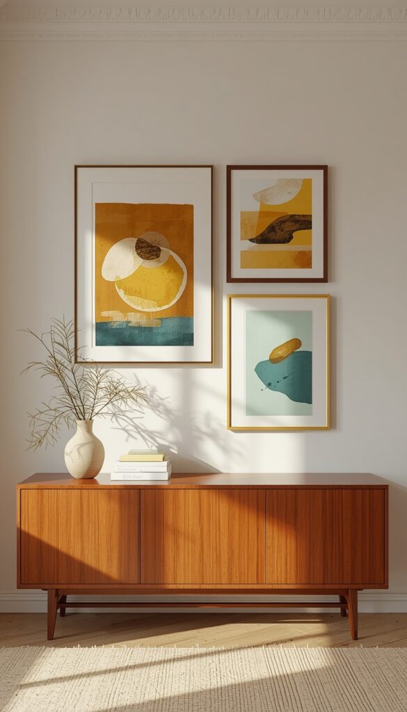
Mid century art favored abstract shapes, bold color blocks, and minimal, confident compositions over ornate or highly detailed imagery. A gallery wall built around this principle, rather than the eclectic mixed frame galleries common elsewhere, uses simpler frames in walnut wood or thin brass, letting the artwork itself carry the visual weight without competing frame styles.
I keep spacing tighter and more grid-like for this particular style, around two inches between frames, rather than the loose, organic clustering that suits more eclectic decor. The structured grid feels more intentional and echoes the clean lines found throughout mid century furniture. Three to five pieces in a horizontal row above a credenza or sofa works better than a large, sprawling cluster.
Color coordination between the art and the room matters more here than in most styles. Since mid century palettes are already confident and specific, mustard, teal, burnt orange, choose art that pulls from those same tones rather than introducing entirely new colors. This creates a cohesive sightline from your furniture to your walls, which is exactly the kind of intentional detail that separates a styled room from a randomly decorated one.
14. Add Greenery in Sculptural Planters with Tripod Stands
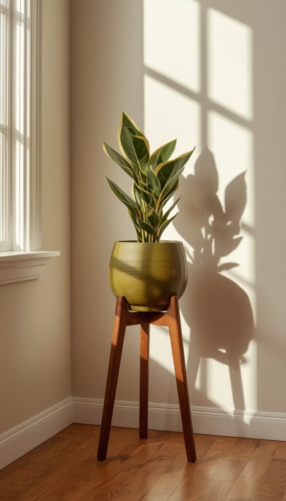
Plants softened the clean lines of original mid century interiors, and a tripod plant stand is one of the most recognizable ways to bring that detail back. Look for a wood tripod base, often walnut or teak, holding a round ceramic planter at roughly knee to waist height. This elevated styling lets a trailing or upright plant become genuine sculptural decor rather than just a plant sitting on the floor.
Plant choice should echo the era’s preference for bold, architectural foliage. A snake plant, a rubber plant, or a split leaf philodendron all have strong, graphic leaf shapes that suit this aesthetic far better than soft, wispy ferns. I’ve found upright plants with large leaves to photograph and style more successfully in this context, since their shape echoes the geometric confidence found elsewhere in mid century design.
Placement near a sunburst mirror, beside an accent chair, or filling an empty corner all work well, since the tripod stand itself adds visual interest even before the plant fills in. Choose a ceramic planter in a warm glaze, burnt orange or olive green, rather than plain terracotta, to keep the color story consistent with the rest of your mid century styling choices.
Bringing It All Together
Mid century modern decor rewards patience and intention more than quick purchases. Every piece on this list works because it follows the same underlying logic: clean lines, warm wood tones, organic shapes, and confident color used sparingly but deliberately. You don’t need to overhaul a whole room at once. Start with one anchor piece, a credenza or an accent chair, and build outward from there. The beauty of this style is how well it layers over time, piece by piece, the same way real mid century collections were originally built. Pick one idea from this list and give your space the warmth and character it deserves.
Frequently Asked Questions
Q: What defines mid century modern decor style? A: Clean lines, tapered wood legs, organic curves, and a confident but limited color palette define this style. It emerged roughly between the 1940s and 1960s, favoring function and simplicity over ornate detail. Warm woods like walnut and teak, paired with sculptural lighting and bold geometric patterns, are the clearest visual signals of authentic mid century design.
Q: Is mid century modern decor expensive to recreate? A: Genuine vintage furniture can be pricey, but the look itself doesn’t have to be. Studio pottery, hardware swaps, and a single well chosen lighting fixture create real impact affordably. Thrift stores and estate sales often hold authentic vintage pieces at a fraction of retail cost if you’re willing to search and wait.
Q: What colors work best in a mid century modern room? A: Mustard yellow, burnt orange, avocado green, and deep teal are the signature tones, typically paired with warm wood and cream or white backgrounds. These colors work best when used confidently in one or two spots, like an accent wall or a single sofa, rather than scattered evenly throughout an entire room.
Q: How do I tell if mid century furniture is real vintage or a reproduction? A: Check the joinery first; genuine vintage pieces often use dovetail joints and solid wood construction rather than glue and staples. Look underneath for manufacturer labels or stamps. Reproductions typically use lighter, more uniform wood with less natural grain variation, and hardware tends to feel noticeably lighter in the hand.
Q: Can I mix mid century modern with other decor styles? A: Absolutely, and many of the best rooms do exactly this. Pairing a mid century credenza with contemporary lighting or boho textiles creates a layered, collected look rather than a themed showroom. The key is keeping wood tones and metal finishes consistent so the mix feels intentional rather than accidental.
Q: What kind of lighting fits a mid century modern room? A: Sculptural shapes matter most here, think globe pendants, arc floor lamps, and tripod table lamps in brass or walnut finishes. Warm bulb temperatures around 2700K give that nostalgic golden glow the style is known for. Avoid stark white or cool toned bulbs, since they clash with the warm, earthy palette this style relies on.
Q: How small can a room be and still pull off mid century modern style? A: Even a small studio apartment can do this well, since the style’s lower profile furniture and tapered legs actually create more visual floor space than bulkier furniture would. Focus on one or two anchor pieces rather than filling every corner, and let negative space do real work in keeping a small room feeling open.