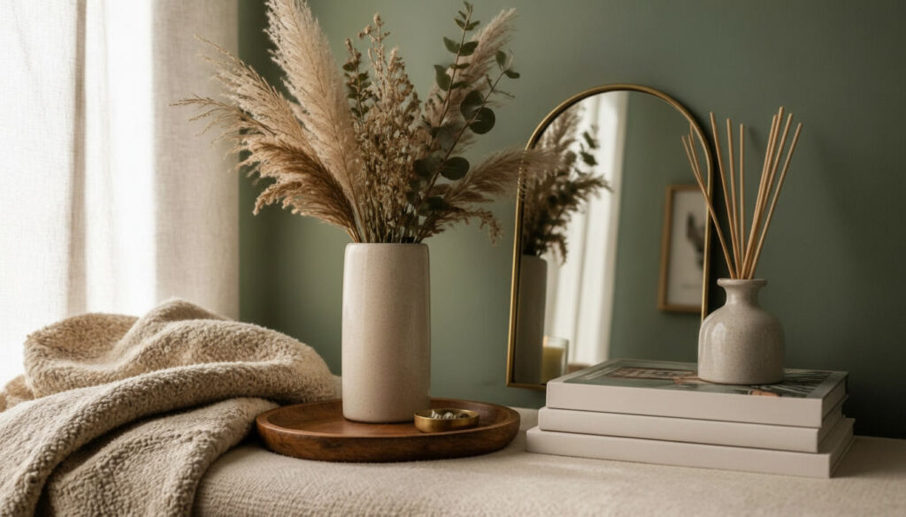
An aesthetic room isn’t about following one strict rulebook. It’s about creating a space that genuinely feels like you, down to the smallest detail. I’ve helped style rooms for people chasing everything from soft, dreamy minimalism to bold, maximalist color, and the throughline is always the same intention. Every object earns its place. Nothing just sits there by accident.
That’s really what separates an aesthetic room from a room that simply has furniture in it. The lighting, the textures, the way objects are grouped, all of it works together to create a mood you can actually feel when you walk in. These 16 ideas cover real techniques I’ve used myself, with the specific details that make the difference between a room that looks curated and one that just looks busy.
1. Layer Multiple Light Sources Instead of One Overhead Fixture
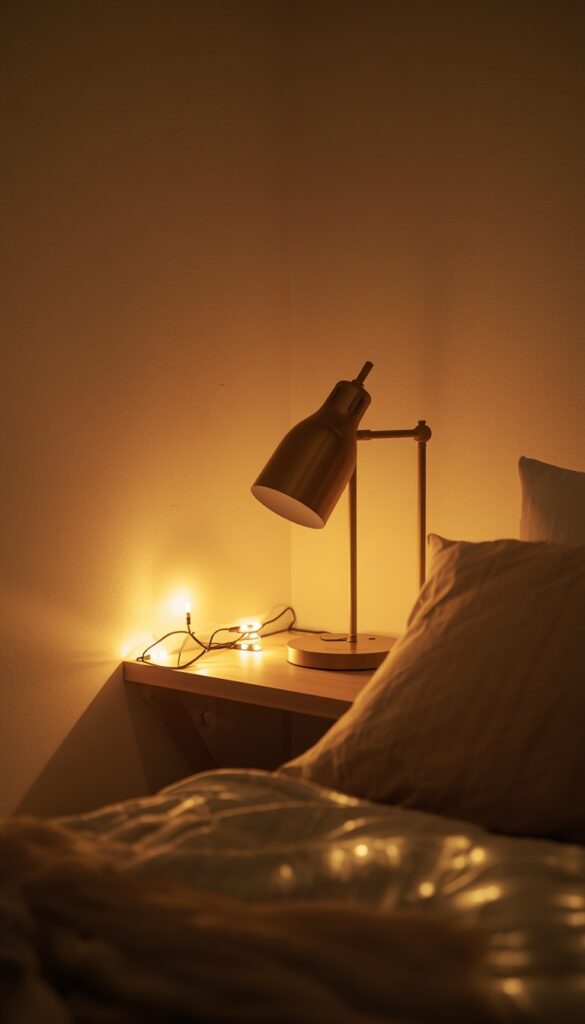
A single overhead light flattens a room and kills mood instantly, which is why aesthetic spaces almost always rely on layered lighting instead. I think in terms of three layers: ambient light from a floor or table lamp, task light for reading or working, and accent light for highlighting a specific object or wall. Stacking these layers creates depth that one bright ceiling fixture simply can’t replicate.
String lights get a bad reputation for looking juvenile, but warm white LED strings, tucked along a shelf edge or draped loosely behind a headboard, add genuine ambient glow without the dorm room feel. The trick is restraint and placement. Avoid draping them across an entire ceiling; instead, tuck them into one specific area so they read as intentional accent lighting rather than leftover holiday decor.
Bulb temperature ties every lamp together visually, even when the fixtures themselves look completely different from each other. I always stick to warm 2700K to 3000K bulbs across every lamp in a room, since mixing warm and cool bulbs creates a jarring, mismatched feeling the moment it gets dark. This one small consistency does more for mood than people expect.
2. Build a Color Palette Around Three Core Tones
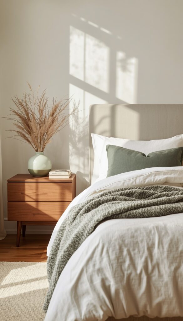
The fastest way to make a room feel chaotic is mixing too many colors without any real plan. I always start with three core tones: one neutral base, one accent color, and one deeper grounding shade. Everything you bring into the room, bedding, art, decor, gets checked against this palette before it earns a spot. This single discipline is the difference between curated and cluttered.
Texture does a lot of heavy lifting when your color palette stays simple. A cream base with a sage green accent and a deep walnut grounding tone still feels rich and layered when you add a bouclé throw, a linen curtain, and a woven basket, even though the actual color count stays low. Aesthetic rooms aren’t boring just because they’re disciplined with color.
I keep one rule firm: if you want to introduce a fourth color, swap it in through something small and easy to change, a candle, a vase, a single pillow, rather than committing through paint or large furniture. This way your palette can evolve seasonally without a full room overhaul every time your taste shifts even slightly.
3. Add a Tray to Corral Items on Every Flat Surface
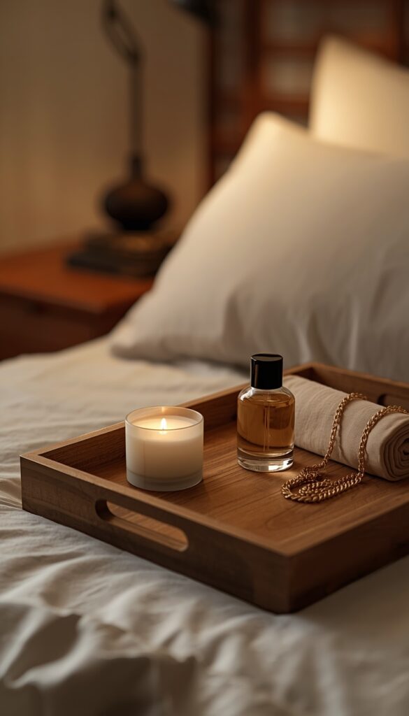
Loose items scattered across a nightstand, dresser, or desk are one of the fastest ways to undercut an otherwise well styled room. A simple tray, wood, ceramic, or woven, instantly groups everything together and creates the illusion of intention, even if what’s sitting on it is just your everyday clutter. I use this trick on every flat surface in a room, and it works every single time.
Material choice should echo something else already in the room. A wood tray ties back to wood furniture legs or a headboard, while a ceramic tray in a soft glaze can pick up a wall color or bedding tone. I avoid plastic or acrylic trays entirely in aesthetic spaces; they read as cheap and break the cohesive material story you’re building everywhere else in the room.
Function should drive what actually sits on the tray. A small candle, a perfume bottle, a folded piece of jewelry, things you reach for daily, work better than purely decorative objects that just sit there. I’ve found a tray with genuine daily use items that feels more authentic and lived in than one styled purely for photos, and it still looks intentional either way.
4. Hang a Curtain Behind the Bed Instead of a Headboard
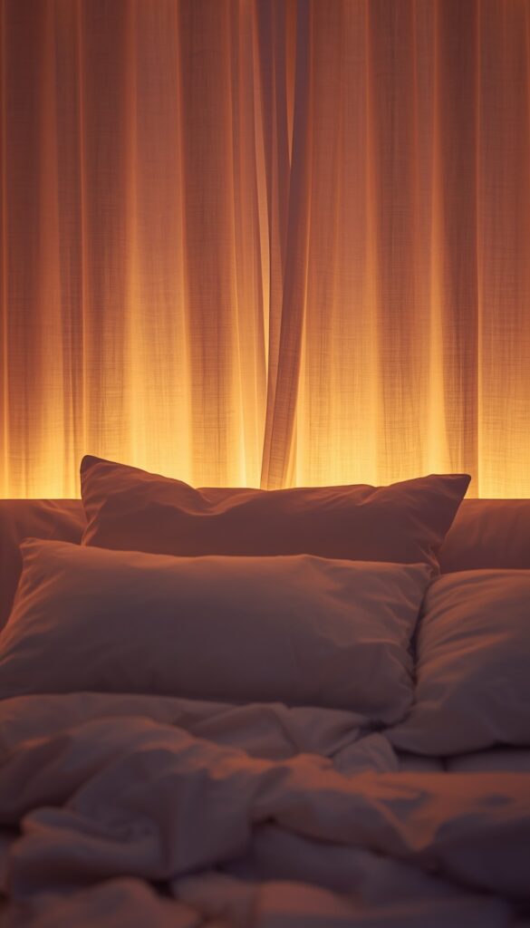
A fabric curtain hung behind a bed solves two problems at once: it adds softness to a plain wall, and it gives you headboard level visual impact without buying actual furniture. Mount a simple curtain rod or tension rod above and slightly wider than your bed, then let a linen or gauzy cotton panel hang loosely behind the pillows. The fabric pools softly at the floor or just brushes it.
Color and texture choice here should follow your core palette, but slightly sheer or textured fabrics work best for this specific technique. A heavy blackout curtain looks stiff and flat in this context, while linen or a lightweight cotton drapes with natural movement and catches light beautifully. I’ve used this trick in rental bedrooms specifically because it requires zero wall damage and travels easily when you move.
Lighting behind the curtain takes this from nice to genuinely striking. A warm LED strip light, tucked behind the rod and pointed toward the wall, creates a soft glow that filters through the fabric at night. This backlighting effect is subtle during the day and transforms the whole headboard wall into a soft, moody focal point once the sun goes down.
5. Style a Bookshelf by Color, Not by Genre
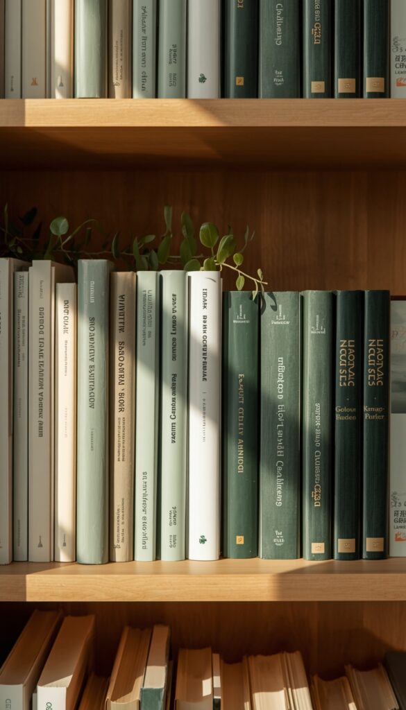
Color coordinated bookshelves get criticized sometimes for being impractical, and that’s a fair point if you’re constantly referencing your books. But for an aesthetic room where the shelf is also genuine visual decor, organizing by color creates a cohesive, almost art like effect that organizing by author or genre simply can’t replicate. I use this technique specifically on shelves that double as display pieces rather than working reference libraries.
Start by pulling your books into rough color groups, then arrange them so the transition between groups feels gradual rather than abrupt. A shelf moving from cream and white spines into soft sage and olive tones, then into deeper forest green, reads as intentional rather than random. Mixing in a few books spine in, showing the page edges instead, breaks up solid color blocks nicely.
Break up the books themselves with small decorative objects every twelve to eighteen inches, a small plant, a framed photo, a single candle. This prevents the shelf from reading as one solid wall of spines and gives your eye somewhere to rest. I genuinely think this is one of the most underrated styling tricks in aesthetic room decor, and it costs nothing if you already own the books.
6. Use a Statement Mirror to Add Light and Depth
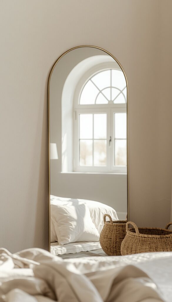
Mirrors do double duty in aesthetic decor: they bounce natural light deeper into a room, and the frame itself becomes genuine wall art. An arched mirror, a round mirror with a thin metal frame, or even an irregular organic shaped mirror all read as current and intentional, far more than the flat rectangular mirrors that came standard in most starter apartments.
Placement directly across from a window maximizes the light bouncing effect, which matters enormously in rooms with limited natural light. I’ve brightened genuinely dim bedrooms just by repositioning an existing mirror to face the window instead of an interior wall. This costs nothing and takes five minutes, yet it’s one of the most overlooked tricks in the entire aesthetic decor toolkit.
Frame finish should match your room’s existing metal tones rather than introducing a brand new one. If your lighting fixtures are warm brass, choose a brass framed mirror too. I avoid mixing more than two metal finishes in one room; gold, silver, and black all competing for attention reads as unplanned rather than the intentional, layered look most aesthetic rooms are going for.
7. Create a Reading Corner with a Floor Cushion or Papasan Chair
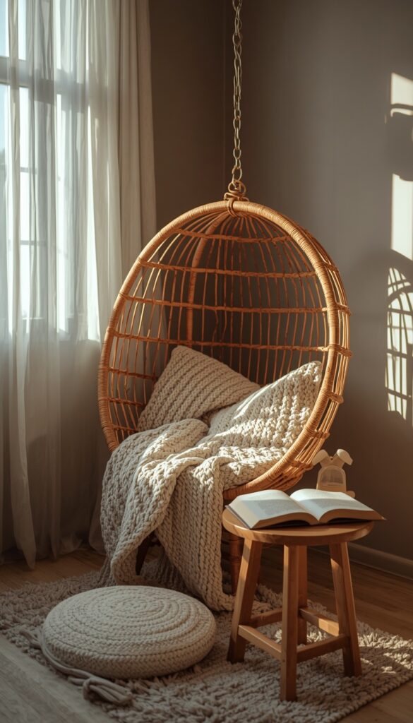
Every aesthetic room benefits from one cozy, low seating zone that invites you to actually sit and stay a while. A floor cushion, a papasan chair, or a low upholstered chair tucked into an underused corner gives the room a genuine destination beyond the bed or desk. I always pair this seating with a small side table or stool, just tall enough to hold a drink or a book within reach.
Texture is everything in this specific zone, since it’s meant to feel inviting rather than purely decorative. A chunky knit cushion cover, a faux fur throw, or a woven rattan papasan frame all add tactile warmth that photographs well and feels genuinely comfortable in person too. I steer away from smooth, slippery fabrics here; they look fine but don’t deliver the cozy feel this corner is meant to create.
Lighting this corner separately from the rest of the room makes it feel like its own little world. A small clip lamp, a string of warm fairy lights, or a tiny battery powered lantern placed nearby gives this zone its own soft glow in the evening. This detail is what turns a chair in a corner into an actual reading nook people want to use.
8. Add Textural Contrast Through Mixed Fabrics
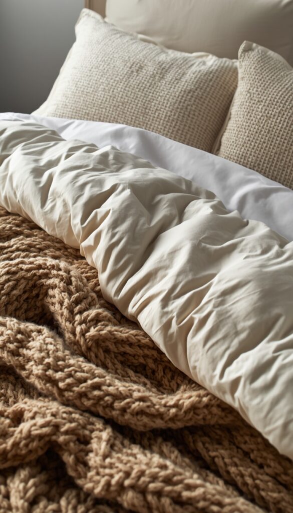
A room built entirely from smooth, similar fabrics feels flat no matter how good the color palette is. Aesthetic rooms thrive on textural contrast: pairing a chunky bouclé pillow with smooth linen sheets, or a faux fur throw against a woven rattan chair. I always check a room for at least three distinct textures before calling the styling finished, since fewer than that tends to feel one dimensional.
Bedding is the easiest place to introduce this contrast, since it’s a large surface area you’re already working with. A waffle knit duvet cover, a smooth sateen sheet set underneath, and one chunky knit throw folded at the foot of the bed creates immediate depth without adding a single new color to the room. This trick works in any palette, from soft neutrals to bold jewel tones.
I genuinely believe texture matters more than color variety for making a room feel rich and considered. A monochromatic room in five different textures consistently looks more expensive and intentional than a colorful room where every fabric has the same smooth, flat finish. This is one of the clearest signals of real styling experience versus a room that was simply furnished quickly.
9. Display a Personal Photo Wall with Consistent Framing
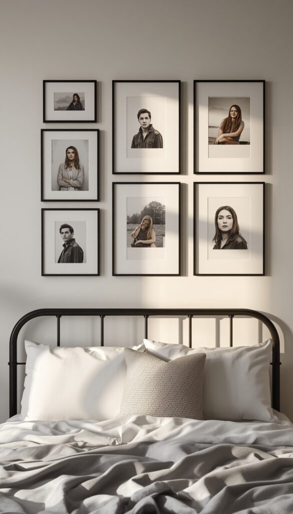
A photo wall feels deeply personal, but it can look chaotic fast if frames don’t share some kind of visual thread. I always pick one consistent element, frame color, frame material, or matting style, even when photo sizes and orientations vary. Thin black metal frames, or matching wood frames in one tone, instantly unify a wall of otherwise mismatched memories into something that reads as curated.
Spacing should stay consistent throughout the arrangement, roughly two to three inches between frames, even in a loose, organic layout. I plan every photo wall on the floor first, moving frames around until the balance feels right, before a single nail or adhesive strip touches the actual wall. This step alone prevents the lopsided, crowded on one side look that ruins so many photo walls.
Mixing in one or two non photo elements, a small print, a pressed flower in a frame, a tiny shelf holding a candle, breaks up a wall of identical rectangles and adds visual rhythm. I’ve found photo walls that include just one unexpected element feel noticeably more curated than walls made entirely of uniform framed photos lined up edge to edge.
10. Use a Canopy or Draped Fabric Above the Bed
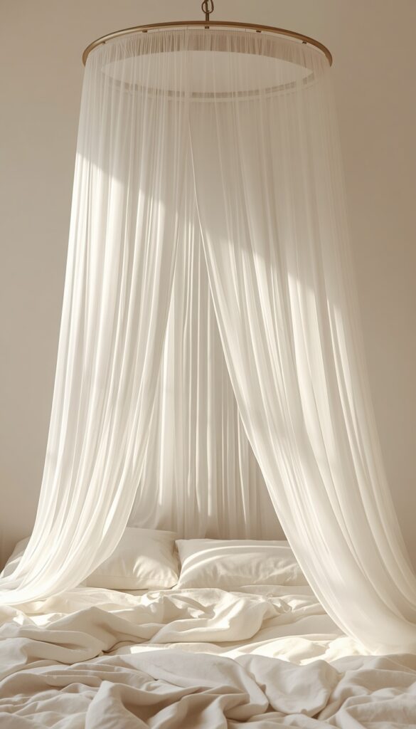
A draped canopy above the bed adds a soft, dreamy focal point that instantly elevates a plain bedroom ceiling. A simple metal hoop, mounted to the ceiling with a single screw or hook, holds sheer or lightweight fabric that drapes down around the headboard area. This technique works beautifully over both regular beds and daybeds, adding height and visual interest to a wall that would otherwise stay empty above the bed frame.
Fabric weight changes the entire mood of this styling choice. A heavy fabric pools dramatically and feels more romantic and traditional, while a sheer, lightweight gauze drapes airily and feels more current and ethereal. I generally recommend sheer fabric for smaller bedrooms specifically, since heavy draping can visually shrink a room that doesn’t have much ceiling height or floor space to spare.
Securing the hoop properly matters more than people expect once fabric is added, since wet or humid conditions can add unexpected weight to natural fiber fabrics over time. A single ceiling hook rated for at least ten pounds handles most lightweight canopy setups safely. I always test the hoop’s stability by gently tugging the fabric before considering the installation finished.
11. Build a Vanity or Makeup Corner with Dedicated Lighting
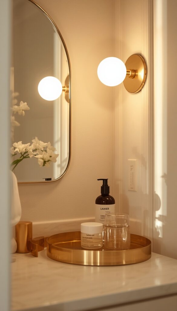
A dedicated vanity corner gives a room genuine function alongside its aesthetic appeal, and proper lighting is what separates a usable vanity from a purely decorative one. Ring lights have become popular, but a simpler option, two sconces or a string of round bulb lights mounted directly beside the mirror at eye level, gives more even, flattering light without the harsh, clinical glow a single overhead ring light often creates.
Storage at this corner should stay visible but organized, since aesthetic rooms favor open display over hidden clutter. A small tiered tray, a few glass jars, or a shallow ceramic dish for daily use items keeps the surface functional without looking messy. I always recommend grouping items by type, brushes together, skincare together, rather than scattering everything randomly across the available surface.
A small stool or chair completes this corner, and its style should echo something else in the room, the same wood tone, the same upholstery fabric as your accent chair. This consistency makes the vanity corner feel like a genuine part of the room’s overall design rather than a separate function awkwardly bolted onto an otherwise cohesive space.
12. Incorporate Dried or Preserved Botanicals for Low Maintenance Greenery
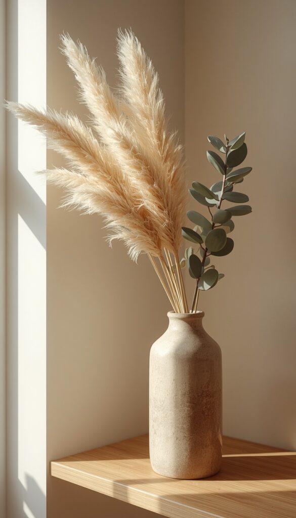
Fresh flowers are beautiful but short lived, and not every aesthetic room has the natural light a thriving plant collection actually needs. Dried and preserved botanicals solve both problems. Pampas grass, dried eucalyptus, and preserved bunny tail grass all hold their shape and color for months, sometimes years, with zero watering, zero sunlight requirements, and zero risk of dying in a dim corner.
Vessel choice affects how intentional this styling choice feels. A tall ceramic or glass vase in a neutral tone lets the dried texture do the visual work, while an overly ornate or busy vessel competes with the delicate, airy quality dried botanicals naturally have. I generally place these in a corner that gets some indirect light, even though they don’t strictly need it, since direct sun can fade the color over extended time.
Refresh the arrangement every few months by gently fluffing dried stems or rotating the vase, since dust accumulation is the real maintenance issue here, not wilting. A soft hairdryer on the coolest setting, held at a distance, removes dust effectively without damaging the delicate dried texture. This small bit of upkeep keeps the arrangement looking fresh far longer than people expect.
13. Add a Woven Wall Hanging for Texture Without Commitment
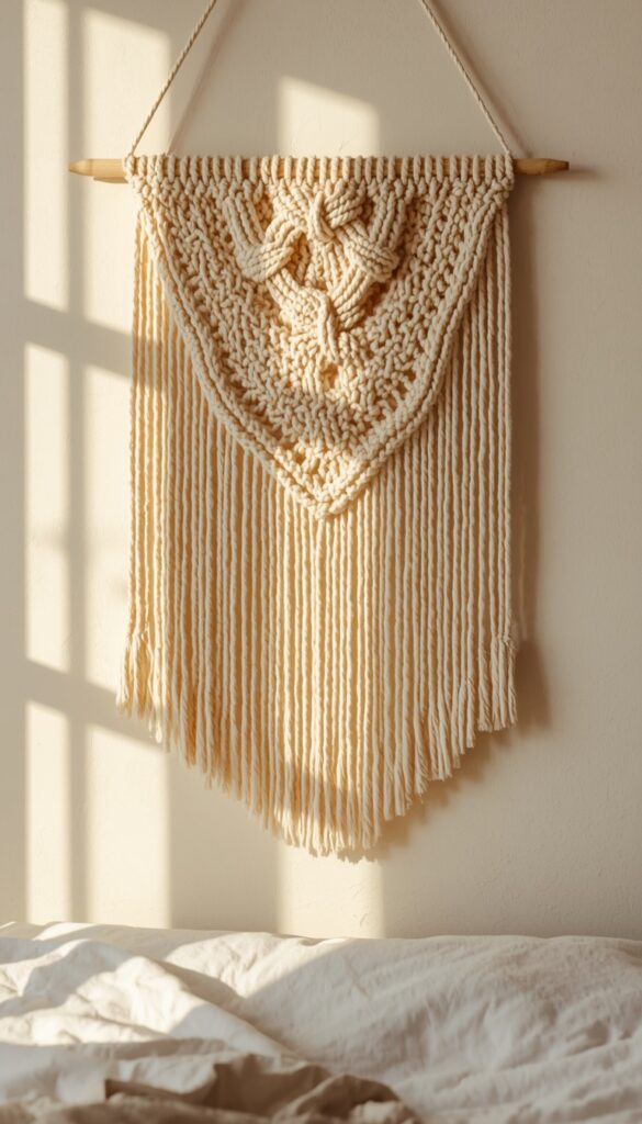
A woven wall hanging, whether a simple macrame piece or a more textural fiber art panel, adds genuine dimension to a flat wall without the commitment of paint or wallpaper. These pieces work beautifully above a bed, behind a desk, or filling an awkward empty wall that furniture doesn’t quite reach. I look for pieces with varied knot textures and a mix of fringe lengths, since uniform, flat weaving reads as less handmade and interesting.
Color choice should stay within your established palette, but natural, undyed fiber in cream or warm white actually works in nearly any color scheme, since it functions more like texture than color. A single dyed accent color woven through an otherwise neutral piece adds just enough interest without disrupting your room’s broader palette discipline.
Hanging weight is lighter than people expect, since most of these pieces are made from cotton rope or fiber rather than anything dense. A single nail or a small adhesive strip handles most wall hangings under three feet wide without issue. This makes it one of the easiest, most renter friendly texture additions on this entire list, with genuinely minimal installation effort required.
14. Use a Room Spray or Diffuser to Add a Signature Scent
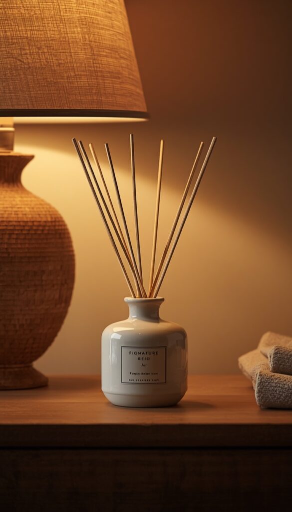
Aesthetic decor isn’t only visual, and a room with a consistent, intentional scent feels noticeably more finished than one that smells like nothing at all. A reed diffuser or a small ceramic ultrasonic diffuser placed on a nightstand or shelf adds ambient fragrance without the fire risk of a candle left burning unattended, which matters if you tend to fall asleep before blowing one out.
Scent choice should echo the room’s overall mood rather than just whatever smells nice at the store. Warm, woody notes like sandalwood or cedar suit cozier, earth toned rooms, while lighter floral or citrus notes suit brighter, airier color palettes. I always test a scent for a full week before committing to a larger diffuser bottle, since some fragrances that smell lovely in a store become overwhelming in an enclosed bedroom space.
Vessel matters here too, just like with botanicals. A ceramic diffuser in a glaze that matches your existing decor reads as intentional, while a mismatched plastic bottle undercuts the whole aesthetic. I keep my diffuser sticks trimmed to a consistent height and angled slightly outward in the vessel, since this small detail genuinely affects how evenly the scent disperses through the room.
15. Create Visual Rhythm with Repeated Shapes or Materials
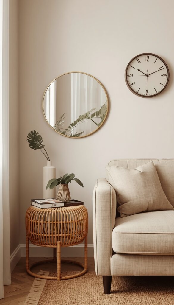
A room feels cohesive when certain shapes or materials repeat intentionally throughout the space, rather than every object being a completely different style fighting for attention. If your mirror is round, echo that curve in a round side table or a circular wall clock. If your nightstand is rattan, a rattan basket or pendant shade elsewhere ties the room together without forcing an exact matching set.
I call this visual rhythm, and it’s one of the clearest signals of intentional, considered design versus a room furnished piece by piece with no real plan. The repetition doesn’t need to be exact or obvious; subtle echoes are actually more sophisticated than an overly matched, showroom style room where everything is from the same collection. Aim for at least one repeated shape and one repeated material somewhere in every room.
Walk through your space and genuinely audit what’s already there before buying anything new. You might already own pieces that share an unintentional thread, and recognizing it lets you build outward more deliberately. I do this exercise with nearly every room I style, and it almost always reveals an easy, low cost way to tie existing pieces together more intentionally.
16. Style Your Desk as Both a Workspace and a Display
A desk doesn’t have to look purely functional to actually function well, and aesthetic rooms treat this surface as genuine decor real estate too. I divide desk space into thirds: one section for active work, like a laptop and notebook, one section for a small styled vignette, a plant and a candle, and one section kept intentionally empty for breathing room. This division prevents the surface from feeling like either a sterile office or total clutter.
Cable management matters more for the aesthetic than people initially think, since tangled cords undercut even the most beautifully styled desk vignette. A simple cable clip or a small woven basket tucked underneath the desk keeps charging cords and power strips out of sight without an expensive organization system. I always handle this before adding any decorative objects, since a tangle of cords ruins photos and daily enjoyment alike.
A small task lamp earns its place here functionally and aesthetically both, especially one with a warm bulb and a sculptural shape rather than a purely utilitarian clip lamp. I genuinely believe a well styled desk is one of the most satisfying corners of a room to get right, since you interact with it daily and the payoff in mood and motivation is immediate every single time you sit down.
Bringing It All Together
An aesthetic room comes together through small, intentional choices, not one big expensive purchase. Lighting, texture, color discipline, and a little visual rhythm do more heavy lifting than people expect, and the best part is you can build this look gradually, piece by piece, as your taste and budget allow. Every idea here comes from real styling experience, the kind of details that only show up once you’ve actually lived with a space and adjusted it over time. Your room doesn’t need to be perfect overnight. Pick one idea from this list, start there, and let your space grow into something that genuinely feels like you.
Frequently Asked Questions
Q: What makes a room feel aesthetic instead of just decorated? A: Intention is the real difference, every object earning its place rather than filling space randomly. A disciplined color palette, layered lighting, and repeated shapes or materials throughout the room create cohesion. Random, unrelated pieces, even individually beautiful ones, tend to read as cluttered rather than genuinely styled.
Q: How do I make my room aesthetic on a small budget? A: Focus on lighting first, since warm bulbs and layered lamps transform a room more cheaply than new furniture ever could. Dried botanicals, a tray for surface clutter, and rearranging existing items for better visual rhythm cost little to nothing. Small, consistent choices add up faster than people expect.
Q: What colors work best for an aesthetic bedroom? A: Soft neutrals like cream, sage, and warm beige work in nearly any style, but the real key is limiting yourself to three core tones rather than chasing every trending color at once. A disciplined palette with one accent shade always reads as more intentional than a room with five competing colors.
Q: How many string lights or fairy lights is too many? A: Restraint matters more than quantity here. One tucked accent, behind a headboard or along a single shelf, reads as intentional, while lights draped across every surface in the room start feeling chaotic and dorm-like. Pick one focal area and let that single placement do the visual work.
Q: Do I need expensive furniture to get an aesthetic room? A: Not at all, since texture, lighting, and styling choices matter more than price tags. A thrifted vase styled thoughtfully often looks better than an expensive piece placed carelessly. Most of the techniques that create real visual impact, trays, mirrors, layered lighting, cost relatively little compared to furniture.
Q: How often should I change my room’s aesthetic decor? A: Swapping small, easy pieces like pillows, candles, or a single accent color seasonally keeps a room feeling fresh without a full overhaul. Your core palette and furniture can stay consistent for years while smaller accessories evolve. This approach saves money and avoids the fatigue of constantly redecorating from scratch.
Q: What’s the difference between cozy aesthetic and minimalist aesthetic decor? A: Cozy aesthetic leans into texture, warm lighting, and layered soft objects like throws and cushions, while minimalist aesthetic favors negative space, fewer objects, and a more restrained color palette. Both rely on intention and quality over quantity, just expressed through different amounts of visual fullness in the final room.