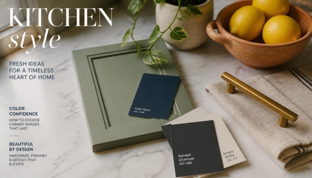
Cabinet color is the single biggest design decision you’ll make in a kitchen, full stop. It sets the tone for everything else, your countertops, your hardware, even how big or small the room feels once it’s finished. I’ve painted, refinished, and color consulted on more kitchens than I can count at this point, and I can tell you the cabinet color choice is almost always where people either nail the whole room or quietly regret it for years.
The good news is there’s no single “right” answer here. What works in a sun drenched farmhouse kitchen falls flat in a moody, low light galley space, and vice versa. These 14 ideas come from real kitchens I’ve actually worked on, with the specific details, sheen levels, undertones, pairing advice, that separate a color that photographs well from one that actually holds up to daily cooking and years of living with it.
1. Choose Warm White for a Timeless, Resale Friendly Look
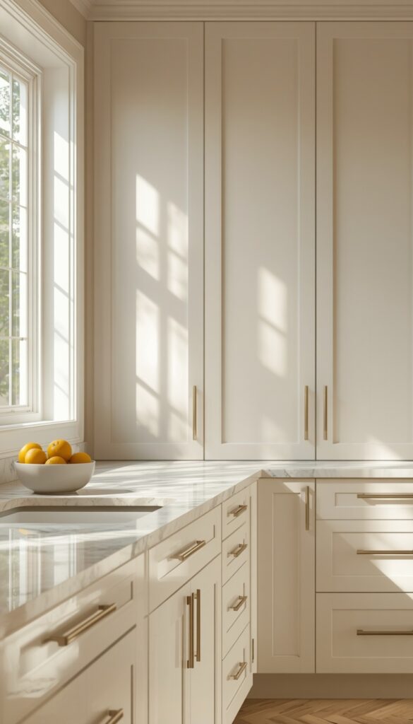
Warm white remains the single safest, most resale friendly cabinet color, and there’s real reasoning behind that reputation beyond just being trendy. A warm white with a slight cream or ivory undertone keeps a kitchen feeling soft and inviting rather than sterile, which stark, cool toned white can sometimes do under certain lighting. I always test samples under both daylight and evening lamp light before committing, since white shifts dramatically between the two.
Sheen choice matters enormously here, more than people expect when they’re focused purely on the color itself. A satin or semi gloss finish stands up to daily kitchen grease and water far better than a flat or matte finish, which shows fingerprints and stains faster around handles and edges. I generally steer clients toward satin specifically, since it balances durability with a soft, non clinical look that pure gloss can sometimes lack.
Pairing warm white with warm brass or aged gold hardware echoes the cream undertone beautifully, while matte black hardware creates more graphic contrast if that’s the direction you want. I’ve found warm white kitchens age remarkably well precisely because the color itself doesn’t read as trend driven the way a bold statement color eventually can after a decade of design cycles.
2. Go Bold with Navy Blue Lower Cabinets
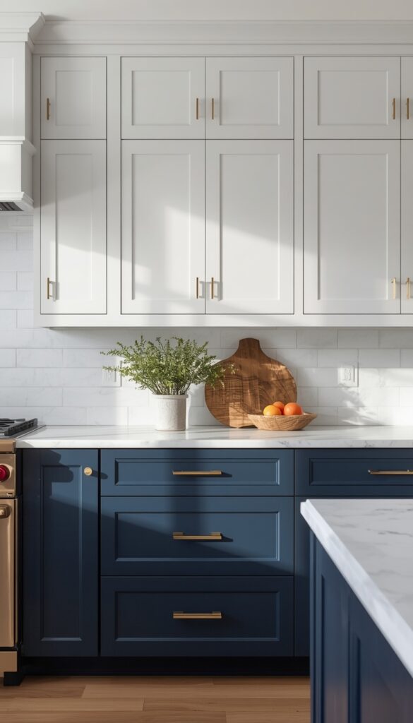
Navy blue lower cabinets, paired with white or cream uppers, deliver real visual weight without the commitment of a full dark kitchen. I’ve installed this combination specifically because the navy grounds the room, drawing the eye down and creating a sense of stability, while the lighter upper cabinets keep the space from feeling closed in or heavy overall.
Undertone matters significantly with navy, since some versions lean noticeably more green or purple depending on the specific pigment mix. I always test a large sample swatch directly against your actual countertop and flooring material before committing, since navy can shift surprisingly under different lighting conditions and clash with certain warm wood floors that read orange beside a cool toned navy.
Hardware choice changes the entire mood of a navy kitchen more dramatically than with lighter colors. Brushed brass against navy reads as warm, traditional, and collected, while polished chrome or matte black creates a crisper, more contemporary feel. I generally recommend brass for navy kitchens aiming for a classic look, and black for anyone wanting something sleeker and more modern in feeling.
3. Try Sage Green for Soft, Organic Warmth
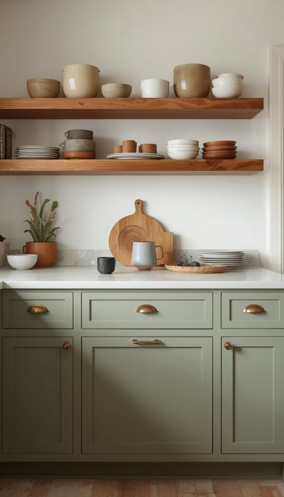
Sage green has become one of the most requested kitchen cabinet colors I work with, and it earns that popularity honestly. The muted, grayish green undertone reads as calm and organic rather than bold or trendy in the way a brighter kelly green might, which means it tends to pair beautifully with both warm and cool toned materials throughout the rest of the kitchen.
Lighting genuinely transforms how sage reads in a room, more than most colors on this list. In a kitchen with strong northern light, sage can lean slightly gray and cool, while southern or western light brings out its warmer, more olive undertones. I always recommend painting a large sample board and moving it around the actual kitchen at different times of day before committing to cabinets.
Sage pairs exceptionally well with warm wood open shelving, brass hardware, and a cream or off white countertop, creating a cohesive, nature-inspired palette throughout the whole room. I’ve also seen it work beautifully against black hardware for a slightly more modern, grounded look. Either direction keeps the overall feeling soft and livable rather than stark or overly styled.
4. Create Contrast with Two Tone Cabinet Colors
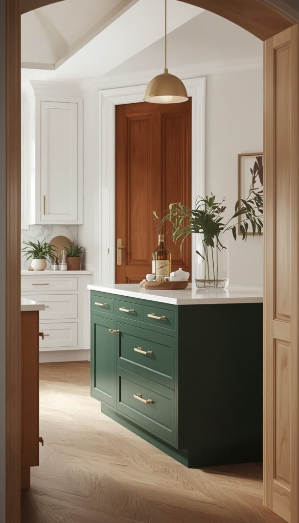
Two tone cabinets, typically a darker color on lower cabinets paired with a lighter color up top, add genuine visual interest without overwhelming the entire room in one bold choice. This approach also solves a real practical problem, since lower cabinets take more daily abuse from spills, scuffs, and general wear, and a darker color simply hides that wear better over years of regular use.
Choosing which colors to pair matters more than people initially think. I generally recommend keeping both colors within the same color family, a deep forest green with a soft sage, or staying neutral with a warm white paired with a contrasting island color, rather than combining two completely unrelated hues that compete for attention rather than working together.
The dividing line between the two colors should follow a clean architectural break, like where the upper cabinets end and the lower section or island begins, rather than an arbitrary split partway through a single run of cabinets. I’ve found this clean separation reads as far more intentional and professionally designed than a split that looks like leftover paint ran out mid project.
5. Use Charcoal Gray for Moody, Sophisticated Depth
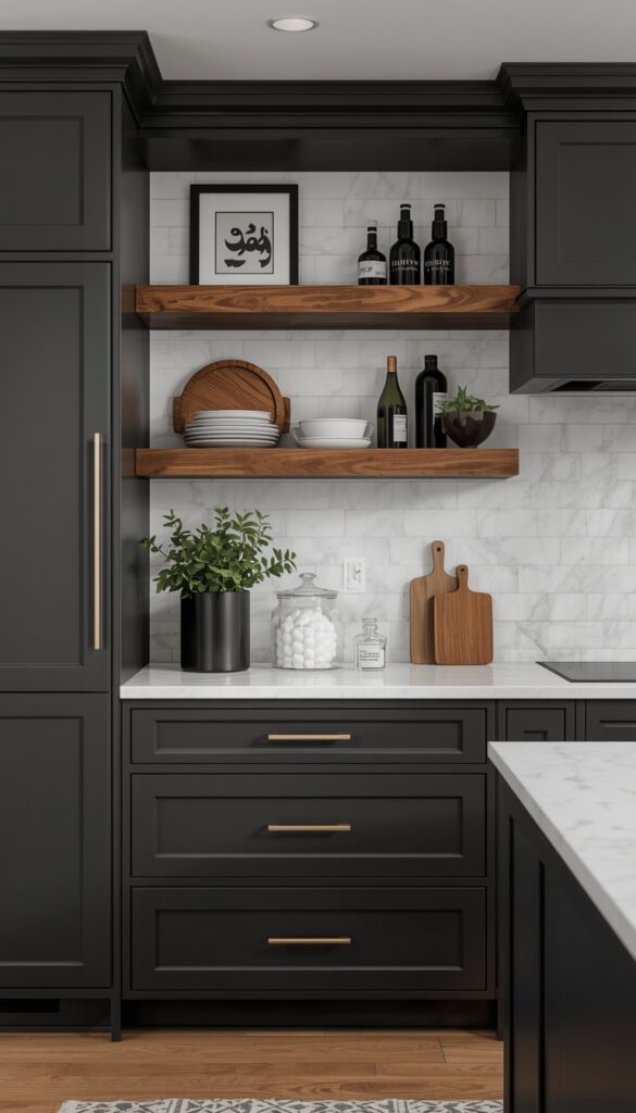
Charcoal gray cabinets bring genuine drama and sophistication to a kitchen without going fully black, which can feel overwhelming in smaller spaces or rooms without abundant natural light. The slightly softer depth of charcoal, compared to true black, still photographs beautifully and reads as current and intentional rather than severe.
Undertone testing matters enormously with charcoal, since some versions lean distinctly blue while others lean warm and almost brown. I always test a large swatch against natural daylight specifically, since charcoal’s undertone becomes much more obvious in bright light than it does under warm evening lamp light, where most grays start looking fairly similar to the eye.
Countertop pairing requires real intention with charcoal cabinets, since the dark base needs enough visual relief elsewhere in the room to avoid feeling cave like. A white or light marble look countertop, paired with warm wood open shelving or a butcher block island, balances the depth of charcoal beautifully while keeping the overall kitchen feeling bright and livable day to day.
6. Choose Terracotta or Burnt Orange for Earthy Energy
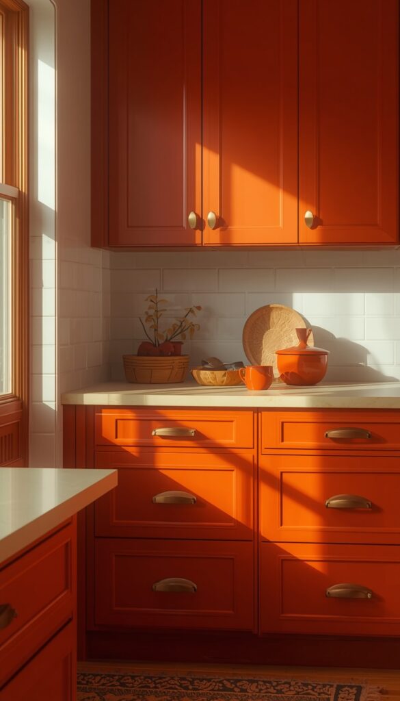
Terracotta cabinets bring genuine warmth and personality into a kitchen, and they’ve moved well beyond a niche, daring choice into a genuinely popular contemporary option. This earthy, muted orange red tone works beautifully because it reads as natural and grounded rather than bright or jarring, much closer to natural clay or sun baked brick than a true, saturated orange paint color.
I generally recommend terracotta for kitchens with abundant natural light, since the color can feel slightly heavy or dim in a room that relies mostly on artificial lighting throughout the day. South or west facing kitchens handle this color beautifully, letting the warm undertones shine rather than reading muddy under limited daylight hours.
Pairing terracotta with warm wood, brass hardware, and cream or white countertops creates a cohesive, earthy palette that feels intentional rather than overwhelming. I steer people away from pairing terracotta with cool gray countertops specifically, since the warm and cool undertones clash rather than complement each other, undercutting the cozy effect terracotta is meant to create.
7. Try Soft Blue Gray for a Calm Coastal Feel
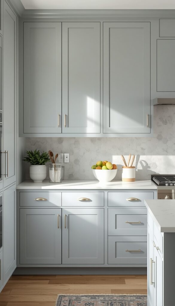
Soft blue gray cabinets bring a calm, airy quality to a kitchen that reads as fresh without tipping into a full coastal theme unless you want it to. This particular shade sits right between true blue and true gray, which makes it remarkably flexible since it pairs well with both warm and cool accent colors elsewhere in the room.
Sheen and undertone testing matter here just as much as with darker colors, since blue gray can shift toward looking flat or slightly green under certain artificial lighting. I always recommend a satin finish for this particular shade, since it catches light just enough to keep the color looking soft and dimensional rather than flat against a wall of identical cabinet doors.
This color pairs beautifully with brushed nickel or unlacquered brass hardware, and either a white quartz or a honed marble look countertop. I’ve used soft blue gray successfully in kitchens that get strong natural light from large windows, where the color reads bright and fresh, and in more modest light, where it settles into a calmer, more muted feeling overall.
8. Add Drama with Deep Forest Green Cabinets
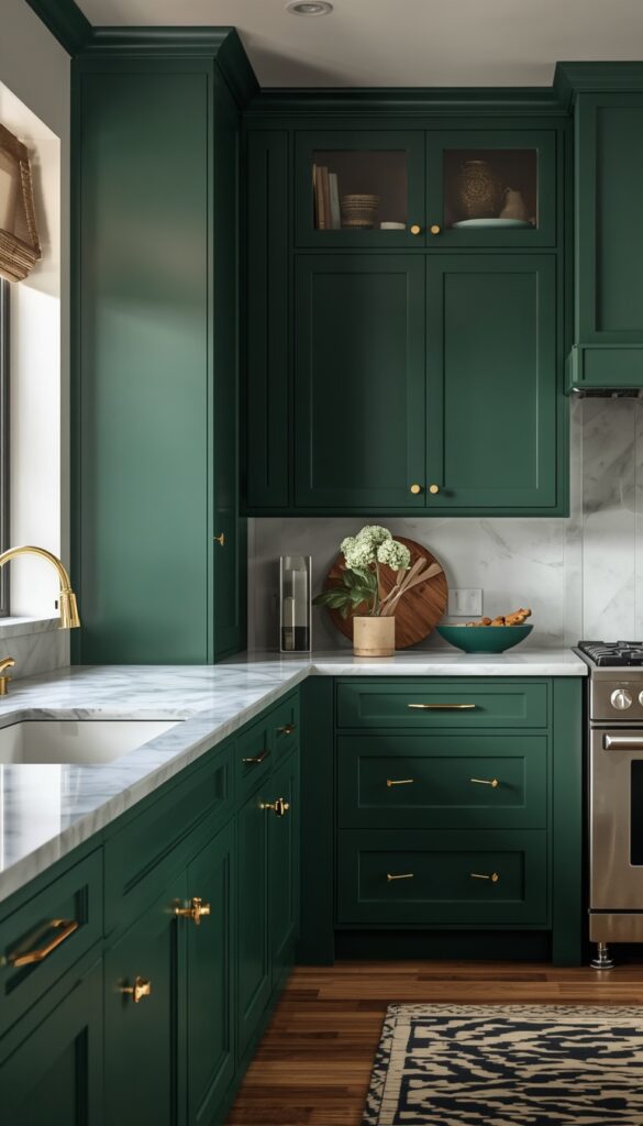
Deep forest green cabinets bring a rich, nature inspired drama that feels both classic and genuinely current right now. This isn’t the same muted sage green covered earlier; forest green leans darker and more saturated, closer to the color of pine needles or dense foliage, and it creates a much bolder, more dramatic statement throughout the kitchen.
I generally recommend forest green for kitchens with at least moderate natural light, since the color’s depth can read almost black in a consistently dim room without enough daylight or strong artificial lighting to bring out its genuine green undertone. Under the right lighting, though, forest green has a richness that few other cabinet colors can match.
Brass or unlacquered brass hardware against forest green creates a genuinely luxurious, almost old world feel, while matte black hardware pushes the same cabinets toward a more modern, moody direction. I always pair this color with a lighter countertop, white marble or a pale quartz, to keep the overall kitchen from feeling too heavy or closed in throughout the room.
9. Use Greige for a Flexible Warm Cool Balance
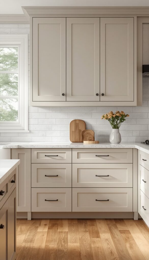
Greige, the blended gray beige tone that sits precisely between warm and cool, solves a real styling problem for people who genuinely can’t decide between gray and beige cabinets. This particular color shifts subtly depending on the room’s lighting and surrounding materials, leaning slightly warmer beside wood tones and slightly cooler beside white marble or steel appliances.
I recommend greige specifically for kitchens that need to coordinate with existing elements you’re not changing, like flooring or a backsplash already installed. Since greige sits in that flexible middle ground, it tends to harmonize with both warm wood floors and cooler stone countertops far more easily than a more committed, single direction gray or beige would manage on its own.
Hardware flexibility is genuinely one of Greige’s biggest advantages over more decisive colors. Brass, nickel, chrome, and matte black all work reasonably well against greige, which makes it an excellent choice if you’re updating cabinets now but might swap hardware again later. I’ve used this color specifically in kitchens undergoing renovation in phases for exactly this reason.
10. Choose Black for Sleek, High Contrast Drama
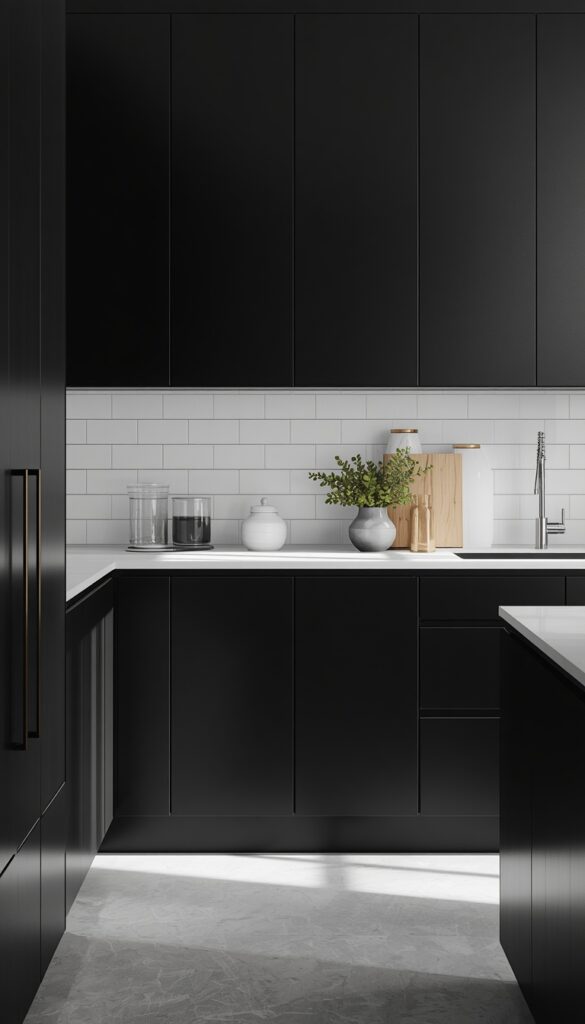
Black cabinets deliver maximum drama and contrast, and despite some hesitation people have about committing to such a bold, dark color, they genuinely work beautifully in the right kitchen. The key factor is light. A black kitchen needs strong natural light or excellent artificial lighting to avoid feeling like a cave, since black absorbs rather than reflects available light throughout the room.
I always recommend a satin or eggshell finish over high gloss black, since gloss shows fingerprints, water spots, and grease far more obviously under daily kitchen use. Satin still photographs beautifully and looks intentional, while genuinely holding up better to the realities of actual cooking and cleaning that a kitchen experiences every single day.
Pairing black cabinets with abundant white elsewhere, countertops, backsplash, walls, keeps the overall kitchen feeling balanced rather than oppressive. I’ve also seen black work beautifully paired with warm wood open shelving and brass accents for a richer, more layered look. Either direction needs that lighter counterbalance somewhere in the room to keep black from overwhelming the whole space.
11. Try Buttery Yellow for Cheerful, Vintage Inspired Charm
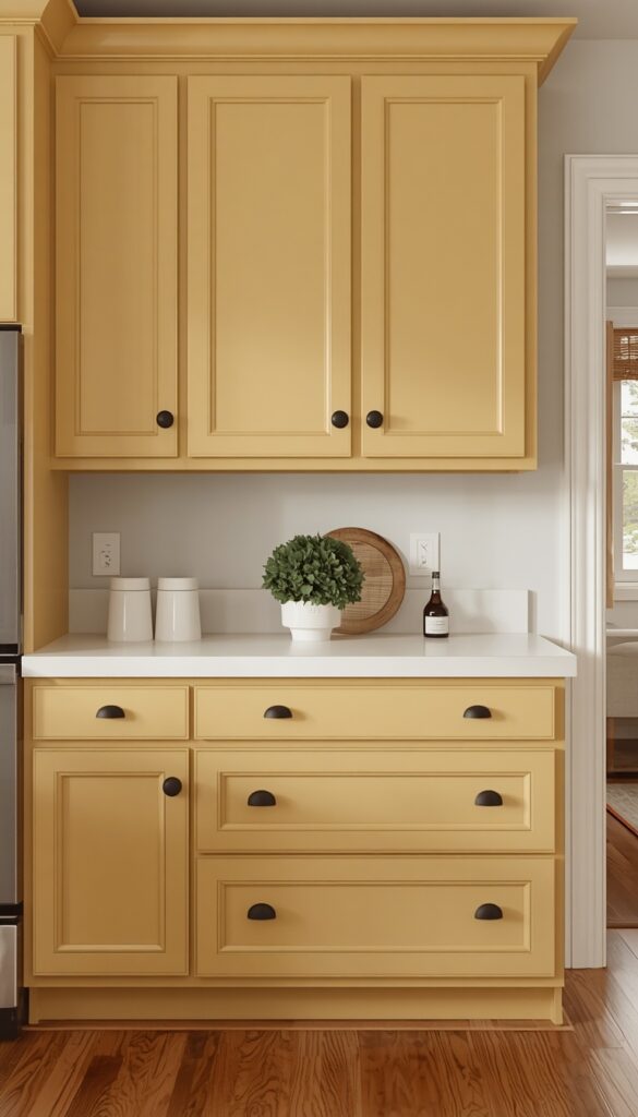
Buttery yellow cabinets bring genuine cheerfulness into a kitchen, and the muted, softened version of this color, rather than a bright, saturated yellow, reads as vintage inspired and warm rather than juvenile or overwhelming. I’ve installed this specifically in kitchens wanting that cozy, lived in farmhouse feeling without leaning into the more common white or cream that everyone already expects.
Undertone selection matters enormously here, since yellow can shift toward looking slightly green or slightly orange depending on the exact pigment formulation. I always test large swatches against the kitchen’s actual countertop and flooring, since a yellow that reads beautifully on a paint chip can clash unexpectedly once it’s surrounded by your home’s other existing warm or cool toned materials.
Black or aged brass hardware both work exceptionally well against buttery yellow, creating either a crisp, graphic contrast or a softer, more vintage collected feel depending on which direction you choose. I generally pair this color with warm wood floors and a simple white or cream countertop, letting the yellow itself remain the clear visual star of the whole room.
12. Use Olive Green for an Unexpected Earthy Statement
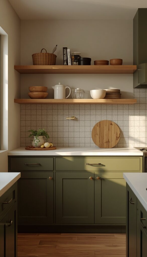
Olive green cabinets occupy a genuinely unique space between sage’s softness and forest green’s drama, landing on something earthier and more unexpected than either. This muted, yellow leaning green has gained real popularity recently precisely because it feels fresh and current without being a color everyone’s already seen in a dozen other kitchens online.
I recommend testing olive carefully against your existing flooring, since this particular green can occasionally clash with cooler gray toned floors in a way sage or forest green typically avoid. Warm wood flooring, by contrast, pairs beautifully with olive’s earthy undertone, creating a cohesive, grounded feeling throughout the entire kitchen rather than two competing color stories.
Hardware in warm brass or aged bronze echoes olive’s earthy quality far better than cool toned chrome or nickel, which can feel slightly jarring against this particular shade. I’ve paired olive most successfully with cream countertops and warm wood open shelving, creating a cohesive, nature inspired kitchen that feels intentional and considered rather than randomly trend chasing.
13. Choose Dusty Rose for Soft, Unexpected Warmth
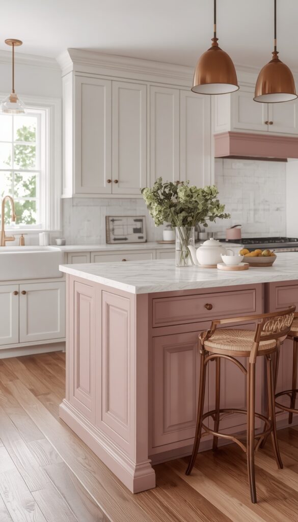
Dusty rose cabinets bring a genuinely soft, muted warmth that surprises people who assume pink automatically means overly sweet or juvenile styling. This particular shade, more mauve than true pink, reads as sophisticated and current when balanced correctly with neutral materials elsewhere in the kitchen, rather than the brighter, more saturated pink that can feel like a much bolder, more playful statement.
I generally recommend dusty rose specifically as an island or accent cabinet color rather than committing the entire kitchen to it, since this allows the color to feel like an intentional, confident choice rather than overwhelming the whole room. Pairing it with warm white perimeter cabinets keeps the overall kitchen balanced and prevents the rose from reading as too much in a large space.
Brass or warm gold hardware against dusty rose creates a soft, cohesive look, while matte black introduces sharper, more modern contrast if that’s the direction you’re after. I’ve found this color works particularly well in kitchens with warm wood floors and a simple white countertop, letting the rose remain a confident but balanced accent throughout the room.
14. Try Espresso Brown for Rich, Traditional Warmth
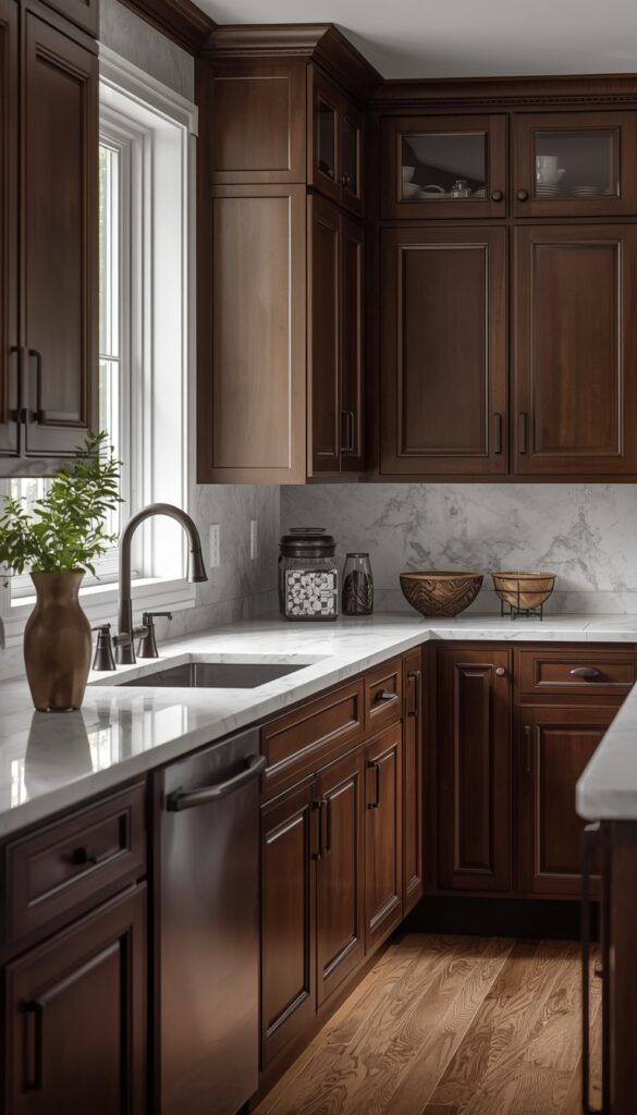
Espresso brown cabinets bring a rich, traditional warmth that’s remained genuinely popular for decades because the color works so reliably well with so many different materials and styles. This deep, warm brown reads as cozy and substantial rather than dated, especially in kitchens with abundant natural light to keep the overall room from feeling too dark or heavy throughout the day.
I always recommend balancing espresso cabinets with lighter countertops and backsplash materials, since an all brown kitchen with dark countertops too can feel noticeably cave-like regardless of how much natural light the room actually receives. White or cream marble look surfaces create the contrast espresso genuinely needs to read as rich rather than overwhelming.
Hardware choice matters significantly with espresso, since this warm brown pairs beautifully with brass or oil rubbed bronze for a traditional, cohesive feel, while brushed nickel creates a slightly more updated, transitional look. I’ve used espresso most successfully in kitchens wanting a warm, classic feeling that doesn’t chase passing trends but still feels genuinely current today.
Bringing It All Together
Choosing kitchen cabinet color comes down to honest self assessment about your lighting, your existing materials, and how bold you genuinely want to feel living with that choice every single day for years to come. Every shade covered here works beautifully in the right context, but none of them work everywhere, which is exactly why testing real samples in your actual kitchen matters more than trusting a photo online. The best kitchen cabinet color ideas balance your personal taste with the practical realities of your specific space. Take your time with this decision, test a few samples, and choose the color that genuinely makes you want to spend more time in your kitchen.
Frequently Asked Questions
Q: What is the most popular kitchen cabinet color right now? A: Warm white and sage green currently lead in popularity, since both feel fresh without being overly trendy or short lived. Navy blue and charcoal gray remain strong contenders for anyone wanting more drama. Honestly, the most popular choice for your kitchen specifically depends heavily on your natural light and existing materials.
Q: Do dark kitchen cabinets make a room feel smaller? A: Dark cabinets can feel closed in a room with limited natural light, but strong lighting and a lighter countertop balance this effectively. Charcoal or black cabinets in a bright kitchen with ample windows often photograph and feel just as open as lighter colors, since light availability matters more than the cabinet color alone.
Q: What color cabinets are easiest to keep clean looking? A: Mid tone colors, sage green, greige, soft blue gray, hide fingerprints and minor scuffs better than pure white or true black, both of which show every mark clearly. A satin finish also helps significantly, since it resists showing grease and water spots better than either flat matte or high gloss sheens.
Q: Should kitchen cabinets match the wall color? A: Cabinets don’t need to match walls exactly, and contrast often looks more intentional and considered than an all matching room. A neutral wall color, like warm white or soft gray, lets bolder cabinet colors stand out as the genuine focal point, while still keeping the overall room feeling cohesive and balanced.
Q: What’s the best cabinet color for a small kitchen? A: Lighter colors, warm white, soft sage, blue gray, generally make a small kitchen feel more open since they reflect available light rather than absorbing it. If you want a bolder color, consider it just on a small island or lower cabinets, keeping the majority of the kitchen in a lighter, space expanding shade.
Q: How do I choose between warm and cool cabinet colors? A: Look at your existing flooring and countertop undertones first, since these are usually the most expensive elements to change. Warm wood floors pair more naturally with warm cabinet colors, while cool stone countertops lean toward cooler shades. Greige offers flexibility if you genuinely can’t decide between the two directions.
Q: Are two tone kitchen cabinets still in style? A: Yes, two tone cabinets remain genuinely popular because they add visual interest without committing an entire kitchen to one bold color. Pairing a darker, durable color on lower cabinets with a lighter shade up top also solves the practical problem of hiding daily wear exactly where kitchens take the most abuse.