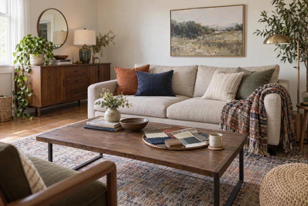
Liking several interior styles is not a problem you need to solve by choosing one label. A better approach is to identify the qualities you repeatedly respond to, check those qualities against your actual rooms and existing pieces, and test a small expression before making a larger purchase. The result can be a home with different influences and a clear point of view.
This process helps when your saved images range from relaxed to tailored or everyone in the household has a different favorite. It replaces a style quiz with evidence from your preferences, routines, fixed finishes, light, budget, and permissions.
Start with what you repeatedly like, not a style name
Named styles can be useful shorthand, but they are not diagnoses. You may like the calm palette of one room, the old-world furniture in another, and the clean lighting in a third. Treat those references as clues rather than instructions to reproduce an entire category.
Create a fresh visual collection using a method that suits you. You might save images digitally, clip pages from magazines, photograph details in places you visit, or gather your own material samples. Include complete rooms along with individual elements such as a chair shape, cabinet door, lamp, rug texture, artwork, or tile. The most useful images are the ones you would genuinely want to live with, not only the ones that look impressive on a screen.
For every image, make a short note. Do not write only “I like this.” Name the reaction:
- Prefer: the feature or overall feeling you would like to bring into your home.
- Uncertain: something attractive that may not suit your routine, room, or existing finishes.
- Avoid: the quality that feels wrong, impractical, too dark, too ornate, too stark, too busy, or too difficult to maintain.
Record the reason beside the reaction. Possible reasons include a warm or cool palette, a particular wood character, a curved or clean furniture line, a metal finish, a level of contrast, a period feeling, a soft or crisp texture, a pattern scale, or the amount of visual order. Also note the room’s light and atmosphere if those affect your response.
After reviewing the collection, circle qualities that appear more than once and cross out one-off attractions you would not want every day. This is not a test with a correct result. It separates lasting preferences from passing attractions and gives you language for choosing home decor when you like everything.
A style worksheet can be as simple as this sentence: “I prefer rooms that feel [your mood], with [your colors], [your materials], [your furniture shapes], and [your level of pattern]. I want to avoid [a quality] because [your reason].” Keep the notes available while you shop or discuss ideas with someone else.
Inventory what your home already contains
Before choosing a direction, walk through the home room by room. Record the furniture, objects, and finishes already doing visual work. A beloved table may be an anchor, while an unattractive but usable light fixture may be a temporary constraint. A damaged item may be a replaceable mismatch. An unknown condition, dimension, or installation history needs more information before you plan around it.
Include details that are hard or expensive to change: flooring, cabinetry, countertops, tile, trim, built-ins, windows, ceiling character, permanent lighting, and natural-light direction. Note what you cannot or do not want to change, and what might change later. Do not assume every existing piece should stay or every mismatch must go. The purpose is to make tradeoffs visible.
Use this blank inventory as a working document. Add rows for additional rooms and features as needed.
| Room | Existing item or fixed feature | Keep / adapt / relocate / replace / unsure | Why it matters to the preferred direction | Condition or limitation | What must coordinate with it? |
|---|---|---|---|---|---|
| Living room | Sofa, chair, case goods, art, rug, lighting | ||||
| Kitchen or dining | Table, seating, cabinetry, counters, hardware, lighting | ||||
| Bedroom | Bed, storage, textiles, lighting, window treatment | ||||
| Work or flex room | Desk, shelving, seating, equipment, lighting | ||||
| Other room | |||||
| Fixed features | Flooring, tile, trim, windows, built-ins, ceiling, permanent lighting |
As you fill it in, ask: Which item has meaning or visual weight? Which condition limits color or material choices? Which mismatch can wait? Which unknown needs a measurement, sample, landlord or association answer, designer input, or contractor assessment?
If you rent or live in a condominium, permissions are project-specific. Paint, window treatments, lighting changes, built-ins, flooring, plumbing, electrical work, and alterations that affect shared building elements may be treated differently by a landlord, property manager, condominium association, or local authority. Check the applicable documents and ask the responsible party before making a change. This article cannot determine whether a particular alteration is allowed or code-compliant.
Turn several preferences into a design North Star
Your goal is not a longer list of style labels. Synthesize the inventory and visual notes into a short, portable design North Star. It should describe observable characteristics that can guide a decision without becoming a rigid specification.
Write a few words under each heading:
- Feeling: calm, layered, lively, tailored, relaxed, warm, airy, collected, playful, or another word that describes how you want the room to behave.
- Palette: colors you want more of, colors you want to avoid, and the amount of contrast that feels comfortable. Consider the fixed finishes already in the room.
- Materials: the character of wood, stone, metal, glass, woven materials, painted surfaces, or other materials that keep appearing in your notes.
- Forms: clean or curved lines, substantial or slim upholstery, simple or ornamental details, cabinet character, leg shapes, and furniture profiles.
- Texture and pattern: smooth or tactile surfaces, quiet or graphic patterns, and whether you prefer restraint or visible layering.
- Light and atmosphere: how the direction should feel in the actual daylight and in the evening, when lamps and overhead fixtures may change the impression.
- Personal meaning: artwork, heirlooms, books, travel objects, collections, or other items that need a natural place.
- Avoid list: qualities that repeatedly feel wrong, impractical, too precious, too dark, too busy, or out of step with the home.
A North Star might read: “Warm, calm, and collected. Creams and softened greens with moderate contrast, medium-to-dark wood, aged-looking metal, rounded forms, tactile textiles, and quiet pattern. Avoid glossy surfaces, sharp black-and-white contrast, and delicate pieces.”
That statement is a filter, not a shopping list. If a beautiful item conflicts with several parts of it, pause rather than letting one exciting image redirect the whole room.
Compare candidate directions against real room conditions
Once you have recurring qualities, describe two or three plausible directions in plain language. “Quiet natural,” “tailored collected,” and “graphic eclectic” can be more useful than a long catalog of named aesthetics because they leave room for your own interpretation.
Compare each direction with how the room is actually used. A direction that looks appealing in a formal photo may be less comfortable when the room also handles eating, work, play, storage, guests, or hobbies. Consider mobility needs, cleaning routines, and the care your household can realistically provide. Record your own conditions rather than assuming a household profile.
Use qualitative entries rather than invented scores. Write strong fit, workable with changes, poor fit, or need more information, then add the tradeoff that led you there.
| Room / activity | Candidate direction | Daily-use fit | Upkeep and durability | Cost and sourcing | Permission / feasibility | Natural light | Existing / fixed-finish fit | Tradeoff or question to test |
|---|---|---|---|---|---|---|---|---|
| Living room / lounging, guests, media | ||||||||
| Kitchen or dining / cooking, eating, gathering | ||||||||
| Bedroom / rest, storage, dressing | ||||||||
| Work or flex room / focus, calls, hobbies |
For daily-use fit, ask whether the direction supports comfort, circulation, storage, work, cooking, rest, and entertaining. For upkeep and durability, identify surfaces or textiles needing frequent cleaning, careful handling, stain tolerance, repair, or replacement. For cost and sourcing, separate essentials from later choices and use your own budget, measurements, quotations, and availability checks.
For permission and feasibility, flag work involving paint, lighting, electrical changes, plumbing, built-ins, structural elements, shared walls, or flooring. A qualified professional may be needed for project-specific installation, safety, accessibility, or building questions. Observe the room’s actual light rather than treating online images as proof, and describe fixed-finish conflicts honestly. An adaptation may work, or a purchase may need to wait.
This companion table helps clarify the decision without turning it into a ranking exercise.
| Candidate direction | What it solves | What it asks you to give up or delay | Best room to test first | Unresolved question |
|---|---|---|---|---|
| Direction A | ||||
| Direction B | ||||
| Direction C |
The strongest direction is not necessarily the most photogenic board. It is the one that fits the priorities and limits you are actually prepared to live with.
Use a shared thread to make mixed styles feel intentional
Different influences can belong in one home when they share a visible connection. Choose a dominant shared thread, such as a palette, material family, line quality, level of contrast, texture, mood, or meaningful personal element. This is more flexible than forcing every room into one named style.
Warm wood can connect tailored furniture with relaxed textiles. Repeated metal or lighting character can relate pieces from different periods, while a quiet palette can let a vintage object stand out. A consistent feeling, such as calm, collected, playful, or refined, can guide choices even when furniture forms change.
A shared thread does not mean repeating one color or buying matching sets. It means that some qualities feel familiar as you move through the home. Select one or two threads that matter most to your North Star, then let room activity determine how they appear.
For example, a living room might express a collected feeling through art, books, and tactile upholstery, while a bedroom uses softer lighting and quieter pattern. A kitchen may need wipeable surfaces and practical storage but can still carry the same wood character or palette. This is how to choose a style for each room without making rooms identical.
If one room already feels successful, diagnose what works there: visual calm, wood tone, repeated shape, softness, or edited personal objects. Carry forward those characteristics as evidence, not as a demand to copy the room exactly.
A hypothetical example: one living room, two possible directions
Imagine an apartment living room with a north-facing window, cream tile flooring, and an inherited walnut table. The table has sentimental value and is in usable condition, so replacing it is not the starting assumption. The room receives less direct sunlight than a south-facing room might, and the cream tile is a fixed finish for this decision. This is a hypothetical example, not a prescription for every north-facing room or walnut piece.
The reader is considering two directions:
Quiet natural uses warm, softened colors, tactile textiles, gentle contrast, and simple forms. It could support the walnut table by repeating warmth through a textile, artwork, or wood detail without trying to match the table exactly. The cream tile would sit comfortably within the light palette. The tradeoff is that too many pale, low-contrast choices could make the room feel flat or washed out in overcast daylight. The test question is whether the direction has enough tonal variation and texture to feel grounded without becoming dark.
Tailored collected uses the walnut table as a stronger anchor, adds more defined furniture shapes, edited pattern, and a few darker or richer accents. It may give the apartment a more deliberate, layered character and make the inherited piece feel central rather than incidental. The tradeoff is that excessive contrast could make the cream tile feel disconnected or make the room feel heavier in limited daylight. The test question is whether the darker accents create focus while leaving the room comfortable during the day and in the evening.
Neither direction is objectively correct. The first may suit ease and softness, while the second may suit structure and visible character. The decision depends on use, upkeep tolerance, furnishings, budget, light, and permission limits. Unknown sofa, rug, lighting, or window-treatment details are questions to answer, not reasons to invent a final result.
The walnut table is not a demand that every other piece be traditional or brown. Coordinate with its warmth, shape, finish, or story while allowing other forms to be simpler or more relaxed.
Run one contained, reversible test
Before committing to a room-wide direction, test a small area or movable combination. A shelf, bedside surface, reading corner, or small seating area is enough. Place an existing object with a proposed textile, lamp, artwork, or accessory, borrowing or moving items when possible.
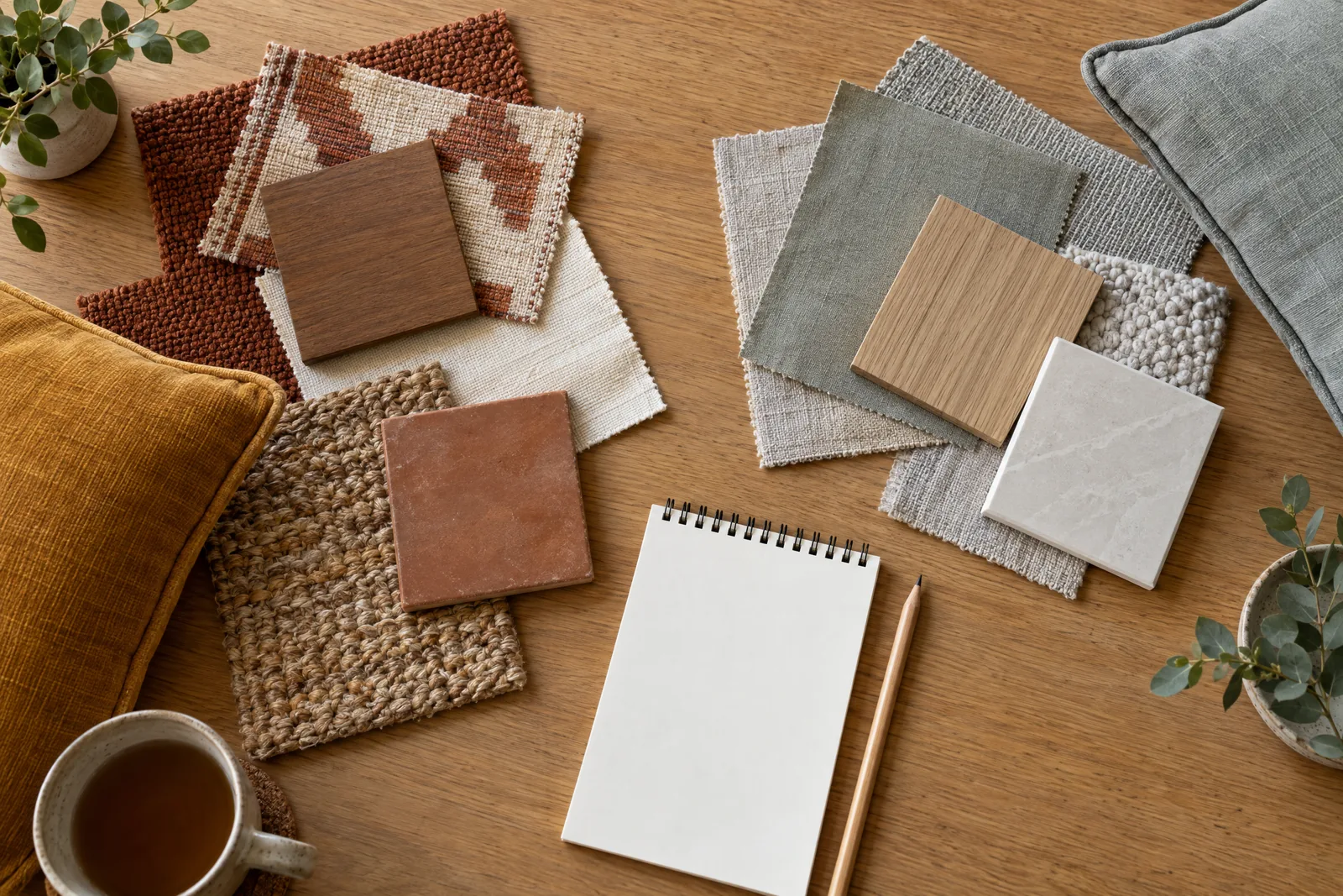
For a meaningful material check, gather physical paint, fabric, flooring, or finish samples. Place them beside the existing furniture and fixed finishes in the room. Look at them in daylight and again later with the room’s usual lamps on. Move the samples to more than one sightline so you do not judge only the spot where you first set them down. Photograph the setup from normal seated and standing views if that helps you notice relationships.
Observe rather than trying to persuade yourself. Write down:
- what feels right and which North Star quality explains it;
- what feels wrong and whether the cause is color, sheen, texture, scale, form, or maintenance concern;
- what changes between daylight and evening light;
- whether the proposed item supports the existing anchor or competes with it;
- what remains unknown, such as dimensions, installation, cleaning instructions, lead time, or permission.
Live with the contained test briefly before making a larger decision when that is feasible. Digital colors and online photographs cannot substitute for real samples in your room. A small test is a learning step, not proof that an entire home will work. For consequential changes, measurements, manufacturer guidance, and qualified design or construction input may still be necessary.
Handle household disagreements by comparing qualities
When two people disagree, avoid turning the conversation into a contest between labels. Ask each person to identify the underlying qualities they want. One person may be responding to warmth, softness, and a sense of history. The other may be responding to order, open space, and clean lines. Those qualities can sometimes share a palette, material, silhouette, or room-by-room role even if the reference images look unrelated.
Each person can mark images as prefer, uncertain, or avoid and explain why. Compare the reasons, not only the images. Put shared qualities in the North Star and genuine conflicts in the candidate matrix. A direction that creates an upkeep or comfort problem for one person is not fully evaluated.
The goal is not to make every choice equally appealing to everyone. It is to find a workable shared thread and to make conscious decisions about where one preference can be an accent, where another can shape the room’s base, and what will be postponed until the household has more information.
Make a final buy or no-buy decision
Before purchasing a major piece or committing to an installation, use this ordered check:
- Can I name the recurring qualities I love without relying on style labels?
- Have I recorded what is already in each room and what cannot easily change?
- Does this direction support the room’s actual activity, comfort, storage, and circulation?
- Can the household live with its upkeep, durability, sourcing, and budget tradeoffs?
- Are permission, code, installation, accessibility, or professional-feasibility questions still unresolved?
- Does the choice work with the room’s real daylight, evening light, and fixed finishes?
- Have I tested a small, low-risk expression or reviewed physical samples before making a larger commitment?
- What shared thread will carry through the home, and what am I intentionally not trying to force?
If several answers are uncertain, the decision is not ready. Keep the notes and inventory active, gather the missing measurement or sample, ask the relevant landlord or association question, or seek qualified project-specific advice. Waiting for information is different from failing to choose.
For additional background on how room decisions relate to function, lighting, materials, and the overall home, see this general interior design tips and ideas guide. Use it as context, then return to the preference, inventory, comparison, and test process here.
You do not need to make every room match or settle on one permanent identity. Choose the qualities that keep earning your attention, check them against the home you have, and let a small real-world test guide the next decision. That is a practical way to find an interior style that feels like you while leaving room for the home to develop.